Wireframes: Message, Flow & Layout Before Design
In simple terms: good website design starts with good wireframing.
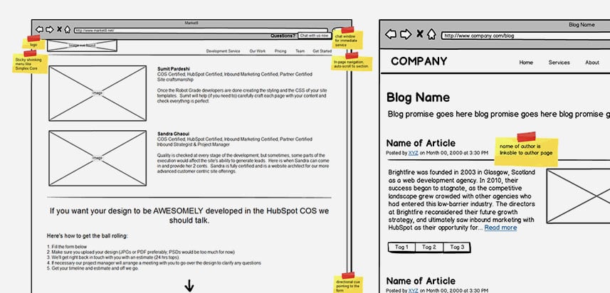
Wireframes are the architectural layout of what your site will be. They’re like a skeleton for your website.

The whole User Experience of your new site is defined through the wireframes, and we follow tested layouts, usability research, and years of experience in creating them.
This process helps us focus on what your buyers need to do on each page without the distractions of the “look & feel.”
Here’s how we will create your wireframes:
We define the goal of each key page
For key pages in the user flows, we need to define what we want buyers to accomplish; do we want them to:
-
Click on a certain CTA?
-
Understand something?
-
Get certain key message and then go to another page?
-
Fill up a form?
So, we’ll define what the most wanted action buyers should take on each key page, then...
We’ll figure out the messaging
We’ll define what needs to be said so that your buyers can accomplish the goal. To do this we take into account:
|
Because if we know that, figuring out the layout of the page becomes a fact-based exercise and not guesswork.
So once the messaging is done...
We’ll sketch out the layout
The layout is like the architect’s plan of the site: what goes where, what’s more important than what, and we start defining how buyers will experience the page. We include in this step the formatting we had done while writing the copy.
Lastly, we’ll add some notes about how we want the page to work
What kind of imagery, functionality and behaviors should be built in during design and development to support the goal of the page.
This is stuff like:
-
Types of images to use
-
Button behavior
-
Interactive functions (what stuff is user activated vs. just displayed, etc etc)
In other words, coolness is engineered to support your goal. Not mere useless gimmicks.
A wireframe is 90% thinking & planning and only 10% sketching.
Most, if not all of your website’s functionality is decided at this stage.
This is how great User Experience is created.

