Website Recommendations
Your Website Recommendations Report + Quick Fixes To Work On Now
Here we plan how your site will be built. This is like the guiding star of the whole design process, that sums up everything you need to know in order to turn your website into a high performance sales person
1
Website Recommendations ReportThis is a no-fluff, straight to the point list of research-based recommendations for your site to meet its objective, including information architecture, usability, user flows, and design guidelines.
|
2
Quick Fixes ListWe’ll also identify a list of quick fixes you can implement on your website right now and start getting some early wins.
Quick fixes will include things that can be implemented ASAP, as well as issues that will be covered in the initial redesign. |
3
No Sugarcoating.If you feel strongly about some of the things your new site should have, and we know it will hurt your business, we’ll push back and say it bluntly without hesitation.
We believe that’s why you hire professionals. |
Here What’s Included in Your Site Architecture Plan:
Key findings & high impact - actionable recommendations.
First, we’ll do a braindump of observations about your site and what should be done to fix it. This could be the famous elephant in the room, low-hanging fruit, things hiding in plain sight... no fluff, straight to the point observations and recommendations.
Your very own Conversion Action Plan
As our team analyzes your site, we’ll be creating a long list (anywhere from a couple dozen, to hundreds of issues to improve on your website. These are categorized a few different ways:
- Potential impact to your business
- Focus of the action, which is one of five types: boost conversions, improve user experience, personalize the experience to your different buyer personas, create marketing assets, or Improve SEO.
- Ease of implementation
- Implication: what kind of activity is it (and which expertise we need on task): testing, analytics, hypothesis, just do it, or further investigate.
This is how we prioritize what should be done first.
The goal of your site.
We’ll identify your site’s ultimate goal. Especially for B2B - this is the ultimate role of your website in your sales process. It can be sign up for a free consultation, request a quote, etc...
This is the one thing that if your site was able to do well, it would be a success, and everything else on your site, campaigns, marketing activity, etc. builds up to it:
This is typically the point at which your sales team will take over.
This becomes your ultimate call to action, your key entry point... the gates of heaven... your website's Arc de Triomphe.
We’ll define this goal together for your site.
Why can’t we just pick any landing page? Because when a buyer fills this landing page, your sales team needs to be ready to jump in. So it has to work with the way you sell.
So, in this process, we will have an in-depth discussion about your sales process too.
Key Performance Indicators (KPIs)
To be successful, you first need to know what is success. So to be able to distinguish success from failure, we will define a few, but really important indicators, and how they will be measured. Our team will take snapshots and set SMART goals for each.

User Flows.
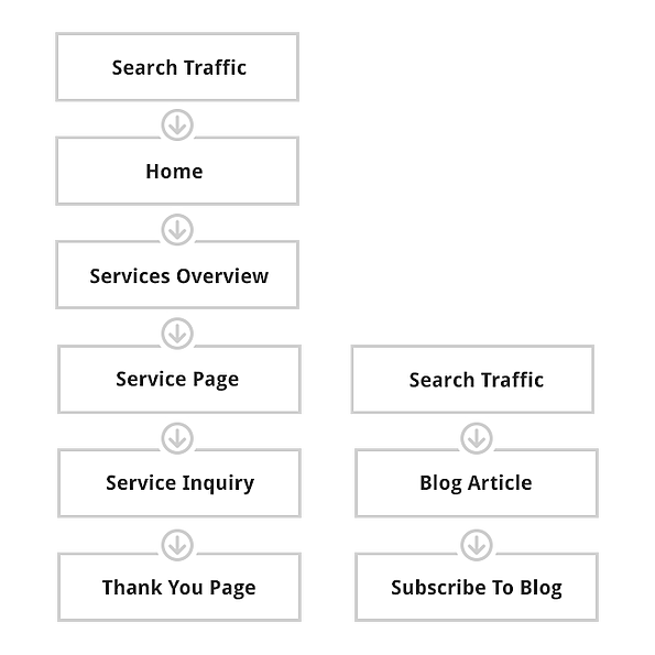
User flows are the steps that we want your buyer to follow through your site to accomplish a goal.
Each one of the pages in the user flow becomes a key page critical for conversion. Here are some examples:
Proposed Site Architecture
For your buyers to engage with your company online, all your information needs to be organized logically. We’ll use deep buyer analysis, analytics and our experience, to define what your sitemap should be.
Design Guidelines
We will define all of the guidelines that should be followed during the design phase. Considering your buyer personas we’ll define everything, from color, look feel, font types, colors, etc.
Site Evaluation
We’ll evaluate your current site vs. our FOCUSED™ framework. We’ll highlight the good, the bad and the ugly.
Feel this is over the top and could be skipped?
Here’s the hard truth:
Skip it, just wing it and run the risk of losing ALL of your investment...
...because without a plan, all you'll be doing is decoration at best.
The more complex your service, the more questions you need to answer, and the more content you’ll need to answer them.
And the more content you have, the more confusing your site will be without the proper structure, architecture and usability features.
Basically your website would become an ugly monster.

