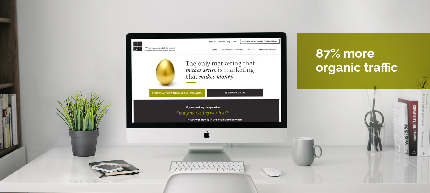
-HubSpot Quarterly Impact Awards Candidate - Website Design-


White Space Marketing Group (WSMG) is a strategic marketing agency dedicated to aligning marketing activities with business and sales objectives.
WSMG is a group of seasoned marketing experts that honed their skills in large marketing companies, advertising agencies, mid-sized businesses, a variety of industries, and different business models. While their experiences vary, they all believe in one thing: The only marketing that makes sense is marketing that makes money for growing businesses.
Market 8 worked with WSMG to formulate a value proposition and website that reflected their unique differentiators.
Components of this project
| 87% more organic traffic |
More clarity More credibility |

WSMG's website had all the ingredients, but the messaging and site architecture did not offer visitors to engage with the brand in a meaningful way. Their key values of experience, quality of work, a link between business objectives and marketing, big agency smarts, small agency attention, clarity of ideas, were hidden underneath undifferentiated language and clumsy navigation. As WSMG, positions themselves for growth, they needed a better website to build upon.
Market 8 approached this website redesign from a business perspective and not as a branding web design exercise. Following our Customer Centric methodology, we first discovered the primary business value proposition. Then, working together with WSMG, we improved the messaging so that WSMG’s value proposition was clear to their buyers. Once satisfied with the messaging, we tackled the web design to match this revised value proposition. The eureka moment for this project was in the value proposition presentation -- the presentation began in the abstract and transitioned towards clear, specific, and benefit driven messaging that would resonate with buyers. The components of our solution were:
Customer-Centric Research - Before proposing anything we took a deep dive into customer perceptions to uncover key questions and hesitations buyers had when visiting WSMG’s website. The top 4 questions and hesitations were cost, clarity of deliverables, intangible nature of the investment, and the ability to drive measurable results. These findings drove there rest of the messaging and design process.”
Messaging and Information Architecture - We worked with the WSMG team to move the messaging away from intangible and purely strategic talk towards specifics around processes and results that reflect WSMG’s client work. We dedicated the homepage and main navigation to give a direct answer to the top questions and hesitations that buyers had when considering WSMG:
a. “Our Process” section. We created a long scrolling page suitable for information discovery to address the buyer’s concern of the intangible nature of their investment.
b. “Case Studies” section. We created a case study section that addressed and put to rest common hesitations. Questions such as, “can you show me tangible results you’ve produced for clients?” and “what is it like to work with WSMG?” were answered by using real examples from past projects.
c. “Pricing” Section. Most professional service firms offering strategic marketing services shy away from showing pricing on their web pages. However, as this Nielsen Norman research shows, not displaying pricing tends to lengthen the buying process and can cause the potential buyer to not trust a B2B firm. So, we created a pricing page dedicated to giving a range of pricing to prospective buyers.
Customer Centric Website Redesign - This redesign included strategy, architecture, layouts and UX, and implementation. The design process followed the solid iterative methodology:
a. Define objectives of each key page. Decided on the most important information the buyer should learn from this page and the action we’d like them to take.
b. Draft the copy & layout. Worked on the copy & rough layouts simultaneously to build the foundation of the desired user experience on the site.
c. Wireframing. Defined the key elements of the user experience via a number of methods including internal user testing.
d. Final design. A user simulator was used to ensure we were driving attention to the right areas of the page while avoiding the creation of unintentional blind spots. Design isn’t about beauty alone -- it must also be functional and fulfill stated business objectives.
e. Responsive development. Using the HubSpot CMS allowed us to develop the website faster and shorten implementation times.
Branding - Although the corporate identity was in place, the website did not convey WSMG’s high-end “boutique” positioning. We focused on design and colors that adequately reflected this positioning in order to stand out from the competition. The website had to feel simple, clear and trustworthy -- it had to look like the Chanel of marketing agencies without coming across as too corporate. It also had to be inviting and comfortable to aid client onboarding while remaining bold and assertive to stay true to Ilene’s tone of voice.
The work on the website has enabled WSMG to onboard clients looking for strategic counsel, customer insight, content and social marketing, as well as website redesign and growth driven design projects. WSMG has repeatedly paid us the ultimate compliment by referring existing clients to Market 8 for a similar website overhaul.
Grow traffic - create content - optimize: The new website represents a stepping stone for WSMG’s inbound marketing journey. In the months following the launch of the website, the WSMG team is working on creating blog content and advanced content pieces to drive more traffic and capture leads on their website.
