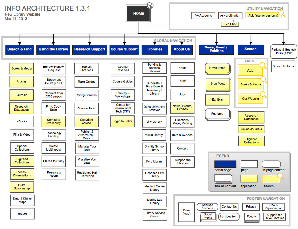
Site architecture is the approach to the planning and design of websites, which involves three distinct elements: technical, aesthetic and functional factors. The whole point of site architecture is to focus on both the user and his requirements. It demands serious attention toward things like web content, the business plan, usability, interaction design, information architecture and web design.
Site architecture is the approach to the planning and #design of websites.

Essentially,it’s all about the flow and content of your B2B site, based on good research and planning. If you handle site architecture well, you should end up with a web-design structure that balances the desire of your users with the needs of your business.
Let’s take a very detailed look at what makes up site architecture and why it matters to any high-performing B2B site.
Why is site architecture so important?
It’s important because it will provide a slew of benefits that will increase your chances of getting buyers. These include a more efficient design process, a more effective layout, a design that’s friendly to search engines and, best of all, satisfied users impressed with your site’s functionality.
All users have four questions in their minds when they get to your site. These are:
- Am I in the correct place?
- Does the site have what I’m searching for?
- If this isn’t what I want, does the site have anything better?
- What do I do now?
To give users what they want, you have to do four fundamental things in response:
- Convince site visitors that they’re in the proper place (clarify where they are)
- Make it easy for your site visitors to find what they’re searching for
- Ensure site visitors know all their options by offering links like “related products” and “see also”
- Permit them to take different types of actions (use crystal-clear calls to action)
Take care of these fundamental things, and you will have happy users. But how do you include all of these considerations in your site architecture? Let’s take a look at how to get every element of great site architecture nailed down properly.
Information Structure: How You Layer Your Site Information Matters
The point of the information layout on your B2B site is to ease your buyer into your content. How you structure your information will have a huge effect on the user experience and, consequently, the conversions.
Trust-building elements are highly important because they increase your credibility in the eyes of your site visitors. They encourage your site visitors to turn into leads by leaving their personal information. Examples of trust-building elements are testimonials, customer logos, awards and educational content.
If you’re asking your users to take action, for example, you could reduce some friction by placing testimonials right beside your call to action, as well as the landing page. Smoothly including testimonials within the conversion path is natural. Customer logos belong on your form page, too, while any awards you got from your industry ought to be placed as prominently as possible, so that buyers immediately see them.
Layers of navigation are also an important consideration. The rule to follow is that you can put as many layers as you want…without confusing your site visitors. In general, the more content you have, the more submenus you’ll naturally have. Still try to stay as flat as possible; 3 layers down should give you plenty of room to present information in most B2B lead gen sites.
You should definitely put a priority on elements that are most important to your business in your global navigation.
Take Schwab’s website, for instance. Navigational elements that are central to Schwab—like “investing” and “banking & lending”—are persistent throughout the site, no matter what page you go to.
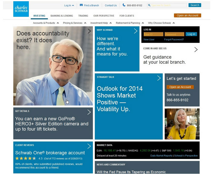 Elements in the site’s secondary layer of navigation—such as “accounts & products” and “investment help”—don’t appear on every page since users won’t be searching for that information if they’re looking for contact information.
Schwab, therefore, is a good example of good information architecture.
Another example is L.L Bean’s website. It features layers of navigation arranged by shopper type (gender) and specific product category, which shows it understands its buyers.
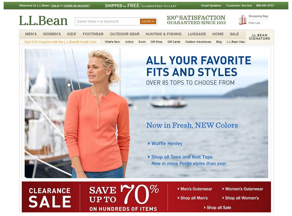
Do not make your buyers take extra steps to explain what should be obvious at a glance. That customize bar at the right of the screen ought to be center-screen and feature a value proposition that explains what the company does.
Good Navigation vs. Bad Navigation
Good navigation is an integral part of good site architecture because it makes it easy for the user to find what he wants. It’s usually best to go with the safety of convention as opposed to edgy design in navigation.
After all, your aim is to make it easy for your buyers to find their way around your site, which will help both the user experience and conversions. If site visitors see specific words and icons in places on your site where they expect to see them, they’ll enjoy the navigation more.
The best practices for your main menu include global navigation (as in, it appears on each page of your site), positioning the main menu horizontally at the top of the page or vertically down the side, and simplicity (fewer buttons in the menu). Having buttons in the menu that are also clearly labeled will work to reduce click fear.
That said, there’s controversy on where to put your menu in the first place, horizontally or vertically. Many will say that the horizontal menu at the top of your page is best, and this study from the Nielsen Norman Group attests to that. It demonstrates that users will typically begin reading your webpage by first scanning horizontally, at the top of the page, so it makes sense to include a horizontal menu on your site.
This analysis also provides a host of reasons why vertical menus are detrimental.
However, if you do decide to go with a vertical menu, perhaps you have a lot of menu items, a best practice is to choose the left-aligned vertical menu since the right-aligned menu hinders scannability, according to another insightful study from the Nielsen Norman Group.
Here are some stellar examples of great B2B site navigation menus:
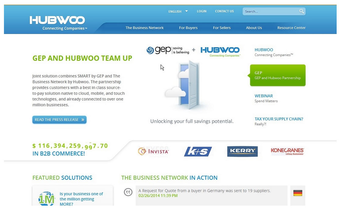
Hubwoo, The Business Network: The global navigation menu is simple, the company understands its buyers by giving them content suited to each part of the buying process, and the menu is across the top of the page.
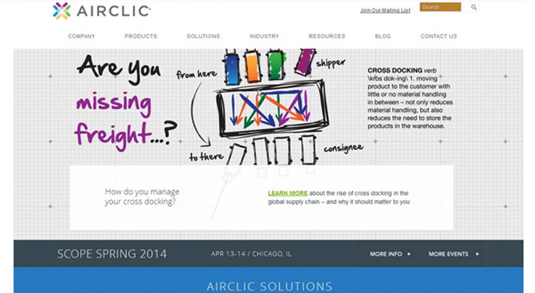
 Airclic: Its navigation menu has just two layers (very simple), it has no clutter and it clearly lays out its products and solutions for its wanting buyers.
 In order to learn more about how to design a site with amazing navigation that pleases your buyers, see these resources:
- 5 Expert Tips for Improving Your Navigation Menu
- Website Navigation Tips
- Website Navigation: 4 Tips for Maximum Usability
Understand the User Flows
Essentially, the user flow is the path that your buyer will take on your website. The goal of any good B2B site is to lead your buyer from the homepage to the bottom-of-the-funnel landing page. Therefore, every webpage on your site has to have a clearly outlined goal and a next step. Good site architecture demands that your design supports these user flows.
The goal of any good B2B site is to lead your buyer from the homepage to the bottom-of-the-funnel landing page.
The user flow generally starts on your homepage, and users typically find themselves there through various ways:
- An organic search
- Social media
- Paid ads
- An email newsletter
- A press or a news item
Once on your homepage, your user has a bunch of different options that means the user flow can proceed like this:
- Services overview
- Services page
- Service inquiry
- Thank you page
Alternately, the user flow may also go like this:
- Search traffic
- Blog article
- Subscription to your blog
Illustration of a Good Example of the User Flow
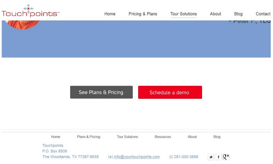
It pays to illustrate the user flow with real-world examples from excellent B2B sites like Touchpoints. It’s a company that was founded in 2009 by consultants to provide employee tools that make it super-easy for employees to reach the benefit information they’re looking for. The consultants have more than 60-plus years of experience between them.
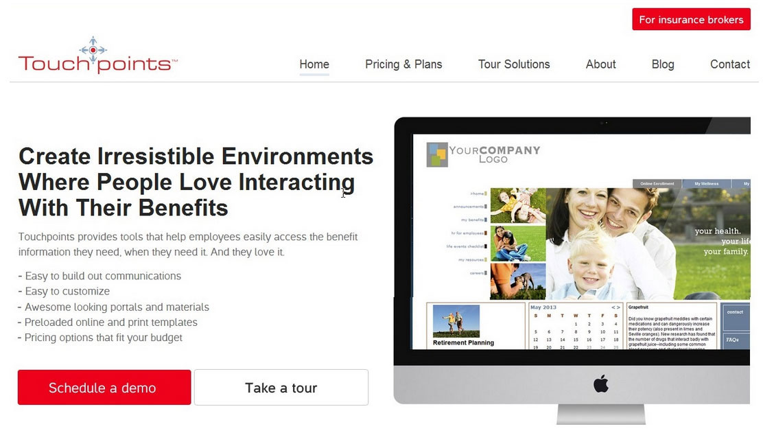 Let’s say the site visitor discovers Touchpoints through an organic search and then makes it to the company’s homepage. Right from the start, the user is never left wondering what to do or what his next step should be. Virtually every page on the site has a definite goal that’s clearly expressed.
Above the fold on the homepage, the user knows he can either schedule a demo or take a tour. If the user scrolls down to the bottom of the page, he’s given the choice of either taking the tour (again) or seeing the company’s plans and pricing. The goal on the homepage is get a lead or have the visitor buy the company’s service.
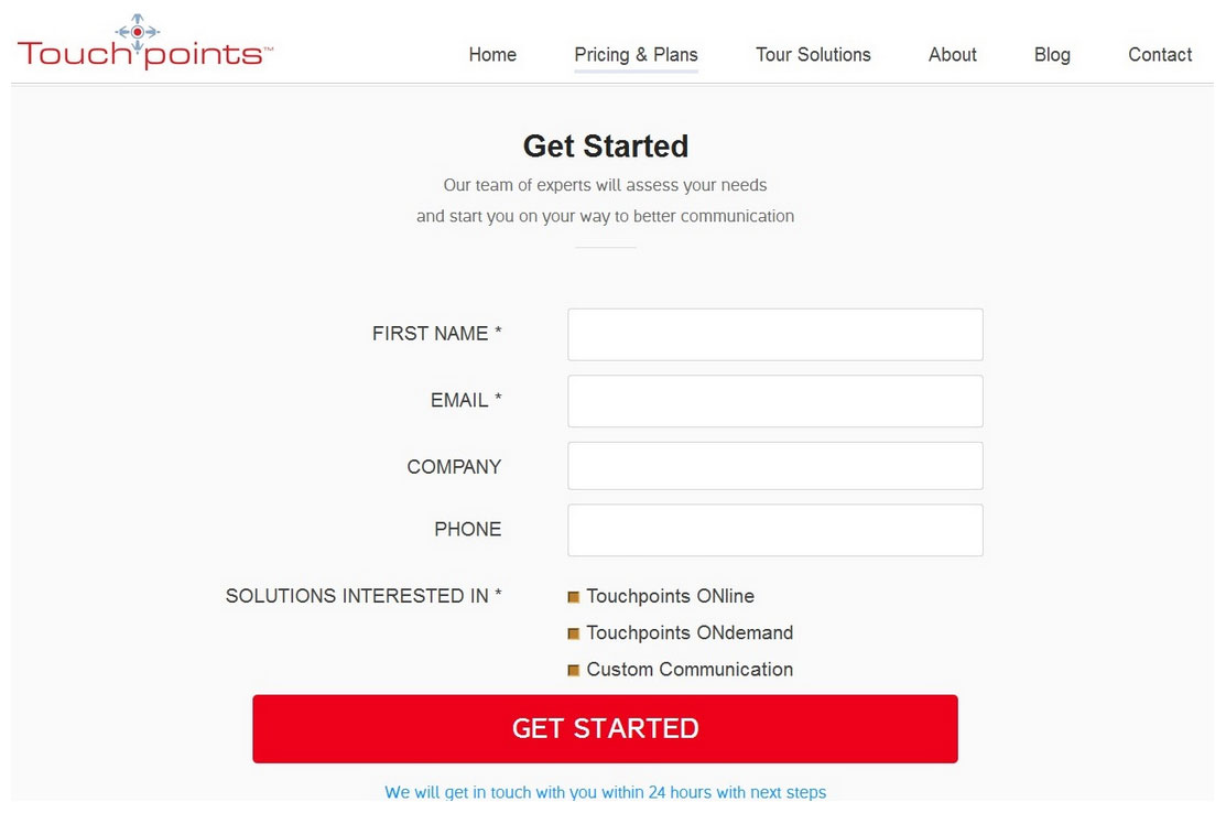
If the site visitor goes to the company’s Pricing & Plans page, he’s immediately greeted by various pricing packages and a “get started” call to action. The goal is to convert the site visitor on this page, and the next step is obviously for him to enter his personal information in the “get started” form.
If the site visitor heads to the company’s Tour Solutions page, he’s also never left in the dark about what to do next since the goal on the page is crystal clear as well. The page features a video, value propositions, a free download, a testimonial and the next step of either clicking on the Plans & Pricing page or getting a demo. The user is always prompted and guided on what to do, so the flow is efficient.
What Is Bad User Flow?
Bad user flow occurs when there is a lack of clarity. Pages with bad user flows are characterized by site visitors being confused about what the point of the information on the page they just read was. They’re also defined by the need of the site visitor to actually go back and reread the information in the hopes of him finally understanding what the goal of the page was.
A page with bad user flow will also fail to clarify what the next step should be for site visitors.
Here is an example of a pretty bad (or non-existent) user flow:

There are 21 different messages spread across 5 different sliders in the homepage, one of which I assume contains the most important messaging in the banner area, unfortunately that’s the one that I’m the least motivated to read because it rotates and I just can’t read it.
So, ok guys where did you want me to click here again?
Oh but the good thing is that everything is above the fold... right? Wrong . If you are going to have important messaging in your homepage the worst thing you can do it is put it on sliders and cram it all above the fold.
A page with bad user flow will also fail to clarify what the next step should be for site visitors. Basically, if you read through a page and still ask yourself what it is that the site wants you to do, then you know you’ve stepped headfirst into bad user flow.
Here is another example:

Here you just wonder... I spent a minute on this page and do not have a clear idea of what the company does, much less what the most logical next step is. The top banner are a is completely wasted with 3 meaningless images rotating; this the most important real estate on the site, where you have to answer key questions for your buyer: “What’s the site about?” “what can I do here?” “Is this for me?” “what am I supposed to do next?”
Your buyer has very limited time and make sure you don’t make him waste it. Do your homework and make it easy for him.
Conclusion
Now you know all you have to know about site architecture to design a site that’s chock full of great flow and content to maximize the user experience of your site visitors. There’s nothing more important for any B2B site than to balance its business needs with the desire of buyers to find exactly what they want and need in a super-efficient way. Good and effective site architecture can make this happen for your business.
To come up with site architecture that makes sense, you have to understand your buyer intimately. You have to properly address extremely vital site elements such as the layout of the information on the site, the navigation and the user flows. Only then will you have a B2B site that gives the user what he wants in a highly efficient way. In turn, you can enjoy the benefits of greater conversions and customer loyalty.
Designing your site willy-nilly is only going to lead to disaster. Paying attention to getting site architecture right will pay for itself many times over in the long run.


