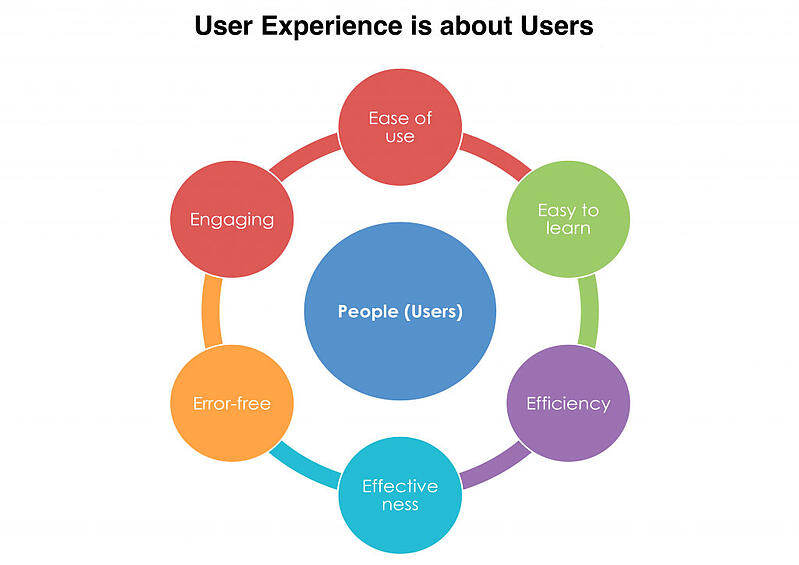
UX stands for user experience, which refers to how simple and enjoyable it is for your B2B buyers to find exactly what they want to on your B2B website. As such, the user experience dictates that you should put your B2B buyers front and center when you’re designing your B2B website.
That’s the ideal, anyway, but, unfortunately, some companies refuse to follow through on this extremely important best practice of web design.
Oftentimes, when designing websites or products, some companies simply don’t take the time to invest in customer research, which, plainly put, is dumb. It’s dumb because design like that only focuses on what the web designer believes is important, and that’s exactly where the inherent problem lies.
Of course, in order to make sure that your customers don’t leave your B2B website, you should be designing with them in mind at all times. This means from the very beginning to the very end, including everything from the planning, design and development to the final implementation, when the site goes live.
Think of it this way: UX design is an engineering job. It should cover all the aspects of:
- Hierarchy
- Improving site clarity
- Directing user attention to the desired action
- Aesthetics
If your B2B doesn’t treat UX design like that, your website will just be an overly expensive exercise in decoration that won’t increase your conversions and revenue. And that’s what we want to help you avoid.
User Experience, User Interface and Usability Clarified
UX is short for “user experience,” which is a necessary concept in both web design and business that, unfortunately, has a tendency to be neglected by companies. Here’s the definition of user experience, according to the preeminent experts in the field, the Nielsen Norman Group:
“The first requirement for an exemplary user experience is to meet the exact needs of the customer, without fuss or bother. Next comes simplicity and elegance that produce products that are a joy to own, a joy to use.”
We’ve defined user experience early on in this blog post because it can sometimes get confused with two equally important, but equally separate, terms that are associated with the user experience. Those are “user interface” and “usability.”
“The way a person interacts with a computer, tablet, smartphone or other electronic device. The user interface (UI) comprises the screen menus and icons, keyboard shortcuts, mouse and gesture movements, command language and online help, as well as physical buttons, dials and levers. Also included are all input devices, such as a mouse, keyboard, touch screen, remote control and game controller.”
For our purposes of looking at web design, we only care about the reference to screen menus and icons.
In addition, usability is also characterized by five, distinct quality components. They are:
- Learnability: The ease with which users can accomplish tasks on your B2B website, the first time around
- Efficiency: The speed with which they can perform tasks (like find your contact info) after they’ve learned the design
- Memorability: The ease with which users can return to your B2B website after a period of absence and still find what they’re looking for (your most popular blog posts, for instance)
- Errors: The number of errors users make, taking into consideration their severity and ease of recovering from them
- Satisfaction: The pleasantness of using the design of your B2B website
PROTIPKeep in mind that UX is always going to be broader than the user interface and usability.
Okay, so now that we’ve got you all set on the subtle differences between the three concepts, we can dig deep and take a look at how you should keep the UX in mind when designing your B2B website.
How to Use Hierarchy for Better UX
Good UX design uses a well-structured hierarchy to show your B2B buyers what statements or images are more important (and so more deserving of their attention) than others.
This relates to information or site architecture, which is also based on understanding your buyer and making sure that the information on your site is laid out in a logical way that flows nicely. It also ensures that the buyer can find everything and that he always knows what the next step on every page is.
PROTIPYou should use size on your B2B website to immediately inform your buyers what they should pay attention to first since page elements that are bigger than others seem more important.
Conversely, smaller elements on a page are deemed by your buyers to be less important. Let’s look at a good example of this.
Take a look at Hubspot’s homepage. What do you see immediately, even within less than one second of visiting the page? Why, you obviously notice the “#1 Marketing Platform” statement right at the top of the page.
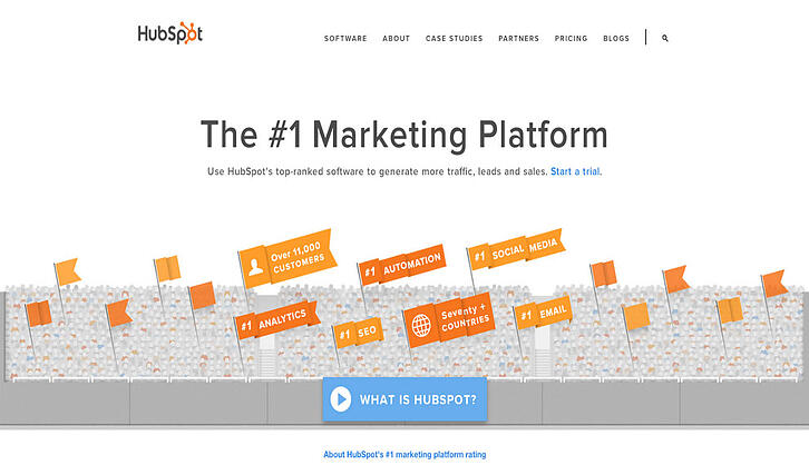
It’s no coincidence that the statement is written in big and bold font either; big and bold font draws the eye while also reinforcing the importance of this statement over any other elements on the page. Since Hubspot sells inbound marketing software, it makes all the sense in the world for it to make site visitors take note of this value proposition.
Another good example in using hierarchy for better UX is Salesforce’s homepage.
Salesforce is best known for its CRM, and its homepage relies on the use of color to create hierarchy in terms of where it wants its site visitors to look first.
Again, this is all based on making elements on a page look important, this time…with color.
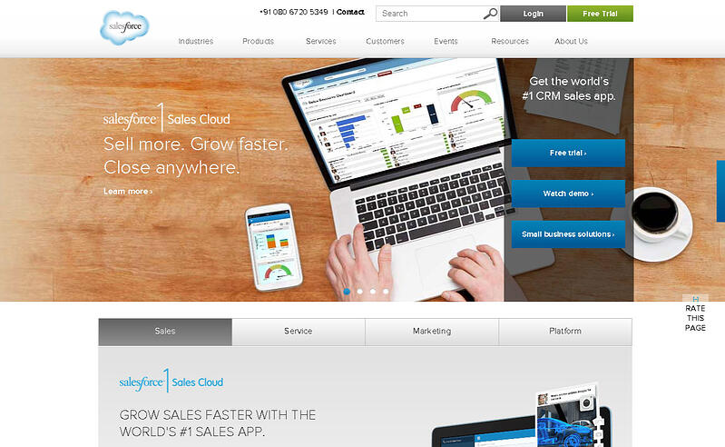
Note how the three buttons for “watch demos,” “editions & pricing” and “small business solutions” on the slideshow are deep blue in color? This instantly draws the eye of site visitors, indicating importance. Since all three buttons are meant to move leads down the sales funnel…it’s an intelligent use of color for information hierarchy.
Now that you have a good idea of what hierarchy can do for a great UX, we can move on to clarity and how it should impact UX in a helpful way.
How to Use Clarity for Better UX
Clarity is something you can’t compromise on.
PROTIPIt’s essential that your buyers understand exactly what to do on every page of your B2B website, whether that’s clicking a button to sign up for a free trial or demo or taking a tour to understand a specific service much better.
When you harness clarity well on your B2B website, you complement the message you’re trying to communicate to your buyers instead of hampering it.
Clarity usually comes down to two, important site elements: your typography and your images, both of which have an enormous impact on moving your leads down the sales funnel, micro conversions and ultimate conversions (purchases).
We’ve stressed many times how absolutely vital good typography is to any B2B website, primarily because 95% of web design is typography. Just think of how much content you can read and absorb on any website that you’ve ever been to. While other content includes video, too, it’s obvious that the vast majority is the written word.
We’ve stressed many times how absolutely vital good typography is to any B2B website, primarily because 95% of web design is typography.
That’s why your typography has to be top-notch, and that’s why it starts with good copy delivered by a good copywriter.
Let’s look at MailChimp’s homepage. By featuring clear site copy, MailChimp succeeds at enhancing its message, which is that its email marketing service helps you to “send better email.”
Right there, in only three words, its value proposition sends the message loud and clear that site visitors, leads and customers need MailChimp. Go down the page, and you’ll also notice the social-proof mention of 6 million people who are using MailChimp.
From this homepage layout alone, we can tell that MailChimp provides a good user experience to those looking for email marketing software because leads looking for an email marketing tool are informed about what MailChimp does and quickly prompted to the “sign up free” call to action buttons. As such, the site also offers a simple user interface that is self-explanatory, which means it also rates highly in usability.
Of course, no B2B website is complete without featuring a desired action. As we’ve said, it’s imperative that every page makes the next step abundantly clear, which is usually to click on a call to action button to sign up for something or make the actual purchase.
How to Direct Attention to the Desired Action to Better UX
The most important desired action that you have on your B2B website is, naturally, to convert your leads. These can be mini conversions via just signing up for your email newsletter or subscribing to your blog, or they can be significant conversions like actually making a purchase.
At any rate, to get your buyers to perform any desired action on your B2B website, you have to focus their attention on your site’s call to action buttons.
There are a couple of different ways of doing this, the first one being through the use of directional cues. The great thing about directional cues is that they make it virtually impossible for your buyers not to know what’s expected of them on any of your pages.
Directional cues can take the shape and form of different things, as long as they make it abundantly clear to your buyers what the desired action should be.
Essentially, there are two types of directional cues: implicit ones and explicit ones.
Examples of implicit directional cues include:
- View direction
- Color
- Visual weighting
- Prioritization
- Color repetition
- Shape
- Size
To illustrate what we mean, take a gander at Eloqua’s homepage.
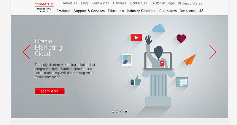
The majority of the “Learn More” call to action buttons in the slideshow are a striking, red color, which is in stark contrast to the backgrounds of the slides, which are various shades of gray.
Naturally, the UX will be pleasant for a person looking for automated marketing software solutions for B2Bs because the user interface makes it easy to find what he’s looking for.
Examples of explicit directional cues include:
- Lines
- Curves
- Graphical arrows
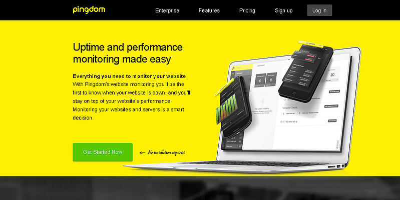
On the flipside, here’s a nifty example of an explicit directional cue that buyers simply won’t be able to miss. Pingdom’s homepage features an arrow as the directional cue that’s pointing right at the green call to action button.
PROTIPNote also how usability is great because a Pingdom user can easily navigate the site’s interface to find the call to action button and make a purchase in no time flat.
While making things super-easy to understand for your buyers is highly recommended, sometimes, just making your B2B website completely appealing can be a huge benefit on its own.
How to Use Beauty for Better UX
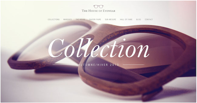
We just blogged about what makes truly beautiful B2B websites, but it’s worth noting that beauty also helps the UX. The concept of thin-slicing means that your B2B buyers are able to judge whether or not they find your website appealing, so it’s in your best interest to design for aesthetics as well. After all, how nice your website looks is a part of the UX, any way that you slice it.
Look at it this way: Even if your user interface is highly efficient and your buyer is able to find your different price points for your services with no friction, an unattractive site design can ruin or at least degrade the overall UX.
It also doesn’t help if the site usability is high because the navigation is so good that your buyer can return time and time again to find what he wants… only to be turned off by an ugly color scheme or contrast that just doesn’t work.
Your website looking nice will never affect your conversions negatively.
That’s not just us saying that—that’s a hard truth backed by science. So if you want a high-converting B2B website, you have to understand that attractiveness is not something you can sacrifice. It is a key component of very effective UX because it’s also something that your buyers want.
Now that you know that your buyers respond more favourably to a gorgeous-looking website, spend some extra time to find a web designer who has a solid understanding of broader design in general, which will undoubtedly complement your efforts to build a more beautiful B2B website.
A competent designer should be well-versed in the following principles of design:
- The Figure-Ground Relationship
- Similarity
- Proximity, Uniform Connectedness & Good Continuation
- Common Fate
- Closure
Aside from that, he also has to have a fundamental grasp of what people think of when they think of beautiful websites. In other words, your designer also has to know what the best practices of website aesthetics are. Here are some showcases of stunning websites, just for inspiration:
- 10 Award-Winning Websites With Kick-Ass Designs
- Top 10 B2B Websites 2013
- 60 Beautiful Examples of Websites With Full-Blown Video Backgrounds
- 25 Beautiful Responsive Web Design Examples for Inspiration
Conclusion
The big takeaway from this post is that UX design without customer research—in fact, without keeping the customer in your mind at all stages of web design—is doomed to failure.
If you’re going to be spending all that money and investing all that time to hire a designer and go through the development process, you may as well do it right by remembering that a great UX is what your B2B website design should strive to provide for your buyers. Otherwise, it’s not worth it.
Don’t be one of those companies that thinks of a general concept for its website and then just hands it off to its designers—as if said designers know what your buyers want when they’re on your website.
PROTIPWhile the designers can do the front-end work well, they’re not responsible for the customer-research side of things. That’s your responsibility as a B2B that wants to offer your leads and buyers a very thoughtful website that’s a pleasure for them to use…and given to high-converting results.
We hope this post has inspired you to take UX seriously and base it on customer research. So whether you’re creating a B2B website from scratch or redesigning an existing one, be sure to design it with your buyers in mind at all stages of the process.


