Any time you design a B2B site...
… there’s good design that increases conversions and creates customer loyalty and there’s bad design that turns off potential buyers.
Needless to say, you want the first kind of design. One of the best ways to get there is by avoiding certain design mistakes.
The key to success with any well-performing B2B site is buyer engagement, which takes some work to get just right.
B2B sites can’t just rely on customers making a split-second and emotional decision to make a quick purchase. B2B sites need to rely on buyer nurturing and a hearty content strategy to support him until the buyer finally converts.
You’ll sabotage your chances of building a successful B2B site if you don’t get a knowledgeable designer to build your site. Whatever you do, avoid these 8 costly mistakes in B2B web design. Your bottom line will thank you for it.
Mistake #1: You Think Your B2B Site Can Function Alone
Probably the biggest error in B2B site design is falsely believing that your B2B site is standalone and can function by itself. This may apply if you have an ecommerce store that sells products, but with B2B the process of closing the sale is a lot more involved and takes a lot longer to complete.
The thing is that your average B2B buyer has a huge hunger for information that can’t be sated very quickly. Especially for high value products and services, B2B buyers want to get as much information as they can before committing to a purchase.
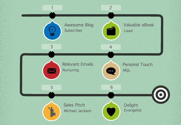
Your site has to provide relevant high-quality content and nurturing workflows to move your buyers down the sales funnel until they make the ultimate conversion of buying your service.
Common Pitfalls You Should Avoid:
- Creating low-quality or uninformative content. The objective of your content should be to add value to your buyers and establish credibility and trust. If your content does not rise to a certain quality standard, your buyers will dismiss your company.
- Unsegmented workflows. Probably one of the worst things you can do is send your buyers irrelevant content or content that they have already consumed. You should always be mindful to segment your contact lists either by buyer persona (so you can send content that’s relevant to that particular persona) or by their stage in the buyers funnel (so you can make sure you’re never sending content too early or too late).
Mistake #2: You Use PDFs to Present Essential Information
If you’re doing this on your website, you might as well just kick your buyers off your website.
Let’s start by defining what essential information is:
- Product or service specifications
-
Any information that addresses key hesitations or concerns
-
Pricing (if applicable)
-
Company and contact information
-
Basically any piece of information your buyers needs to make a decision
Your buyers should be able to access this kind of information without putting any effort at all. It should be present on your website at 2nd level navigation at most.
Why? Let’s take this scenario for example:
-
Your buyer is browsing your website trying to find out if your product has certain specifications he’s looking for.
-
He looks at the main menu and sees a link to “Products”.
-
He navigates to Products and finds it’s a page that holds a library of PDF documents, one for each product you have.
-
This means he now has to go and download a PDF (more if he’s trying to compare products) and go through it.
-
Your buyer doesn’t like that idea and navigates away.
If your buyer was browsing your website through mobile, you can forget about ever converting him into a lead. PDFs on mobile are unusable, and even if someone actually goes through the trouble of downloading the document, they won’t be able to read most of it on their small screen.
Forcing your buyers to find information in PDFs adds layers of friction and anxiety, and it is the enemy of mobile.
PDFs are also difficult to search and are often written for print, which means they are unscannable.
What PDFs Are Good For:
-
eBooks and whitepapers
-
Worksheets
-
Comparison charts
-
Case studies
-
Reports
-
Other such complementary content
- Detailed product specifications (in-depth stuff that only realy interested people would like to learn)
Mistake #3: Your Links Are Invisible
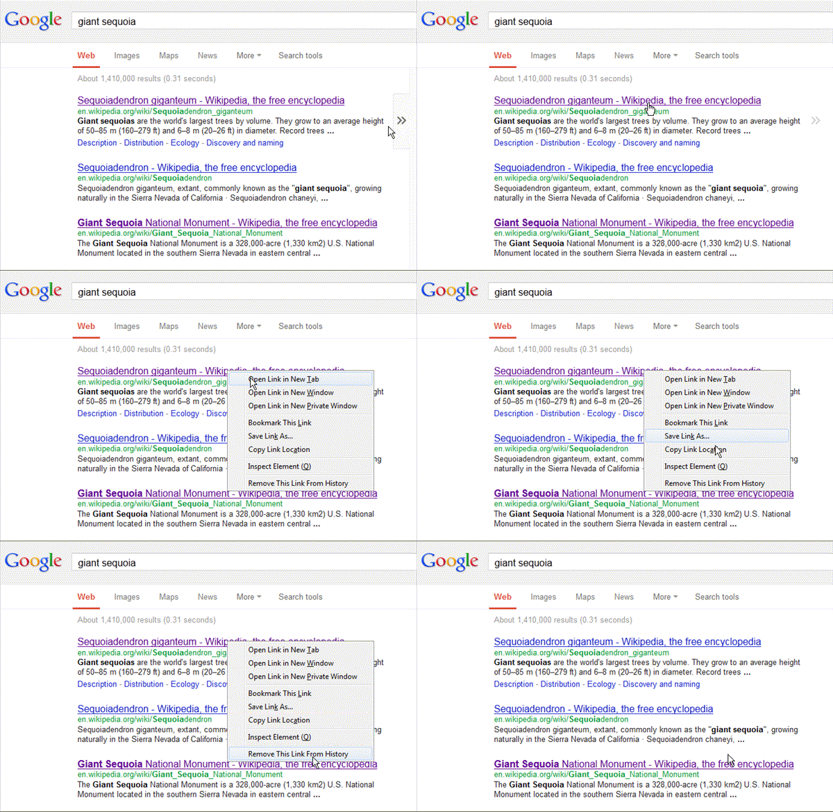
Invisible links are links that are indistinguishable from the rest of your copy. Usually it’s because they are not highlighted enough.
If your buyers can’t see the link, how do you expect them to click on it?
But it doesn’t stop there. You also need to highlight the links that your buyers have already clicked on. If you fail to indicate links that they have clicked on with another color, and this is especially true for pages with a lot of links, they might get frustrated trying to figure out where they’ve already been and where they want to go next.
This creates confusion, confusion creates frustration, and frustration is bad for conversions.
Making the color of visited links on your B2B site different helps buyers since they’ll understand their past navigation efficiently. This will make their current navigation and, hence, user experience all the better. If your buyers know what links they visited, they may do one of two things in navigation:
-
Stop visiting links that failed to give them the information they were looking for
-
Revisit links that proved helpful to them in the past
You can read more about designing links for the best user experience here.
Mistake #4: Your Site Copy Leaves a Lot to Be Desired
We always mention the not-so-old declaration that 95% of all web design is typography… because it is.
While it sure is a sumptuous treat for your eyes to take in the latest parallax scrolling effect or enjoy the bold and vibrant colors of flat design, you spend the majority of your time on websites reading. As such, it makes a world of sense to focus on only putting high-quality copy on your B2B site.

Mistakes in B2B site copy are all-too common; just look at any number of B2B sites. Here are some B2B copy best practices to follow:
-
Make sure that your site copy clearly explains how your product or service will help your buyers
-
Make sure that your site copy is free from overly technical jargon that just reads like nonsensical tripe
-
Break up or “chunk” your text into more easily readable snippets and paragraphs
-
Use the more exciting and persuasive active voice when writing copy
-
Make sure you don’t overdo or go too light on your relevant keywords
Mistake #5: Your Copy Isn’t Easy to Scan
It’s a cruel fact of life that people simply don’t read content thoroughly or completely on the Internet, and this includes your B2B site copy.
That’s why the only sensible solution to this problem is to write exactly how people read on the web. Doing this empowers you to make tactical adjustments, still get people to absorb your content, and increase conversion rates.
So how do people read on the web?
They are extremely fond of just scanning text. We advise you to reject the urge to just paste walls of text on your landing page or blog. Instead, try these tried, tested and true strategies to persuade people to read your site copy:
-
Make paragraphs shorter
-
Use the inverted pyramid (read: lead with the conclusion)
-
Use subheadings
-
Use bulleted lists
-
Make sure to highlight relevant keywords
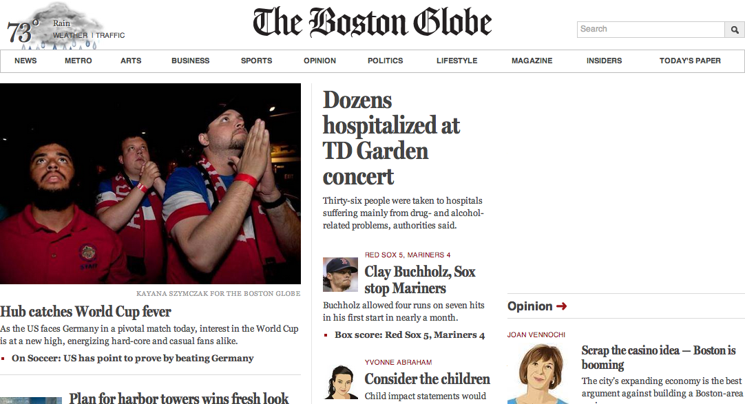
The Boston Globe is a perfect example of typographic hierarchy for better scanning. At a first glance, you can easily distinguish the headlines, the body copy, and the navigation. If you see something that interests you, you’ll drill down and read the rest of the copy. But their homepage is perfectly modified for quick scanning.
Mistake #6: You Don’t Even Have a Call to Action
It may surprise you to discover that some B2B sites don’t even include a clear call to action—the star and main point of any good landing page—on their homepages.
This sad but true fact was confirmed in Online Marketing Coach’s 2013 Small Business B2B Call to Action Study. It turns out that 70% of all small business’ B2B sites fail to present a clear call to action on their homepages. Talk about helping to sink your own conversion rates.
Your call to action is what will move your buyers to act on the goal of your page, whether that’s signing up for an email newsletter or actually making the most significant conversion of purchasing your product or service.
That’s why neglecting the inclusion of such a vital button is self-destructive.
Here are some tips on writing stellar calls to action:
-
How to Write Call to Action Copy That Gets Visitors Clicking
-
The Complete Checklist for Creating Compelling Calls to Action
-
5 Tips Every Content Curation Needs to Write Better Calls to Action
Mistake #7: Your Page Titles Don’t Help Your SEO
The page titles on your B2B site are the primary tools that you have to attract new buyers from search listings, as well as to aid your existing users in finding the pages they require.

Your page title can be found in the HTML <title> tag; most of the time. It’s used as the clickable headline for any listings on search engine result pages. Page titles are even used as the default name when users bookmark pages on your site.
To help your search engine visibility as far as titles are concerned, start with the homepage. Ideally, you want to start with your company name and then follow that with a short description of your B2B site. You can also switch around the order, just as long as you have both important elements in your page title.
Since you’re on our site, try a little exercise of checking out the page titles as you navigate. Start by looking at the title of the page you’re currently on. And if you find a mistake, point it out to us!

How To Handle the Titles on Your Inner Pages:
-
Start every page title with a few words that are highly relevant to the content the user will find on that page
-
Don’t begin each page title with the same words, as that will impair your buyers’ usability (if they’re using tabs to navigate between different pages on your site)
Mistake #8: Your Site Elements Look Like Ads
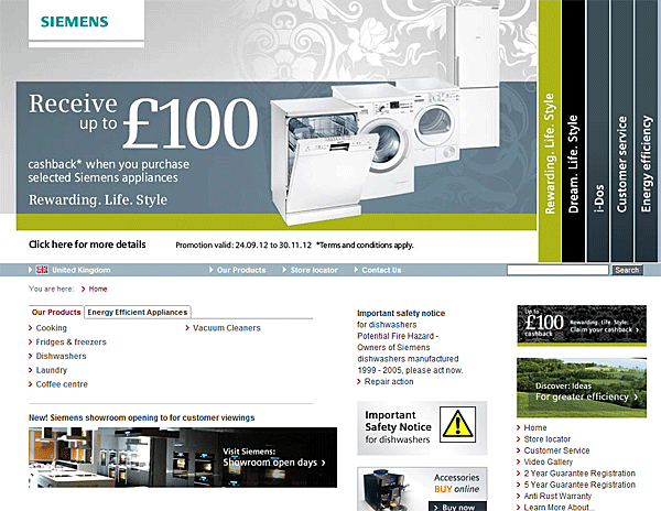
If there’s one thing that buyers don’t enjoy, it’s ads. Most often than not, users hardly ever look at ads on websites. If any element on your site looks anything like an ad, it will be ignored.
This is a very common pitfall for banner carousels or sliders. Overdesigned and distracting banners are very often ignored, much like what happened with Siemens.
What You Should Do:
-
Don’t use flashing or blinking animations or text
-
Be careful with the use and placement of pop-up windows or windoids on your site, as buyers and users will take them for pop-up ads
-
Be careful while displaying pricing in big fonts, as this is often correlated with advertising
Conclusion
Now you know all about the 8 worst mistakes in B2B web design that you could have a hand in. To avoid these mistakes, it’s highly recommended that you understand the fundamentals of the user experience, how buyers purchase and what design elements are necessary on your site.
It’s also a good idea to first screen your web designer to make sure that he has a solid grasp of these fundamentals before putting him to work on your new B2B site.
What do you think of the information you’ve read in this article?
Which B2B design mistake do you think is hardest to stop making?
On how many B2B sites that you’ve navigated have you seen make these mistakes?


