2012 was an unmistakably awesome year for the tech industry. More than ever, people are spending money on the latest and greatest device for work or leisure. But 2012 shocked the industry as well when it scheduled a decline in PC sales for the first time in eleven years!

Instead of PCs, people are opting for more mobile solutions such as tablets and smartphones. In fact, the shift to mobile devices is happening so fast that BGR expects sales to top notebooks for the coming year.
So what do all these numbers mean for your company? These numbers mean that more traffic is coming into your website from mobile devices. If your website isn’t mobile friendly, they will find another one that is. Mobile-optimized websites are no longer a luxury if you want your company to keep moving forward.
There are three things you can do to keep up with the shift:
1) You create an entirely new mobile-friendly website with a similar URL and program a redirect whenever someone accesses your website using a mobile device. If you’re thinking about going with this method, think again. From a long list of cons, let me highlight a few. Doing this means you have to maintain 2 different websites, keeping an eye on both their metrics. It also means that search engines will get confused while trying to crawl them. If you accidentally duplicate content in the two versions of the website, it dilutes your content’s ranking and search engines may even penalize you for it in certain situations
2) You create an app for your website that can be downloaded onto mobile devices. This is a smarter idea and if you’re a bank it can actually be terrific. But if you’re in the B2B website, making people download an app to your website is a huge point of friction and the vast majority would opt not-to. Not to mention that you would have to build the app for all the different stores which is not an easy task.
3) Responsive web design. Thus begins the article.
What is Responsive Web Design?
In a nutshell, responsive websites are websites that work on all formats, regardless of the device. They are able to detect the resolution of the device and will reorder and adjust the content to fit the resolution perfectly. It is one site for every screen.
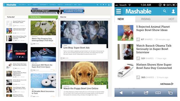
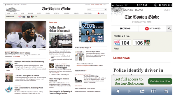
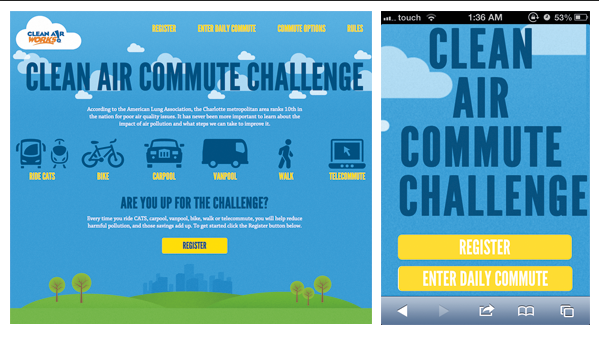
Let’s look at a few examples.
We’ve seen the examples, now let’s talk about benefits.
Cost and Time Efficient
Picture this: you’ve just finished working with a company to plan, design and implement your website. It’s been a tough few months, you’ve had to pay a lot, but it’s out there now. Just when you think you’re done, someone with a smartphone tries to access your website and you find out that it’s not mobile-friendly. Now you have to spend as much time and money to develop this new one.
I think it’s safe to assume no one would want that. With responsive web design, you only have to go through the motions of one website and it automatically fits all.
Content Consistency
Website maintenance can be a chore. Not only do you have to make sure all your content is up to date, you also have to create and upload new content to stay fresh and relevant. If you have several websites, it would be difficult to keep track of all the changes across all of them. If you don’t you’ll end up with a lack of consistency.
Since a responsive website is one website, you just need to maintain it and all will be well across all devices.
Responsive is Google's Recommended Configuration
Six months ago, Google released an article discussing mobile optimization. Below is an excerpt from this article:
“When building a website that targets smartphones, Google supports three different configurations:
1. Sites that use responsive web design, i.e. sites that serve all devices on the same set of URLs, with each URL serving the same HTML to all devices and using just CSS to change how the page is rendered on the device. This is Google’s recommended configuration.”
This means that Google’s search engines are better equipped to handle responsive web design and prefer them on any other mobile optimization.
Inbound Marketing Friendly
Having two websites will obstruct your inbound marketing efforts. Responsive websites guarantee that all your inbound links are consolidated, that all your traffic is pouring into one source, that your page views are the total number, your A/B testing is accurate, your metrics are correct, etc etc. All of which would not be possible (at least not very easy) if you have two different pages.
In addition, having one website will help you avoid the issue of search engine confusion. No matter where the traffic is coming from or on which device your website is being viewed, it will be treated as one website by search engines.
User Friendly
If a user is accessing a non-responsive website on a smartphone, he’d have to wait for the entire page to load, zoom into the button he wants to press, tap on it, then wait for the page to load again.
Responsive websites take into consideration screen resolution, which means that that flow of content is more appropriate to the screen size. There are no tiny buttons, no illegible type, and no oversized images. The amount of content is also reduced which means that pages are less cluttered and would load quickly.
Forward Thinking
Each year, new mobile devices are introduced into the market and each device has a different screen size. If you don’t have a responsive website, the mobile version of your site might not be super-compatible with all of these sizes and more problems will occur. However, responsive design groups similar screen sizes together. So for example, you’re not designing for an iPhone or a Samsung, you’re designing for a smartphone. This ensures that your website is flexible and would respond to the exact size of the screen viewing it. If a new device comes out and it’s a little larger or smaller, it would still work perfectly.
Adaptive Layouts
I’ve already mentioned that responsive websites will automatically adjust according to screen sizes and orientation. But they can also go beyond that. You can actively choose which content to show on which device. You can control what you want your visitor to view based on which device they’re using to access your website. For example, you can choose to show only a form on a smartphone, or the top 4 articles of your blog on a tablet.
Is It For You?
If you’re still not convinced and you’re wondering if it’s entirely necessary, check out this tool. It’s just a matter of plugging in your URL and it’ll show you how your website looks across different platforms. If you find yourself scrolling around a lot and looking for things then it’s time to take the leap.


