So far we’ve debunked the fold myth and proved the conversion prowess of long homepage designs. But in order to make sure you maintain your viewer’s attention, you need to create engaging design. In this article, I’ll go over some important things to keep in mind while designing for long pages.
Novelty
We can lose interest in absolutely anything when nothing new is being presented. If you’re listening to a monotone speaker, if you’re watching your favorite TV show and the plot isn’t progressing, if you’re eating the same thing every day, you will get bored.
Novelty slaps us across the face and demands our attention. By introducing simple changes, you can break up the monotone and keep your audience captive.
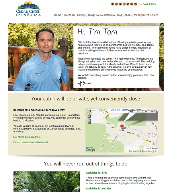
Cedar Creek Cabins use background colors to highlight different information across the homepage. By doing this, they have grouped relevant information together so that the copy is easy to read and easy on the eye.

Visuals and Transitions
A picture is worth a thousand words. Adding visuals such as icons or photos helps reduce the “heaviness” of an all-text page. They also provide people who skim with a good idea on what’s going on. Just by seeing the visual, they’ll get the message.
Another set of visuals you should consider adding are directional cues. Directional cues help you lead one idea to the other by literally pointing at it. It makes it easier to create a fluid motion running across the length of the website. This will also help you avoid the trap of a false bottom so you can be sure that no one will think the page is finished.
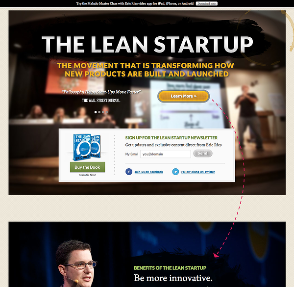
The Lean Startup has a terrific mixture of photos, illustrations, and directional cues. They use large photographs and drawn-in elements to provide novelty and directional cues that lead from one point to the next.

As for transitions, it would be helpful if you have in-page buttons so that clicking a button would automatically scroll your viewers to the right position. The Lean Startup does that too.
The Awesome Factor
If you have novelty, nice visuals, and clear transitions, then you’re set in terms of design. But you can add in an extra something that will give your website the awesome factor. This little something can be anything that invites interaction and uses scrolling to your advantage.
Have things animate, fly-in, change, play, move around, just by simply scrolling down the page. Web Design Ledger had compiled a list of websites that have fun with scrolling.
Going that extra mile will make your user experience more enjoyable and will make it more likely that viewers will revisit your website or refer it to a friend.
So all in all, long homepage design can be a great tool for conversion. But before you start considering it, you have to first find out if it is for you. There is no point in using this method if your company doesn’t need it.
Before deciding how your web-page should look like or how long it should be, ask yourself these questions:
1. How complex is my idea?
Complex ideas require to be broken down and explained in full. The more complex the idea is, the more explaining you’ll need to do, and the longer your page will turn out. A healthy practice would be to tell a friend about it. Note down the questions they ask and how long your conversation lasts before they get it. This is what you need to address on your homepage!
2. Do I have the resources to create an engaging website?
Let’s assume you have an idea that calls for long copy but you don’t have an in-house web designer or the budget to outsource. As I mentioned in the previous article, designing long homepages is very delicate as you need to make sure that the viewer doesn’t get bored and bounce off. Even if your copy is fantastic, a lack in enticing visuals will have a negative effect. In this case, you might want to opt for several short pages that explain the idea gradually.
3. Have I structured my information in a logical flow?
This is a very critical question. How the information flows directly affects two things: your buyers’ understanding and their willingness to take the next step. If you start a story in the middle then go back to the beginning then skim through the middle again then end, it will confuse everyone. This confusion will result in a negative effect, they will turn away and find another company that can offer them an easier solution.
You have to find a way to present your information in a way that one section leads to the next and the next, and that each section builds on the information presented before. By the time your buyers reach the end of the page, they have a very clear understanding of how your solution can save their lives and will be more willing to take that next step.
I hope you’ve enjoyed our deep dive into long homepage design. If you feel like you have more questions that I haven’t addressed, leave a comment below and I’ll make sure to answer it.
Previous posts:
Part 1 - Debunking "The Fold"
Part 2 - Conversion Analysis


