Directional cues on B2B websites are helpful and add to the user experience only if there are no other competing elements on the page. Examples of directional cues are your basic arrows and even people pointing their fingers at a target object.
However, if your B2B page leaves a lot to be desired—like it suffers from a lack of clarity and doesn’t have a proper focus (as in the buyer is confused about what the next step is)—then all the directional cues in the world will not help.
The smart use of directional cues should still make most B2B buyers smile. After all, they are that little extra push that skilfully guides the eye of your buyers and directs them to what final action you expect from them on the page. When we talk about the user experience, we mean that directional cues are an improvement to an already sound page.
When we talk about the user experience, we mean that directional cues are an improvement to an already sound page.
Before directional cues can play their part in helping your B2B website be the best salesperson it can be, your site already has to be very well designed.
This includes things like making sure that:
- The navigation is spot on
- The site copy makes everything clear
- The information architecture is laid out perfectly
- The next step on each page is clearly explained
- Call to action buttons begin with an actionable verb
Only once all of these things have been properly taken care of can you effectively enhance the user experience of your page with a killer directional cue.
That’s what we’re going to talk to you about today, so get ready for various examples and copious research to back it all up.
Recap of a Good User Experience as the Basis for Helpful Directional Cues
What makes the user experience on your B2B website sound? To start with, for the user experience to be pleasing, it has to meet the exact needs of your buyers, but this is obviously a too-broad definition, so let’s narrow it down by specifics.
PROTIPSimilar concepts like usability and utility (your B2B website should provide the features your buyers are looking for) are subsets of the user experience.
Here are some essential elements to nail down to ensure your site’s user experience is second-to-none:
- A homepage with a clear message that efficiently explains what your B2B’s all about
- Important content (like contact information as a trust-building element) on every single page
- Great readability that incorporates best practices like bulleted lists and easy-to-read font sizes
- External links that open in new tabs; internal links that open in the same tab
- Informative site copy that lets buyers find what they’re looking for
Getting all of these elements right increases the user experience for your buyers because they can then navigate your B2B website, find the answers to the questions they have, and then hopefully get in touch with you if they’re interested in moving down the sales funnel because your product or service addresses their pain points.
Studies have proven that the user experience is directly affected by how your website looks and, more importantly, how the specific placement of the various elements on the pages appears to your buyers. These aspects are direct foundations of any good user experience, so they have to be handled carefully if you want to build on a studied site layout with directional cues.
One of the first criteria to nail down is visual complexity, or, rather, a lack of visual complexity.
PROTIPKeeping visual complexity to a minimum on your website ensures a smoother and more pleasant user experience.
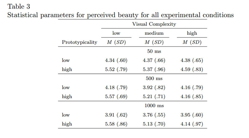
This is because a website that is more minimalistic empowers your buyers to find what they want on your website, understand the next step of each page, and follow through on the call to action with greater success. As a result, your buyers will find your website more attractive and will be in a position to convert with greater likelihood.
The other criterion that you have to also keep in mind according to the research above is the concept of “prototypicality.” Prototypicality is defined as a website appearing to users as the usual kind of website they’ve been accustomed to seeing over the course of their Internet-browsing lives.
In other words, it’s a website that looks like the standard type of website with:
- A header
- A footer
- The navigation menu
- A scroll bar
- A grid layout
- Site copy
- Images
- Etc.
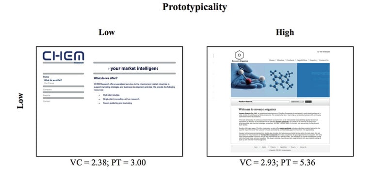
So in order to ensure a good user experience that stems from your buyers encountering the type of website that they are already expecting, it’s a good idea not to mess with success.
Alright, so now that we’ve briefly gone over some of the best practices to ensure a user experience that’s pleasant, functional and well-received by your buyers, we can move on to building on top of this strong foundation with directional cues that are right on the mark.
A Primer on Directional Cues
You can think of directional cues as being your secret weapons on any page where you have a call to action, whether that’s for a mini conversion or a bigger conversion.
They’re that little, extra push that can be instrumental in guiding the gaze of your buyers to your call to action, as well as persuading them to make the commitment and click.
That’s why directional cues, when used properly on a B2B page that doesn’t have many other problems (like competing elements or a lack of focus, for instance), can be brilliantly effective.

These directional cues can be grouped into two, distinct categories: implicit directional cues and explicit directional cues.
Generally, implicit directional cues include:
- View direction
- Color
- Visual weighting
- Repetition of color, size and shape
- Prioritization
Generally, explicit directional cues include:
- Arrows
- Pointing fingers
- People or faces looking at calls to action (body language)
- Curves
- Lines
For our purposes, we’ll focus more on explicit directional cues on B2B pages because they make a bigger and clearer impression than implicit directional cues. Plus, they are also easier to see and understand in examples.
What the Science Says About Directional Cues
The use of directional cues is so important that scientific studies have been launched to understand this phenomenon better. Of course, in the B2B industry, it’s material to know whether or not directional cues produce a better cueing effect and response time in users who see the directional cues. This can impact the time and budget invested in a B2B site design.
According to studies like this one from Duke University, there is indeed a correlation between response-time, cueing effects and directional cues.
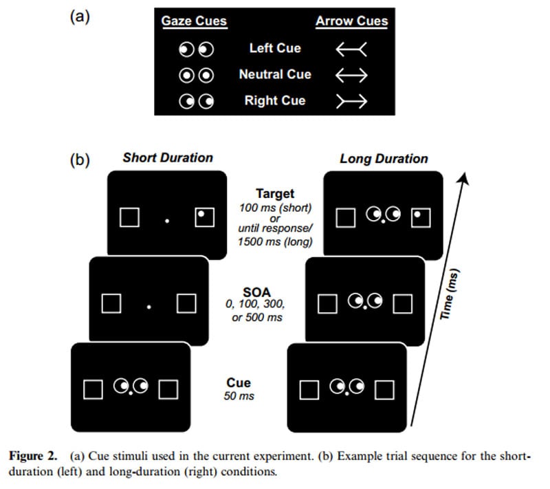
Put simply, when you’re looking at a directional cue like an arrow or a person’s eyes moving to a target, your response time isn’t based on an automatic reflex. Rather, it’s based on the conflict of the spatial info between the directional cue and the ensuing target.
However, the biggest and most important takeaway from all of this is that directional cues work in drawing the eye of the user and getting him to pay attention to the target. Period.
Talking of drawing, this research conducted by Conversion XL, using eye-tracking data collection methods to quantify user behavior, demonstrated that people paid most attention to a form when a hand-drawn arrow was used as a visual cue.
Still, in spite of all of this, there is actually one, vital area that the study didn’t cover, which is a pity.
The biggest and most important takeaway from all of this is that directional cues work in drawing the eye of the user and getting him to pay attention to the target.
That relates to the effectiveness of these directional cues in cases where B2B pages are already great and feature great user experience.
We strongly believe that B2B pages that already exhibit this highly efficient layout can benefit even more from directional cues in that the response time of the buyer, as well as the actual time spent on the objective (read: call to action), will be positively impacted.
How Not to Use Directional Cues
Let’s look at an example of a B2B page where the directional cue is hampered because of competing elements on the same page. This mistake in B2B web design is naturally something that you should aim to avoid at all costs.
Have a look at the free trial page of Halogen Software, a provider of talent management services. While the directional cue is clearly the use of color contrast to guide the buyer’s eyes to the call to action button, which is in bright orange, the page has too many competing elements for the directional cue to actually be effective.
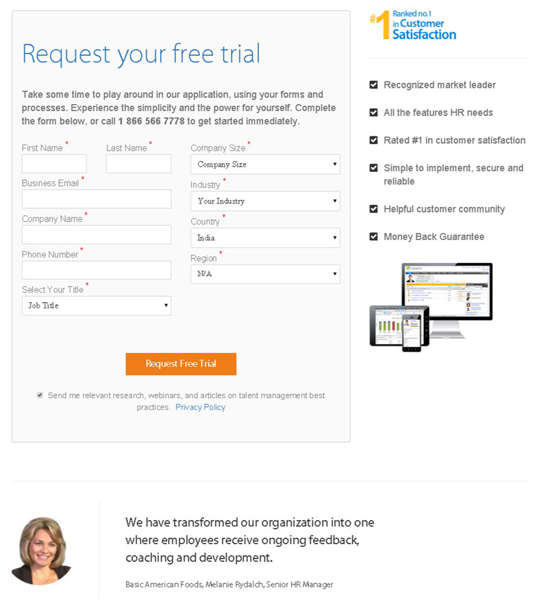
- For one thing, the form itself is overwhelming because there are too many fields (we counted 10).
- Next, the bullet list of trust-building elements to the right of the web form is distracting to the user because it subtracts from the purpose of the page, which is to have users sign up for the free trial.
- Finally, what could be a more explicit directional cue at the bottom of the page (the woman smiling and looking to our right) is confusing because it’s really a photo of someone providing a testimonial.
So with all of that stuff happening on that free trial page, it makes it quite unlikely that the use of color contrast as an implicit directional cue will have that much effect. After all, there’s a lack of focus on the page, and the various, competing elements make it a challenge for the user to efficiently pick up on the color-contrast cue.
With all of that stuff happening on that free trial page, it makes it quite unlikely that the use of color contrast as an implicit directional cue will have that much effect.
Examples of Good Uses of Directional Cues
When directional cues are done right, they completely enhance the user experience of any B2B page. Your buyer understands perfectly what your page wants him to do, and he appreciates the extra persuasion or push to help get him there.
Here are some excellent examples of using directional cues effectively on B2B websites.
First up is the website for The Power of Pinning, which is an online training program that teaches folks who run a product- or serviced-based business how to get the best results from Pinterest.

It should be easy to see why this explicit directional cue is so appealing and so effective. For starters…you can’t miss it. When your homepage features a large picture of a woman pointing with both of her fingers to the service’s features and benefits…then you’ve got a winning directional cue.
PROTIPIn addition, what makes this page a winner is the precise focus of the message. The page is uncluttered and features only a moderate amount of copy, but that’s more than enough to make site visitors understand the service’s all-important value proposition.
Because of how clear this sign-up page is, there are no competing elements to the explicit directional cue. As a result, it is highly effective at drawing the eye of site visitors and getting them to pay attention to the service’s features and benefits.
Next up, we have the “Get a quote” page from Geico, the insurance company with the famous gecko mascot. If you take a gander at the company’s homepage, not only do you have the call to action in the upper part of the page (which is where the F-shaped pattern of readers generally starts, to boot), but you also have the Geico gecko’s body directed at the call to action. This is a way to use body language as an explicit directional cue.
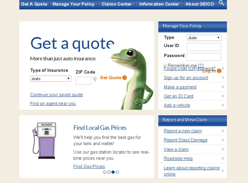
It works because the page is already well-organized to begin with. If you notice, there’s a good amount of both white space and padding that helps to focus the user’s eye on the call to action as well. Besides that, the call to action is already high up enough on the page that it’s the first thing a user will notice.
PROTIPUsing bigger and more colorful fonts for the call to action also makes it less likely that competing elements will be a factor.
Another good example of a smartly positioned, explicit directional cue comes from Manpacks, which is a men’s service for men’s basic needs like underwear, socks, razors and other, more unmentionable items.
As far as explicit directional cues go, the one on the company’s homepage could give other companies lessons in how to implement an effective, can’t-miss and explicit directional cue on a homepage.
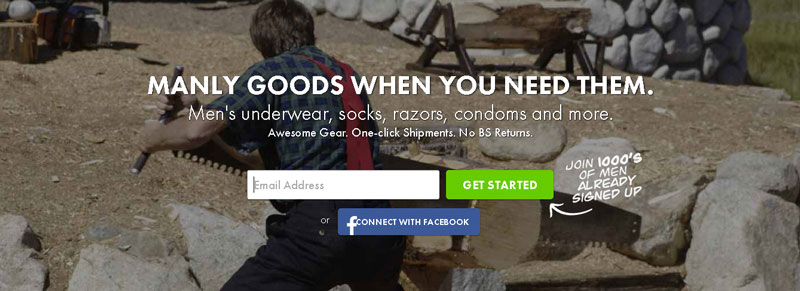
When the buyer’s eyes move across the homepage, they’re right away drawn to the curved arrow that’s pointing to the “Get Started” call-to-action button. That’s about as textbook as an explicit directional cue can get.
In addition, the site also utilizes the implicit directional cue of color contrast to direct a buyer’s attention and, ultimately, action. The “Get Started” call-to-action button is a very noticeable, bright green color that makes it impossible to miss.
As a result, this demonstrates to a tee how beneficial the directional cue can be when there are no competing elements on the page. The page is very clean and simple, with only the value proposition and features appearing on top of the directional cues.
Conclusion
Now, you should have an extremely clear idea of how to use directional cues in your website’s user experience.
PROTIPRemember: Directional cues have to enhance the user experience, so they should only appear on pages on your B2B website that don’t have any competing elements or a lack of focus.
When the next step of pages is clear-cut, then adding a directional cue is just the cherry on top to finish properly.
Of course, before you can even think about adding directional cues, your B2B website’s user experience should be top-notch. You’ll want to pay extra mind to the information architecture, navigation, copy, images and the clarity of the next step on your site.
Only when these are working together to provide your buyers a seamless user experience can you think of adding directional cues to help the cause of your call to action buttons.
Remember also that directional cues, depending on their placement and use, can be good or bad. Not everything will work, so it’s necessary that the directional cues on your B2B website are easy to see, large and make an impact. Try different things, too, such as arrows, pointing people or fingers and even mere body language cues.
How much faster would your buyers click your calls to action if they had directional cues guiding them?
Which type of directional cue do you think would be most appropriate for your B2B website?
What can you do to make sure that there are no competing elements on your B2B pages?


