
A website wireframe is defined as the visual guide that gives a framework for your website. This blueprint or page schematic is created to layout site elements in the best way possible to support a specific purpose, whichever your page goal is (yes, every page should have a goal; I mean, e-v-e-r-y p-a-g-e on your site needs to have a goal).
In the B2B context, this specific purpose could range from just earning your user’s confidence in an about page; social proof on a case study page; or download an eBook.

The website wireframe will show the arrangement of the content on your site. This normally includes the navigation, interface elements, copy and so on. However, that’s just a really small part of the picture because you first need context before you can put your website wireframe together.
The context includes your messaging direction, which is something you can only hope to put together if you understand:
- The buyer
- The product or service
- The value proposition
- The actual message
You should really only worry about website wireframing when you have a really good idea of what the final page messaging will be.
Let me repeat that, if you think wireframing is just putting blocks on a paper with no context at all, I wouldn’t say you are completely wasting your time only because you could find some therapeutic relief in doing it... but it just won’t help your business. Well, maybe it’s just a good first step... maybe.
What a website wireframe is not
Here is a quick rundown of what a website wireframe isn’t:
- A place to include various end visuals such as pictures, actual colors and fonts (there’s a reason they’re called “end” visuals)
- A place to include lorem ipsum filler copy (use real text in the wireframe for clarity)
- An actual design (wireframes show how the site works, not how it will look)
- Just a drawing (wireframes are 90% thinking/planning and just 10% drawing)
- A place to do a rush job (you should label and describe every element of each page to avoid any misunderstandings)
Here is an example of what a proper website wireframe should NOT look like:
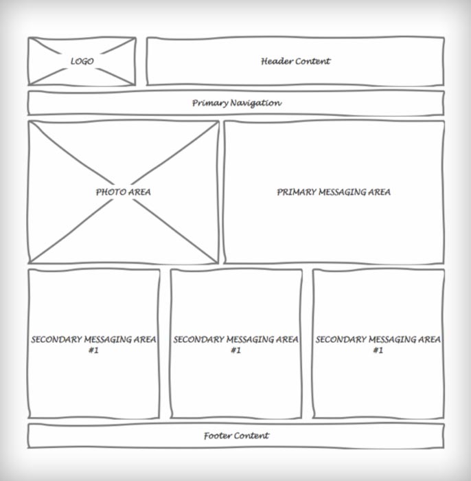
What guidance does this give your design team?
How is this this kind of “wireframe” supposed to guide any intelligence around how your site should be built? How does it ensure that your message is focused?
It doesn't, of course.
Proper website wireframing is an architectural project. Imagine if the architect of your condo building came up with a layout he just thought up that morning and shows up with the building company saying:
Well guys, here's your layout, I put them together this morning; sorry it’s on a napkin. You can take it from here, right?”
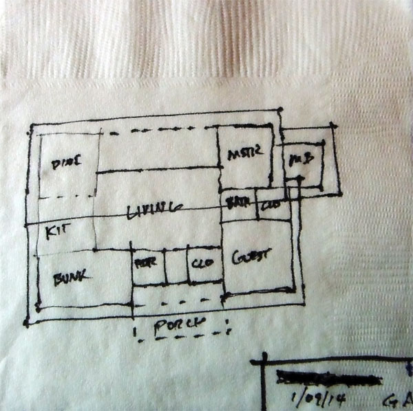
Website wireframing is as close to an architect’s job for web design as it can be.
It should lay out the details necessary to visualize how the page will be structured, what’s the layout, the flow of the messaging, where copy & images should be placed, and consider all of the elements that will help the page fulfill its goal: navigation, links, copy, microcopy, flow, calls to action.
Your website wireframe is the first solid step towards engineering your new website; it is where everything comes together for the first time in the process: all of the customer research, analytics, conversion goals, buyer personas, buying process analysis, persuasive messaging, and experience in building websites.
All comes together here in the wireframing stage.
It’s literally when the rubber hits the road.
You could even run your first round of usability tests at the wireframing stage.
This makes a world of sense when you realize that design is actually only the final phase of the process that should create a mighty business tool meant for lead-generation.
Website wireframes are 90% thinking/planning and just 10% drawing
Well, a few things, but essentially, if you skip wireframing, you’ve decided to put your business objectives aside to waste time and go do a pretty website.
It’s like if you start building a house by speaking with the interior designers about the color of the fabrics.
When this happens, a strange phenomenon takes place: everybody in the project forgets about the business objectives and hundreds if not thousands of emails start flying through your inbox (I swear I’m not exaggerating) discussing minute, completely irrelevant things such as: “what hue of blue should the titles font be,” or “should the images have round edges...” or “the shape and color of the social media buttons...”

I have seen in more than one occasion, how countless hours of intelligent business people are just wasted in this process. I even wonder if bad web design puts a dent in the productivity index of the country.
Web design is not branding, and it is not decorating; it’s a way of helping your business sell more. Now, should it be beautiful and fit your brand? yeah of course (and trust me, if you pay for good design, it will)... but if you want it to make money for you, that’s secondary to fulfilling the business objective.
‘nuff said...
You can see how the process of creating wireframes fits into the whole website engineering process in this article: 10 MUST DO's Before You Start Designing Your B2B Website
So here is how the process to come up with good wireframes breaks down:
STEP 1. Identify Your Buyer Personas
This one is beaten to death but it’s just that, without your dear buyer personas, you have nothing... Specifically, as it pertains to wireframes, you are looking to understand:
- Who is your buyer?
- What is the specific problem that he is trying to solve?
- Specifically why would he buy from you and not from the competition?
- What are the repetitive questions that you constantly need to answer before he makes the final call?
- What is it that he is looking to do in your website?
These are just some of the questions you have to ask yourself to be able to put together a potential buyer persona of your customer that is useful.
As you are figuring this out it is VERY important that you look back at the phrases that came directly from the buyer.
You don’t want to be re interpreting and summarizing stuff. If you can copy paste the problems exactly as the customer stated them in your prior research, that’s even better.
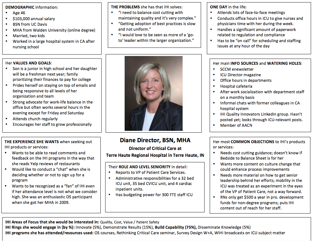
To understand all of the finer points of getting your buyer personas done, see our guide on the subject:
STEP 2. Figure Out Your Site's Messaging
So at this point your buyer personas are telling you exactly what is it that you need to say in your website.
Figuring out the messaging of your site is absolutely vital. You can think of messaging like this:
Messaging is the information you want to show on your site in the first place and, equally important, how this information is going to flow. This is a crucial building block in the wireframe process.
To craft your messaging you can use the findings in your buyer personas as follows:
- Who is your buyer and what is his problem
- What does your company do to solve that core problem - this needs to be addressed in the top value proposition of your homepage.
- What questions he has before deciding - these questions need to be addressed throughout the copy of the site; specially the headlines because those are the ones that your buyers will read first.
- Why would he buy from you vs. the competition - also throughout your copy you need to address your unique points of differentiation.
An integral aspect of messaging is prioritizing how you are displaying all of this important information on your site. Not all information is created equally, so it makes sense to decide which piece of information has a higher priority on any given page.
To do this you should really start with a blank piece of paper. Don’t worry about layout at first. Just think about what you need to say, then what you need to say next, and then next and so forth...
What's the story?
Think about what is a good flow for your messaging and how do you determine where to put your call to action? Would you need a form, or would you send the buyer to another page through a button? You can answer this by determining what the ultimate goal of your page is and what the next step should be.
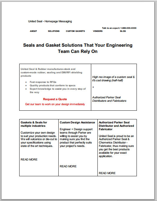
Define your messaging in word
For example, let’s talk about a product page. The objective of any product page is always to tell site visitors about the product and hopefully get them to buy/ask about/request a quote for it. One of the first things you want on the product page is an attractive, large picture of the product, along with all of the relevant product details.
For example, if it is an industrial product, buyers will be interested to know some general information, specs, uses of the product, can it be customized or is it in stock.
To sweeten the information on the page for the buyer, it would also be a good idea to include links to associated videos (you could also have the video on the page) and PDFs. Basically, anything that works to supplement your product page is fair game to include.
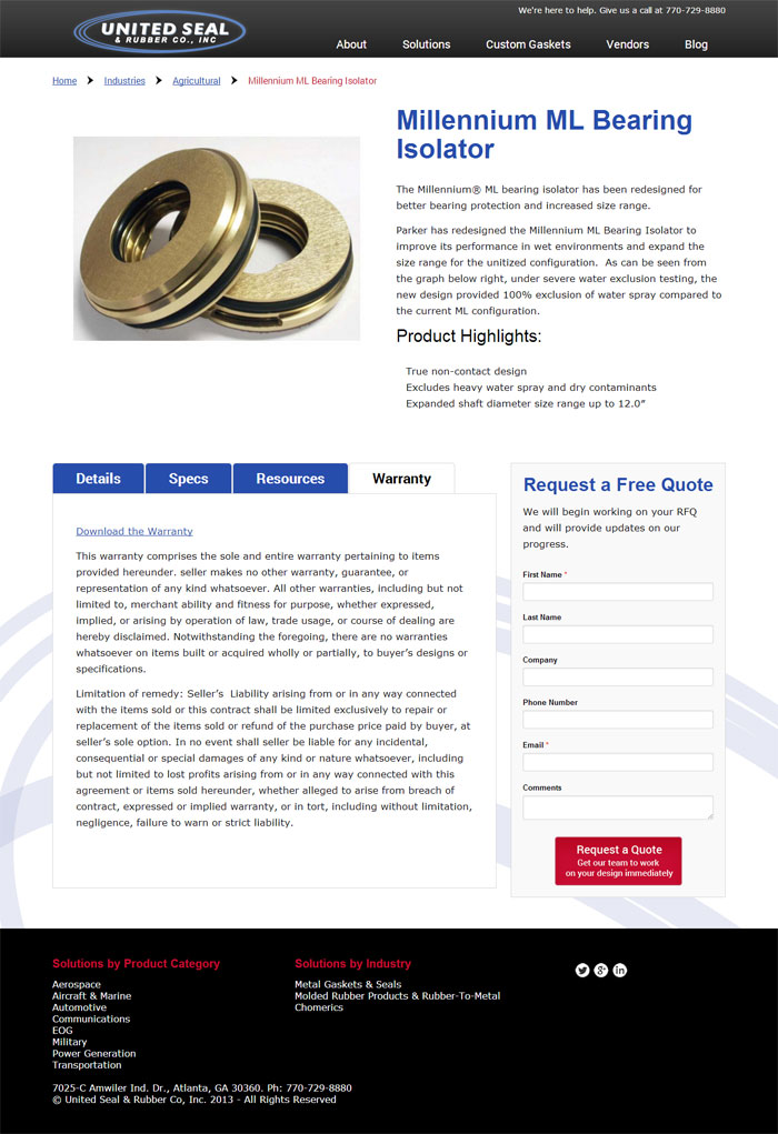
United Seal does it right, in their product pages they have enough information to answer the most commonly asked questions about their products, plus a form to make it easy for buyers to contact them on the spot.
This helpful PDF by Isurus Market Research and Consulting spells out the basic points of successful B2B product messaging. These include:
- Understanding your audience (which ties into the buyer persona above)
- Focusing your message
- Making your message credible
- Using the ROI message with care
- Considering the position of your brand and the maturity of the market
At this point, it would be an absolutely tremendous help to you if you can get the site copy as close to final as possible. That just means less for you to change as the process continues.
Here are some instructive references on writing the perfect site copy:
- How to Write Better B2B Copy
- How to Write B2B Copy That Sells
- 3 Simple Steps to Writing Better B2B Web Copy
STEP 3. Use a Sharpie for Wireframe Blocks
Once you have the messaging figured out, it’s time to start thinking about the layout, so now the task is to find the proper place for everything and start thinking about visual hierarchy. For this, a big fat sharpie is ideal.
For some web designers, a Sharpie is what they swear by when it comes time to sketching out their wireframes.
A fine example of such a philosophy can be found in Basecamp’s co-founder, Jason Fried’s blog. According to him, he enjoys sketching out his user interfaces with a big, fat Sharpie marker pen. While some designers may prefer to use a sharpened pencil or even a ballpoint pen, that’s not for Jason.
To hear him tell it, a Sharpie (the thicker, the better) allows him to really fill the page. A Sharpie helps you to resist the urge to draw and instead get your concepts onto the page in bold lines and shapes.
This type of pen lets you focus a lot less on drawing and a lot more on getting the concept down onto the paper.
As a result, you simply get to sketch more effective website wireframe blocks.
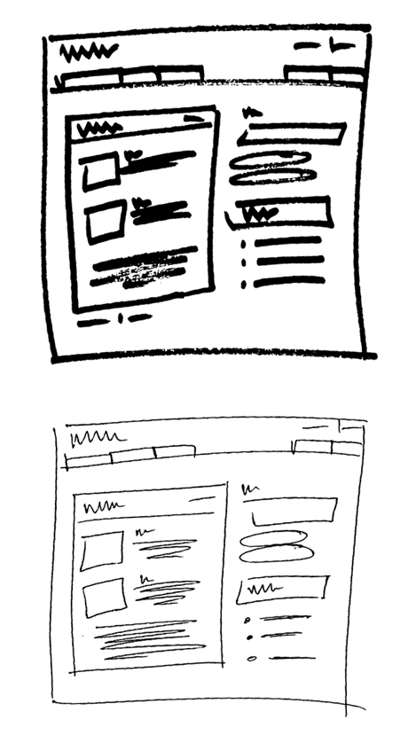
So if you’re already at the point where you’re sketching out your website wireframe, do yourself and your productivity a favor by using a Sharpie.
STEP 4. Detail the Wireframe
Once you have the messaging down and your basic sharpie-made-layout idea, you’ll need to translate it into your site layout. Go from top to bottom and then left to right.
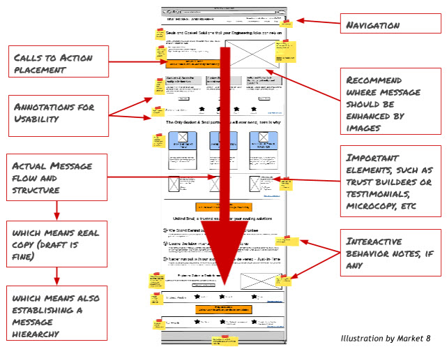
As you are creating your website wireframe in real size, you will need define the following elements in your wireframe:
- Usability conventions, such as placing the navigation on top next to your logo, and add a tagline, placing the search box (if you’ll have one) on the top right, etc.
- Layout and spacing -
- Information hierarchy: what’s more important than what? Which messages need to be emphasized with font size.
- Making annotations for interactivity
- Where would you place your calls to action? How big should they be?
- What type of images/interactivity might help convey the message
- Where would you place trust building elements?
If your main buyer is, for instance, a company that wants you to redesign its B2B website to boost conversions, then you may want to include a case study on how responsive design drives sales, a featured testimonial from your biggest client who got a boatload of increased conversions, and a call to action button that prompts buyers to get pricing information for a redesign.
In particular, these issues should be addressed in the wireframe:
Clarity
A good wireframe establishes clarity right off the bat.
Right at the top you need to have your value proposition answering basic questions for the visitor: what is this? what can I do here? Is this for me?
A wireframe helps you to visualize if the layout and the messaging make these basic questions clear without being distracted with design look & feel decisions.
Focus and Distraction
Distraction or noise is detrimental to the user experience and will reduce your all-important conversions.
It can take the form and shape of too many links or too much copy. Keeping your user focused on the task of the page (read: conversion) is the main goal.
You can already spot these kinds of issues without having to incur in expensive design iterations.
User Confidence
Can the user feel confident that yours is a trustworthy business?
Can the user feel good about using your site and navigating through it with no problems? This can already be spotted at the wireframing stage because user confidence consists of (besides clarity), control, navigation, humility (yes, humility).
If behavior is not predictable, it will also raise yellow flags. Your buyer will only feel confident about taking an action if he knows pretty well what is going to happen next (and a lot of it is copy and hierarchy). You can easily spot this in your wireframes.
Later in the design stage you can reinforce user confidence with the quality of your design and the consistency of it. If it looks cheap and ugly, or if you are using pretty-people-laughing-alone type stock photos, it immediately sends a warning signal to your buyer.
Social Proof
Social proof is defined as assuming the behavior of others in an attempt to copy “correct” behavior for a given situation.
So basically everyone would hate to be the first one to buy your product or service. Having testimonials and business cases, in the case of B2B, will serve as social proof.
Friction-reducing Elements
The more friction-reducing elements you have on a page, the greater the number of conversions will be since friction interferes with the user experience.
Some friction-reducing elements include shorter sentences, sentence and paragraph structures that can be scanned easily and that consider how people read on the web (F-shaped eye-path, reading pattern and bullets). Therefore, it pays to use concise copy, copy organized in a left-to-right, top-to-bottom pattern, and bulleted lists layouts in your wireframe.
Microcopy
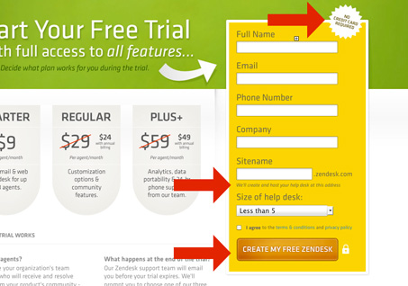
Don’t forget to make a plan to include the very integral microcopy in your wireframe. Microcopy is the tiny bit of text that can assist in putting to rest the concerns of your users.
For example, microcopy is the text on a form that explains to your users what specific information certain fields are asking about. Or that little copy that reassures the user that moving to the next step is a good idea (easing concerns of the buyer persona).
Conclusion
So now you know exactly what a proper website wireframe is and what it’s not.
You also know how to build a wireframe and how not to. The big takeaway here is that you shouldn’t confuse a wireframe with the design of your B2B site.
A wireframe is all about presenting a visual guide for the framework of your site and how it will work, not how attractive to the eye it is.
Website wireframes are 90% thinking/planning and just 10% drawing
A wireframe starts out with deciding to whom you’re selling your product or service. From this, you can build your buyer persona, which is going to help dictate the actual messaging on your site. Messaging involves both what information to lay out where and how it is going to flow.
Then, you better take out the old Sharpie because you want to go straight into sketching the concept of your wireframe without getting hung up on just drawing.
Finally, you have to lay out all of your site elements into blocks, and then carefully detailing where everything goes to aid your number one goal: to drive conversions.
Looking at a wireframe in this way is going to be the difference maker when it comes to creating a killer B2B site. Get it right the first time.
What’s your experience with wireframing? What do you think about wireframing in the site-building process?
Have you discovered any ways of approaching wireframes that make the process easier?


