Of all the pages on your B2B site, the one that receives the least amount of praise, ironically so, is probably the About Us page. That’s too bad since this is always the first page that your buyers go to when they want to know more about your company. It’s essentially the page that provides vital information to anyone who’s not yet completely persuaded to do business with you.
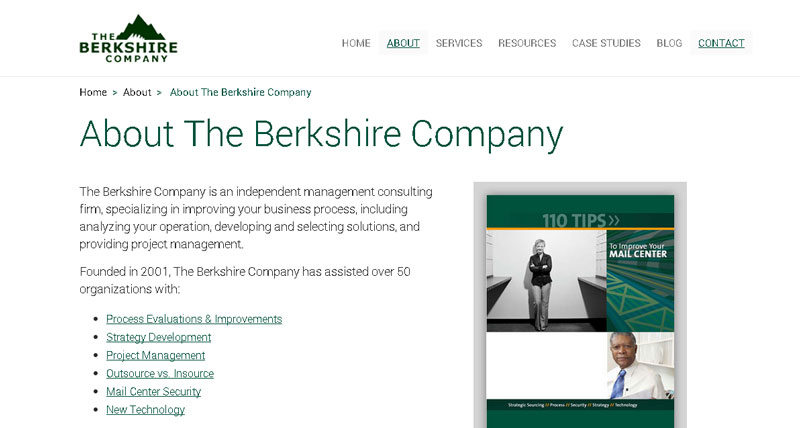
The purpose of a B2B’s About Us page should be to build trust in your buyers. It’s the place on your website that they can go to when they have questions about:
- Who you are
- What exactly you do
- The health of your company
- Your business philosophy
- What successes you’ve had in your past
- If there are jobs available at your company
- What your community involvement is like
PROTIP
Since your buyer is always going to want to know more about you, it pays to have a very strong About Us section in place.
That’s what we’re going to look at in today’s tutorial on About Us page best practices.
Element #1: Company Information
The most immediate information that your buyers will be looking for is your company information. That’s why it’s imperative that you display an overview of your B2B on your About Us page. Studies from the Nielsen Norman Group show that buyers or users expect to find company information immediately after they click on the “About Us” link.
Studies from the Nielsen Norman Group show that buyers or users expect to find company information immediately after they click on the “About Us” link.
A good example of following this best practice can be found on Alcoa’s About Us page. Alcoa is the world’s leader in lightweight metals technology. As you can see, the page shows an easily digestible snapshot of the company’s key details, presented in very readable bullet points.
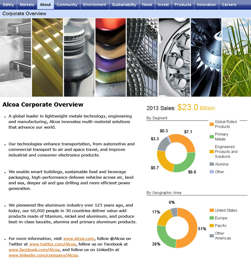
A quick note, though: While the “corporate overview” page is very useful, it’s only accessible by users by choosing “corporate overview” from the second layer of navigation that drops down after clicking the “About” link in the navigation menu.
PROTIP
A best practice would be to eliminate the dropdown menu and bring the user directly to the overview page after he clicks on the “About Us” link.
Element #2: History & Timelines
Your buyers will also be curious about your B2B’s history and any significant moments since its inception. That’s why featuring a history section on your About Us page is a great way to continue to build trust with your buyers. Plus, it also gives you a chance to show off some of the major milestones in your B2B’s existence.
The historical information ought to be formatted in such a way to highlight significant dates and events in a scannable manner. As such, vertical arrangement of events in timelines is preferable to normal paragraph style.
One company’s “History & Timelines” section that did well in a recent Nielsen Norman Group report was Pier 1 Import’s.
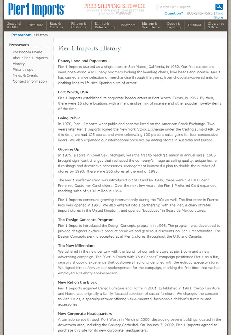
As you can see, the arrangement of the important elements in the history of this company is presented in a vertical style with short paragraphs for efficient readability. As a result, users can appreciate that this company first began in 1962 with just one store, from which it has since grown and expanded considerably.
Element #3: Your Business Philosophy
What your B2B requires for a business philosophy is a mission statement on your About Us page. The important thing to remember is consistency: The tone of your mission statement ought to be in keeping with what’s appropriate for your target audience.
The statement must also be short, memorable and sincere. For instance, if you’re a B2B that sells to tech companies, your mission statement should be intelligent and conversational—not nonsensical gibberish that even engineers can’t understand.
The important thing to remember is consistency: The tone of your mission statement ought to be in keeping with what’s appropriate for your target audience.
It’s just as important to showcase pages that display the core values, ethics and code of conduct that you expect from your employees. Again, this all goes toward motivating your buyers to do business with your B2B, which you want to present as an upstanding corporate entity.
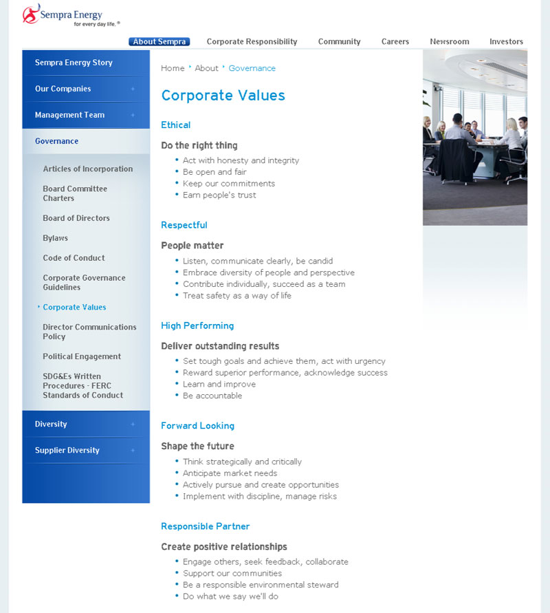
Sempra Energy—a U.S., natural gas-utilities holding company—has a very effective page that showcases its company’s corporate values. Again, the page was mindfully designed with an emphasis on readability (the bullet points) and trust building (references to openness and honesty).
Element #4: Executive Members (Who’s Your Team Made up of?)
Curious buyers contemplating doing business with your B2B are interested in knowing exactly who’s behind the company. They want to know the answers to burning questions such as who’s running the company, who’s part of the team, and who are these people?
By putting pictures to the names of your executive team, you’re able to more persuasively gain the trust of your buyers because research shows that human beings enjoy looking at pictures of faces…it helps them feel like they’re in familiar territory.
By putting pictures to the names of your executive team, you’re able to more persuasively gain the trust of your buyers.
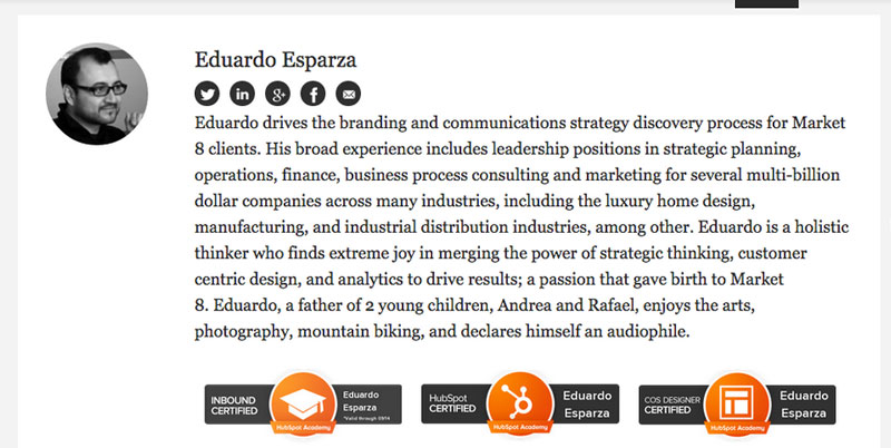
Our About Us team page is a good study in the use of pictures to tell our buyers more about our executive members.
The biography of Eduardo, Market 8’s Chief Web Architect, features a recent picture, his name and a brief though thorough bio. By reading the bio and glancing at the picture of Eduardo, buyers can determine that he’s a holistic thinker with a wealth of experience across many industries, which aids in his leadership role at Market 8.
Element #5: Social Responsibility
These days, your buyers are also going to be curious to know if your B2B has any community involvement. If your company is involved in any charitable or philanthropic efforts, then this is the section on the About Us page to feature it. When telling your buyers about these efforts, then be sure not to overwhelm them.
PROTIP
You want to tell them of your B2B’s social responsibility, but don’t give them too many details (showing off) that will backfire with them feeling exhausted.

Always use a sincere tone when describing your community involvement because your buyers can suspect self-serving interest if it’s too obvious.
PROTIP
Platitudes, clichés and catchphrases like corporate citizenship and sustainability must be excluded because many users don’t understand that, according to Nielsen Norman Group research.
Finally, even if your company’s been caught up in a scandal in the past, don’t shy away from it. This section is the perfect place on your B2B website to address it.
Element #6: Awards & Recognitions
Awards and recognitions are significant, trust-building elements on your About Us page. Therefore, you should reserve a part of your About Us page specifically for the showcasing of customer-related awards and recognitions.
It’s recommended that you craft headings and summaries that succinctly explain the significance of any honors received, as well as the actual details that briefly inform buyers about the distinctions.
PROTIP
If you have endorsements to feature, be sure to provide details about the endorsements; in the case of customer success stories and feedback, cite your exact sources to continue to build trust in your buyers.
As usual, the customer success stories and feedback must be very relevant to your B2B’s target audience.
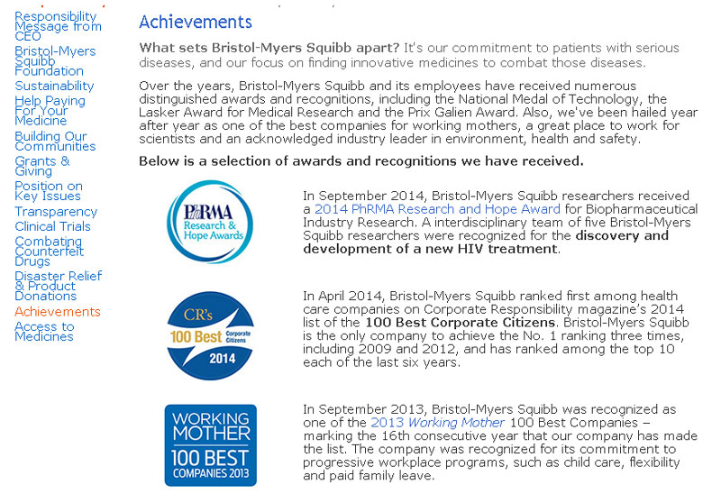
Here’s the Bristol-Myers Squibb page featuring its awards and recognitions to inspire you to create something similar on your B2B website, if you’ve racked up various distinctions. This is a highly effective page because it features all of the company’s achievements in an easy-to read, scan-friendly format.
The use of selective bolding, in particular, helps to guide the user’s line of sight to pick up the most important pieces of information about its awards and recognition.
Element #7: Contact
Some B2Bs may not believe that having contact information prominently displayed on their About Us page is important, but they’re sorely mistaken. According to more research from the Nielsen Norman Group, having contact information generously distributed across your whole B2B website isn’t just desirable, but also necessary.
Again, the function of an About Us page is the steady building of trust in your buyers; hence, having a phone number to reach a live person for further assistance is paramount in trust-building. That’s why it ought to be featured on your About Us page, too.
If you don’t provide a phone number on your About Us page, at least provide a link that will bring your buyers to it. If you have a “contact us” link, it must bring your buyers to a page with your complete contact information. If you want to offer a contact form on your site, keep it short and sweet, and don’t let it replace your actual contact information like phone numbers.
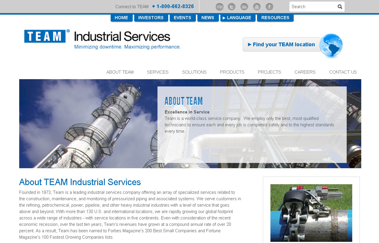
A great example of this is the About Us section of Team Industrial Services. Note how easy it is to see the company’s phone number, as it’s sitting right on top of the page, smack dab in the middle for easy viewing.
The use of the sticky navigation to ensure that the number always stays within easy viewing even when scrolling down is also a brilliant touch.
Element #8: Customer Service
Your buyers are more concerned about their privacy than ever these days, especially with how easy it is to hack and collect information online. That’s why it’s vital that your About Us page show some form of guarantee of protection to guard the privacy of your buyers.
For example, it’s a good idea to feature your B2B’s privacy policy anywhere on your site where your buyers are required to enter their personal information. These days, that’s a standard best practice for any B2B or anyone selling anything on the Internet.
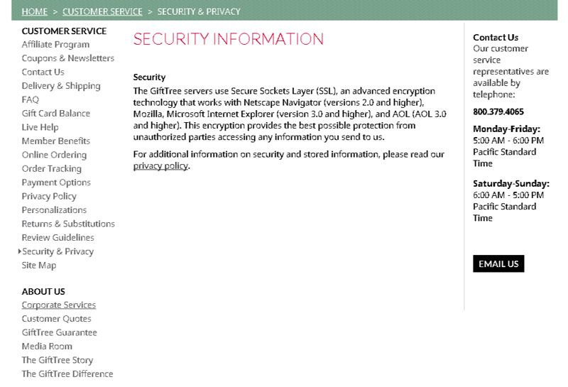
Gift Tree.com is a splendid example of a company making it easy as pie for their buyers to find its privacy and security page, right above its About Us section. Not only does this efficiently help with peace of mind for their buyers, but it also makes clear right off the bat that the site’s encryption layer technology, Secure Sockets Layer, offers the best protection for the personal information that buyers on the site send to Gift Tree.com.
Element #9: Graphics & Multimedia
Graphics and multimedia are a material part of any well-functioning About Us page because it’s not only what content you feature on your About Us page…it’s also how you show it to your buyers. That’s where the intelligent use of graphics and multimedia comes into play.
Ideally, you should do the following for your About Us page:
- Select images that reinforce your B2B’s image and communicate information about your products or services
- Don’t use stock photography
- Don’t let your graphics obstruct the written content
- Use the very handy explainer videos to describe products or services that may be complicated
- Sprinkle your blog with videos if you feel they can enhance the comprehension of your buyers
- Make sure that your videos are never longer than a couple of minutes
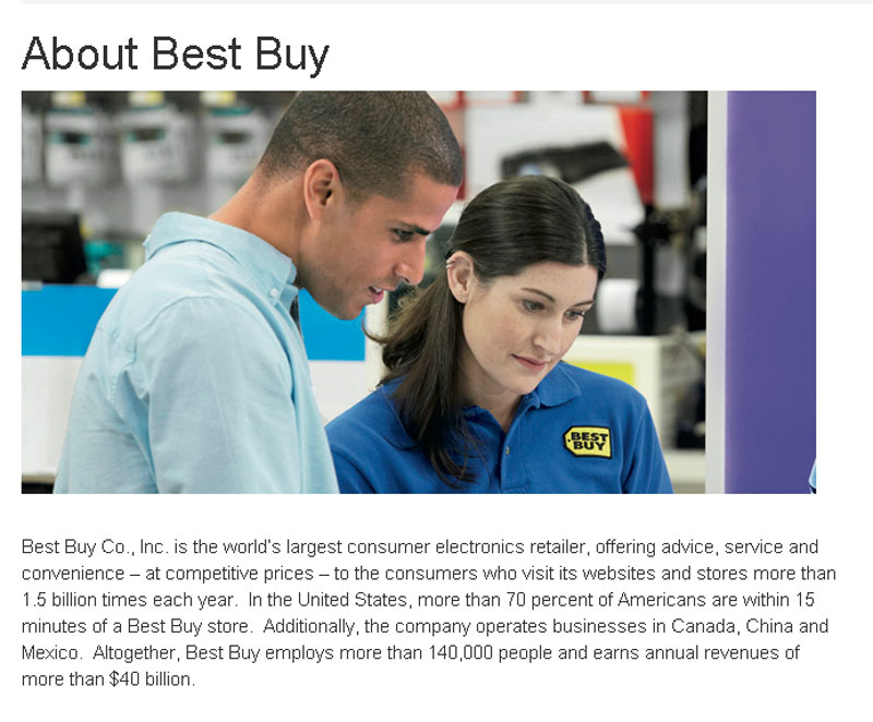
A great example of using graphics well belongs to none other than Best Buy. On its About Us page, the company wisely opted to use a picture of a real Best Buy employee in the header, as opposed to using stock photos to represent Best Buy “employees.” Naturally, this comes across as more legitimate and sincere, which is also better received by buyers in general.
Element #10: Usability Fundamentals for Your About Us Page
Usability is always an aspect of your B2B website that you can’t neglect because it enhances the user experience, which in turn leads to more conversions. Even your About Us page demands best practices for usability that you should implement.
For starters, the navigational structure should remain clear and consistent on your About Us page as it is on every other page of your B2B website. Your graphics should be consistent, too, even on your About Us page.
When it comes to links, be sure to help your buyers understand what they’ve visited and what they haven’t. The links to visited areas should have a different color than links to non-visited areas. The link names should be clearly named as well; be sure to avoid link names that are vague or cause confusion.
When it comes to typography, font styles and sizes that enhance readability and legibility should be the only ones in use on your About Us page. The color scheme between the text and background should display a meaningful contrast to, again, help with reading.
Finally, use conversational and accessible language to promote more efficient communication instead of using fancier terms your buyers may not understand.
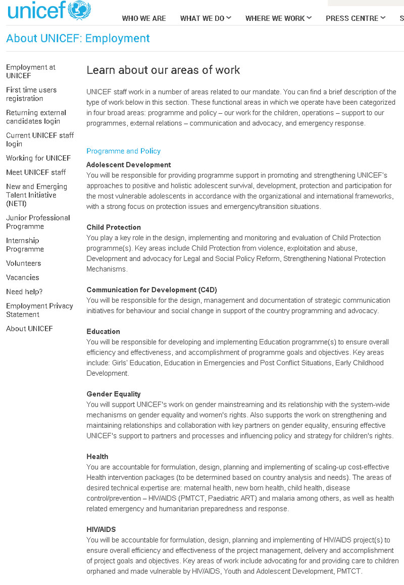
UNICEF’S About UNICEF: Employment page demonstrates great usability for a page of this type. Note how every program area is separated into short, easy-to-scan paragraphs with a bold heading to draw the eye.
Conclusion
Your About Us page is, strategically, one of the more important areas of your entire B2B website, so don’t take it for granted. Remember that your buyers will always want to know more about you, so it’s in your company’s best interest to build trust with them by making information about you freely available.
Building trust with your buyers is essential to landing more sales.
Your About Us page is, strategically, one of the more important areas of your entire B2B website, so don’t take it for granted.
Make sure that you design an About Us page that incorporates all of the best practices we just talked about. Above all else, your About Us page should give your buyers immediate and thorough information about your B2B, right when they land on the main About Us page.
By giving them this integral information right from the start, you succeed at laying down the foundations of trust, which will lead them to explore other parts of your company on the way to making a full conversion.
While the About Us page may sometimes be overlooked, don’t be among those who make that mistake. Remember: It can be the unsung hero of your B2B website because it helps build trust in your brand.
What changes to your About Us page can you think of implementing right now?
Have you been using trust-building elements well on your B2B website?
Is the usability on your About Us page as good as it is elsewhere on your B2B website?


