
People read way differently on the web than they do with print, and that’s a fact. In order to produce highly successful web copy, you have to change your writing style to suite how people read online. This vital reality is the guiding principle of all persuasive copy.

People have short attention spans when it comes to absorbing websites, pages and content. It follows then that your web copy should fit into the average user’s reading behavior.
If you abide by this simple rule, then you’ll eventually get more site visitors, greater conversions and more engaged users. If you don’t abide by this rule, then you’ll end up with a B2B site that barely anyone pays attention to.
If that sounds a bit harsh, don’t fret.
Knowing exactly how to write copy to increase readers and conversions is your best defense against a B2B site that no one follows.
Here are some stellar recommendations on precisely how to write for the web, so that you can write content for exactly how people read on the web.
It Starts With the F-Shaped Pattern
Anyone who’s done even a bit of research on how people read on the web will have at least heard of the notorious F-shaped pattern, at least in passing. Based on solid research, the F-shaped pattern is the most definitive study out there on exactly how people read on the web. As the name implies, people read web copy in an F-shaped pattern.
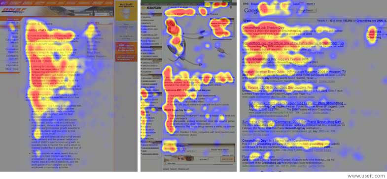
A user’s main type of reading behavior involves the movement of the eyes on a screen in three unique though related components:
- Reading in a horizontal movement typically across the upper portion of the web copy (this is the top bar of the F)
- Moving down the page somewhat and then resuming reading in a second horizontal movement that stretches across a shorter area than the first movement (this forms the lower bar of the F)
- Scanning the left side of a page’s web copy in a vertical movement (this forms the lower stem of the F)
Knowing that this is the most common type of reading behavior on the Internet, it’s imperative that you hire a B2B web designer who can lay out your site in a way to facilitate super-easy reading.
Many Won’t Even Read All That You Write
A sad but true fact about Internet reading is that many people simply don’t bother reading everything on any given page—this includes your landing page, for instance.
According to research done by Slate, many readers will never, ever finish reading everything that you paste on a page. If your copy is too long for them to finish, too bulky, or not properly formatted for skimming and scanning, they might miss the important message you want to convey.
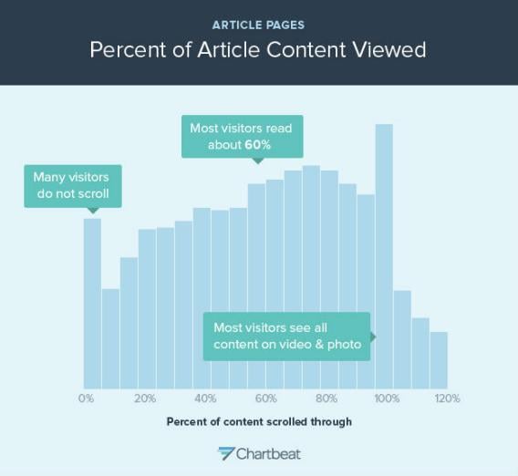
The typical online reader actually fully absorbs just 60% of the average online article. This obviously makes a really good case for writing web copy that’s short, succinct and to the point—or at least breaking longer-form content into easy-to-scan and digestible paragraphs of only a few lines in length.
The Fold is a Myth, Don’t Get Scared of Putting Content Below It
Some folks still think that putting copy and other content below the fold is a sure conversion killer because hardly anyone will read it or click through on it. They couldn’t be more incorrect. This so-called “conventional wisdom” is still prevalent, unfortunately, in some corners because of a lack of information, but we’re doing our part to help change that.
A good deal of both research and analysis has been invested as of late into the question of above or below the fold.
The conclusion being drawn from this investigation is that the placement of call to action buttons above the fold is a lie that’s not substantiated by the evidence.
Some landing pages actually perform better with a call to action button below the fold; others perform just as good as landing pages with the call to action button in the first 600 vertical pixels.
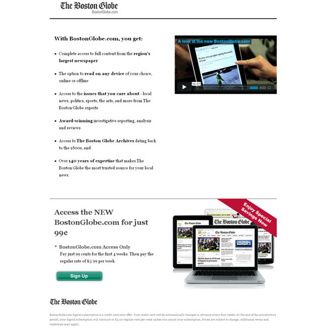
In reality, what’s happening here has nothing to do with the fold. What’s going on is all about the copy on the page.
If your copy presents your buyers with a great value proposition that motivates them to continue reading the copy even below the fold, then they will click on the call to action button—even if it’s way below the fold.
Simply put, your readers will scroll through their page if something compels them to. The mission of all the copy you have above the fold is to get them interested enough to continue. That’s why it’s advisable to captivate your audience with a compelling value proposition. Create one, and your readers will go below the fold without any issues at all.
If you’re interested in reading more about the studies behind long homepage design and how to create pages that your audience will scroll through, you can check out our conversion analysis and the design considerations.
Scanning Pages Is Infinitely More Preferable to Reading Them
Even if you’ve spent a lot of time and effort composing copy, your online readers will invariable prefer to just scan what you have written.
Even the people who read online articles (60% of them, as we stated above) are given to scanning a page instead of fully and thoroughly reading the copy word for word.
This means that people reading on the Internet are not the most engrossed bunch.
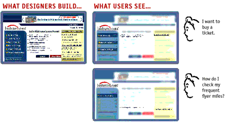
In fact, this lack of commitment to reading copy fully can be explained in one of three ways:
- Readers are simply in a hurry because users on the Internet are motivated by trying to save time
- Readers understand perfectly well that they don’t really have to read everything because, usually, they’re just searching for what’s personally relevant to them or what can help them achieve the task they’re pursuing
- Readers are already so well-trained in scanning pages from years and years of scanning print (newspapers, magazines, textbooks, novels, etc.) that they’re used to it and good at it
When you’re writing web copy, never approach it with the mentality of thinking that you’re going to be writing the next Pulitzer Prize-winning piece.
How to Write for People Reading on the Web
Now that we’ve explained to you in detail how your audience actually reads on the web, we’re going to give you one killer recommendation after another on how to specifically write for them. After all, your time is precious, and so is theirs.
Make Your Text Very Scannable
One of the most fundamental recommendations that Jakob Nielsen has championed over the decades is to make your site copy extremely scannable. So what does text that’s easy to scan look like? It has to include the following features as much as possible:
- Highlighted keywords that rely on a combination of hypertext links, different colors and variations in typeface
- Subheadings or subtitles that are relevant to users instead of attempts at being clever
- Bulleted lists for easy retention of information
- Only one main idea or topic per paragraph to limit the number of readers skipping the section
- Use of the inverted pyramid, where copy begins with the conclusion instead of the introduction
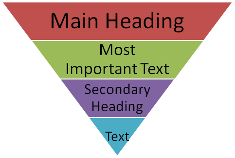
- Reduction in the word count from what would normally occur in conventional writing
Place the Most Important Stuff in the Top Left Corner
This recommendation ties into the research finding that people on the Internet mainly read pages in an F-shaped pattern. When people start reading in this pattern, they begin in the top, left corner of a page since the top bar of the F begins in that area.
Put important information in your copy in this portion of the page, and chances are greater than ever that they won’t ignore or miss it.
The F-shaped pattern is further bolstered by something called the Gutenberg diagram, which simply splits up a webpage into four quadrants.
The one at the top left is the primary optical area, and the top right quadrant will be the second-most looked-at area because readers’ eyes generally go there next.
Finally, readers will view the bottom left quadrant next (the weak visual area) and end their gaze movement in the bottom right of the screen, which is obviously the terminal area.
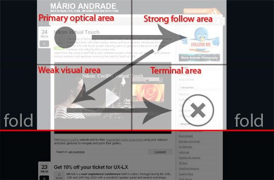
On a point of interest, it’s therefore advisable to put the call to action button in this terminal area. This is not a hard and fast rule, but, rather, just something that’s a logical follow through from where the average reader’s eye movement will end.
Chunk Your Web Copy and Keep Paragraphs Short
In keeping with the reality that readers on the Internet are basically addicted to scanning through copy instead of thoroughly reading it, it’s highly recommended that you write in short paragraphs when you write for the web.
Writing copy that is easily digestible and manageable involves simple sentences, short paragraphs, and an 8th grade vocabulary. When you make information easier to absorb by shortening the paragraph length, you naturally encourage readers to read more because it won’t seem nearly as overwhelming to them upon first glance.
Chunking your information into shorter paragraphs has psychological benefits for readers. Instead of interpreting a page on your B2B site as overwhelming them if the formatting of the text runs from the top to the bottom of the screen, readers will find the task easier to do. The task of reading seems less like a chore with shorter paragraphs, but more of an enjoyment that can provide them with relevant information quite efficiently.
Write Attention-Grabbing, Super-Clear Headlines
You may have heard it said that people really only read headlines until something grabs their attention, and that’s true. Successfully writing for how people read on the web involves a laser-beam focus on how you’re formatting all of your copy. The place to start, of course, is with your headlines since that’s where people’s attention is first drawn.
But how do you craft headlines that command the attention of your buyers, readers and site visitors?
For starters, your headlines ought to be relevant and full of information for your readers; that way, they’ll find that combination very interesting and more cooperatively continue reading down the copy.
Here are some tips for creating attention-grabbing headlines for your webpages:
- Provoke an emotional response
- Appeal to certain readers only (target audience)
- Draw readers to your body copy
- Get right to the so-called “big idea”
- Establish trustworthiness
Focus on your formatting and prevent yourself from pasting huge walls of text on your pages. Huge block of text will repel your site visitors, and they won’t even bother with reading or scanning through your site copy.
Conclusion
People’s reading habits on the web are very different than their reading habits when they have a book, magazine or newspaper in their hands. This means that you have to tailor your B2B site’s whole written content—landing page copy, blog posts, etc.—to the unique and sometimes unexpected behavior of online readers.
Failure to do so means a low-converting B2B site, which is what you want to avoid at all costs.
Writing web copy doesn’t mean that you have to be the best and most literate wordsmith around.
On the contrary: It means knowing exactly who your audience is on the Internet and what they expect. Thus, you have to present them with nothing but highly relevant, chunked content that’s properly placed on a page, with regard to eye-tracking studies’ findings. Do this, and more readers will pay attention to your content.
Do you now see how reading on the web is very different than reading something in print?
Have you been making some of these mistakes with the copy of your B2B site?
How do you think you can implement some of these recommendations to create a wonderful reading experience for your site visitors?


