Although the user experience is integral to web design, there’s still a misunderstanding among business users and marketers to this day about what it really means. In short, great user experience design is not about simply creating a beautiful website and leaving it at that. In our own Market 8 process, the actual design part of site creation is only step number seven.
Before design comes into the picture, we have six preceding steps that already support the user experience:
- Asking the end customer
- Asking the client
- Creating buyer personas
- Creating the buyer’s analysis and overall inbound marketing strategy
- Creating the website strategy
- Creating and testing wireframes for all vital pages in the user flows
If you’re putting design ahead of everything else, you’re doing it wrong.
ConversionXL’s Peep Laja elaborates on this principle a bit more when he says that:
A beautiful website might make a great first impression, but if it has terrible usability, users can’t figure out what to do, forms on the site don’t quite work, the error messages are not helpful and the copy on the website is vague, the overall experience will be quite bad.”
What is the user experience, then? The Nielsen/Norman Group defines it as:
User experience encompasses all aspects of the end-user's interaction with the company, its services, and its products.”
The term “user experience” was in fact coined by Don Norman, a cognitive science researcher who was also the first to describe the importance of user-centered design (the notion that design decisions should be based on the needs and wants of users).
Metaphors on Design and the User Experience
Let’s look at a couple of examples to illustrate the concept of User Experience.
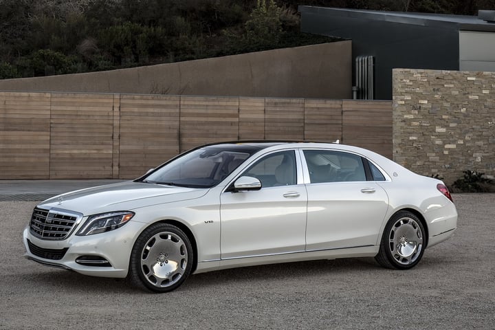
Metaphor #1: Which car do you think will give users a better experience?
Car A:
or,
Car B:
Thinking A?
Here is a piece of contextual info...
..on this road:
Which car do you think will provide the user a better experience now?
Methaphor #2: The keyless car entry app
Golden Krishna, author of “The best Interface Is No Interface,” coined down this metaphor during the Web Summit 2015: Think about an app that promises they can open your car doors for you without you having to use your keys. This may sound like a tempting and hot premise, but in practical terms, this is the experience of a female user of this app:
- Approach the car
- Fish out the smartphone out of her handbag
- Pull it out
- Turn it on, swipe
- Get out of the latest app being used
- Then, swipe across pages of apps to find the proper app group
- Open the app group, and open up the app
- Scroll on the screen, click on the button “open my car”
- Enter the 17 digit car key
- Click again
- Car opens
There are, however only 2 steps that matter for the user:
- Approach the car <------STEP THAT MATTERS
- Fish out the smartphone out of her handbag
- Pull it out
- Turn it on, swipe
- Get out of the latest app being used
- Then, swipe across pages of apps to find the proper app group
- Open the app group, and open up the app
- Scroll on the screen, click on the button “open my car”
- Enter the 17 digit car key
- Click again
- Car opens <------STEP THAT MATTERS
So, the user would have had a better experience if the process looked like this:
- Approach the car
- Car opens
Right?
In this ideal user experience, did it matter at all the design of the interface of this app? It probably did once, during the setup.
Naturally, this analogy does not translate 100% to the experience the B2B users can have on your site, however it is an aim; this is exactly how you should look at user experience design on your website.

Golden Krishna, Image credit
The point then is:
User experience is what your users feel when interacting with your ______. (Fill the blank with whatever you feel like: website, company, product, service, sales people, customer service team...)”
On a website context (this deserves yet another callout text):
If it doesn’t actually improve the user experience—by making it super-easy and super-fast for site visitors to find exactly what they’re looking for on your site—then all the cool designs and bells and whistles are useless and do more harm than good.”
How the C-Level Needs to Think About Website User Experience
One of the biggest traps business owners and marketers fall into is associating a cool website look with great UX, but this is pure nonsense.
The right way to think about it:
Once, I was talking with a CEO of an important software firm (who really gets it), about possibly engaging Market 8 to improve their website’s user experience and conversions. Here’s how the conversation went:
Customer: “So what would be your focus on your project with us?”
Me: “Well, we will partner with you to grow your business using your site. Look at what your customers are looking for, give them exactly that, and, engage them, so we can grow your funnel. We’ll make sure that your website is a great salesperson, and also a tool for your salespeople.
Customer: “Well I think our website already meets those objectives; Our website provides the leads that our salespeople work on, and this is the base of our firm’s growth... I’m just not sure that we are as relevant as we can for all of the distinct users: customers vs. late stage buyers vs. early stage buyers. Also, issues that our software solve differ by industry... I think we can provide a better user experience to each one of those types of users. We can be smarter about it”
Bingo.
This, is exactly how CEO's should look at user experience design for their websites. Just like a living-breathing salesperson (and, yes we are happily collaborating with this client, and continue to pile up great results).
The wrong way to think about it:
On the other hand, some executives are simply unable to understand that their mindset is on the very way of their success and drive website decisions that simply make their website difficult for people to use. Typical reactions I’ve heard all the way from web designers to marketers and executives when their users fail to convert, or fail at completing a given task on their website, include:
- “Our users are stupid”
- “In reality, users won’t have a problem finding this button”
- “Users won’t read all that - let’s cut the copy and improve the design - the design is the most important thing”
- “All our users want is a really cool design”
Users are not stupid. The stupid is the design team for not understanding how users look at the website pages, in what context, and for not making information that matters to the users, more visible.
Great user experience design can boost your conversions and grow your business, but it’s not easy to get right. We’ll explain why.
Is Investing in UX worth it?
Investment in User Experience is usually perceived as intangible but this is not the case. User experience has very tangible benefits; they are just hidden in your website’s lost leads, lost sales, and website redesigns (because the first one didn’t work out).
Let’s do some math:
If your company sells complex solutions, consider this scenario:
|
Status Quo (monthly) |
Scenario 1 |
Notes |
|
|
Web site monthly visitors |
10,000 |
10,000 |
|
|
Qualified Leads from website |
5 |
10 |
After doing some research, you find that buyers are exiting the Demo landing page at an alarming rate and decide to dedicate resources to fixing it. |
|
Closed deals from website |
1 (20% close ratio) |
2 (20% close ratio) |
|
|
Average deal size |
$50,000 |
$50,000 |
|
|
Annual Revenue from website |
$600,000/yr |
$1,200,000/yr |
|
|
Cost of opportunity |
($600,000/yr) |
||
|
Cost of fixing the UX |
($50,000) |
||
|
Net profit vs. status quo |
$550,000 |
In this scenario, given the average conversion rates the value of a qualified lead generated on the website is exactly $10,000 ($50,000 x 20% close ratio), and you have a 90% drop off from that page. Just improving it slightly could double your qualified lead generation, say from 5 to 10... that’s an additional potential revenue of $50,000 every month ($600,000 annually) for your firm. If it costs you $50k to solve the problem, then you will still profit a handsome $550k. Is it worth spending the time and effort?
Dr Weinschenk, with Human Factors International sums it up in a great way in this 2 minute video:
Facets of User Experience
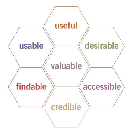
Peter Morville at Semantic Studios came up with the User Experience Honeycomb; a really good diagram to explain different facets of user experience:
Here is how Peter explains each facet:
- Useful: Is the information presented relevant?
- Usable: Is it easy to use?
- Desirable: Does the interfaces uses emotional design through the effective use of text, images and context?
- Findable: Is information easy to find?
- Accessible: Accessibility is a practice that now is still treated as separate, but it’s just good business practice to account for people with disabilities.
- Credible: Can users believe it? Stanford university presents 10 guidelines to improve website credibility; does the website meet them?
- Valuable: Does it bring value to the organization? does it help achieve a business objective?
There are at least 3 ways this honeycomb can help:
- It helps advance the conversation and helps set priorities for a web redesign project: what should the design accomplish? Usability or desirability? how should value to the organization be balanced vs. usefulness for the user?
- It supports a modular approach to web redesign process: perhaps in the first phase you decide to prioritize findability and usability, whereas focus on desirability are consciously pushed to a later phase.
- It provides a framework to evaluate the work being done, and helps you uncover opportunities that would have been difficult to see otherwise.
Conclusion
Successful user experience design is about so much more than just focusing on having an updated design. Yes, beauty in site design is important, but it only constitutes a fraction of the overall experience users have on your website.
User experience design that works incorporates principles like clarity, ease of use, desirable, all based on sound research derived from site and buyers analysis.
For additional details on how solid design optimizes your marketing effectiveness, download our “Website Re-Design for Maximum Marketing Performance” ebook.


