You’ve probably been hearing more about conversion optimization lately, as well as this approach called growth design, or growth driven design. It’s no coincidence. Countless marketers both at agencies and companies have been somewhat frustrated with web design projects: lengthy, costly and not focused on results. Growth Driven Design changes the traditional waterfall-like web-design approach that most people use into an agile process that allows businesses to have higher-converting websites because they are constantly updated to fit buyer behavior.
It can also be thought of as evolutionary site redesign in that it’s constantly tweaked based on measuring user behavior at regular intervals throughout the year.
Hubspot Partner Program Manager Luke Summerfield defines Growth Driven Design as:
…constantly researching, testing and learning about our visitors to inform ongoing website improvements.”
Growth Driven Design goes beyond Conversion Rate Optimization, because it’s not really about the conversion rates. It’s about driving growth. Here’s how Sean Ellis, CEO of Qualaroo and founder of GrowthHackers.com puts it:
Making CRO [Conversion Rate Optimization] a growth driver requires a holistic view of optimization. When you go beyond conversion optimization of marketing campaigns, to full funnel improvement, you move from testing to true growth driving activity.”
I like to call it Customer-Centric web design, because as anything that is centered on the customers, from organizations, to services, to websites, it is a process to look at your target customers continually, and adjust your website accordingly:
Customer-Centric web design is an incremental website-design approach to designing a website.
Instead of your website being designed once and then forgotten for years, customer-centric web design allows you to start quickly and cautiously and base every design decision on buyer observations. It allows you to improve over time to get you more and better leads.
It is less risky and drives better results than traditional web design.”
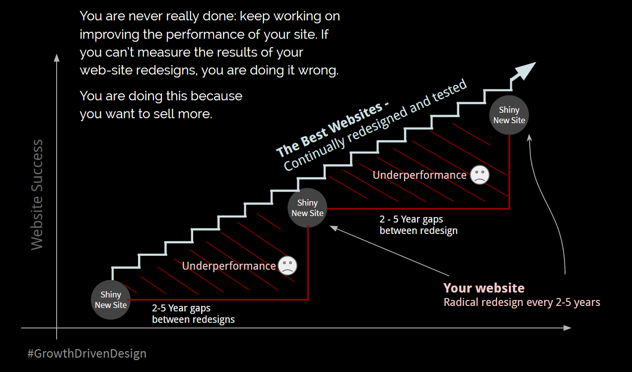
Now, compare this with traditional site redesigns, which take place in one-off redesigns every few years without any site analysis to determine if your buyers are actually responding positively to the content you’ve put up on your site.
Growth Driven Design looks at websites as living creatures that continually have to be updated as your understanding of the buyer and their journey gets better, with research and data to support that learning.
Because of Growth Driven Design, a website redesign doesn’t need to be the anxiety-riddled process that it usually is anymore.”
Here’s why:
The Role of Your Website
First off, think about the role your website should have in your customer acquisition process. Before digging into what Growth Driven Design is, here are some core assumptions:
-
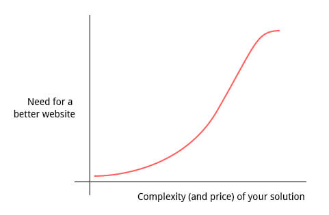
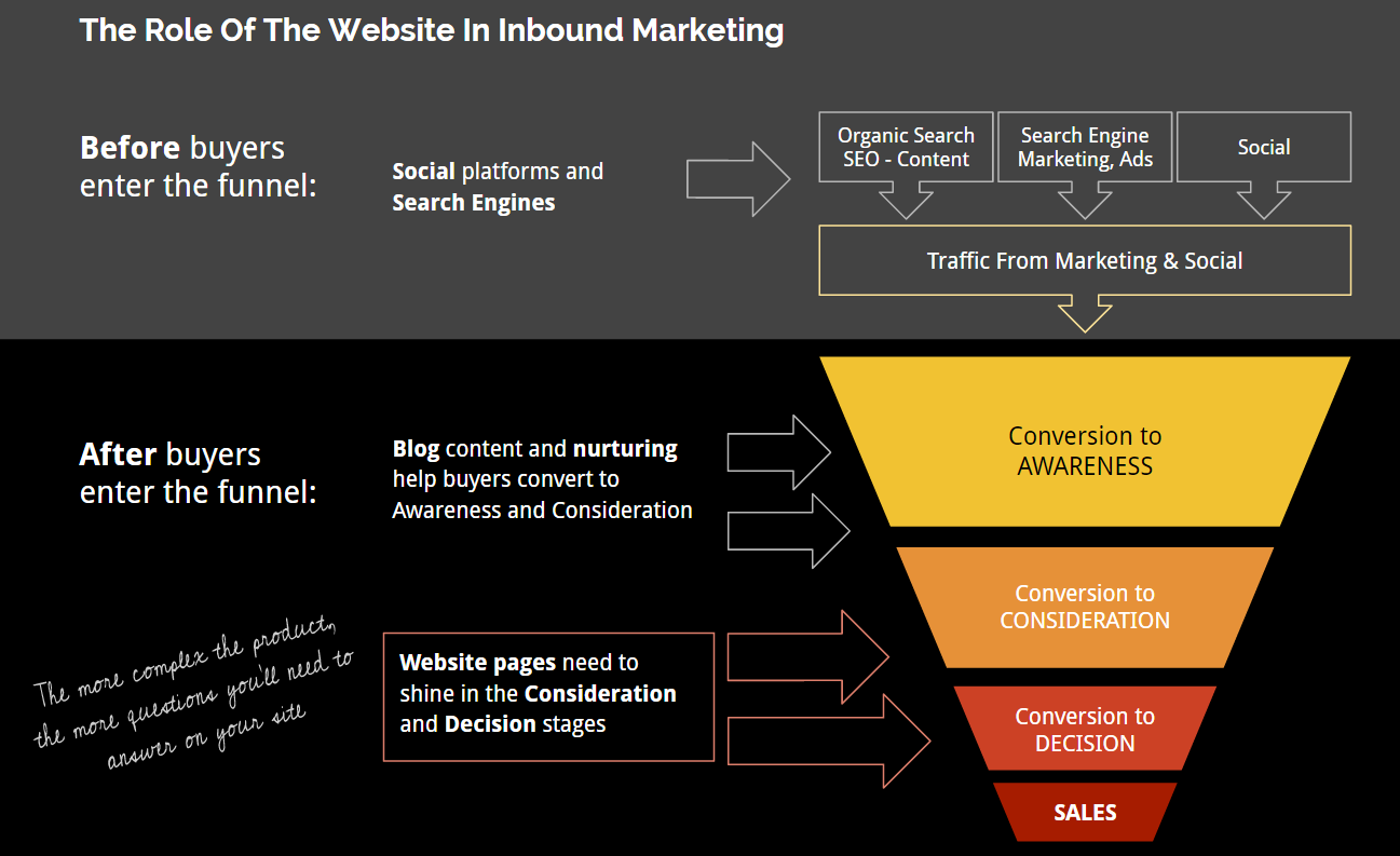
Your website is your biggest marketing asset because most, if not all of your marketing, leads to your buyer visiting your landing page or website. Since it all boils down to the site, a bad website will make you waste marketing dollars. Also, the more complex your product, the more important your website is--not less.

Image credit -
Your website is your best salesperson since your website is THE ONE place where you can be open and explain to your buyer how your product can help him solve his problem in an environment you have some control over. However, it’s still relaxed and low-pressure enough for the buyer. Taking advantage of this requires that the information on your site is complete and easy to find, so that the buyer can learn about your product freely and at his own pace.
-
Your site is a critical resource for your buyer while he’s in the consideration and decision stages of the buying process. During the consideration stage, your buyer will perform large amounts of research--your website’s where he’ll do that. Later during the decision stage, your buyer will seek to justify his decision by looking for case studies featuring other happy clients who have done the same. Case studies also live on your website.
With that in mind, if your website is part of your strategy and you want it to be your best salesperson, then think about this:
Building and coaching a salesperson does not end the day you hire her.
So your ‘best eSalesperson,’ aka website, should not be forgotten after launch date.”
Key Differences Between Growth Driven Design and Traditional Site Redesigns
The biggest differences are the focus on minimizing risk and focusing on results:
|
Traditional Web Design A Radical Redesign every two to five years |
Customer-Centric Web Design An incremental, Growth Driven Design methodology |
|
| Risk
|
Larger upfront costs Lots of time and resources Often late and over budget |
Launch quickly & improve over time Agile: on time and on budget with no overruns |
| Results
|
Static for two to five years--quickly obsolete |
Based on data and research. Continuous improvement |
Growth driven design is an iterative approach where your site is constantly tested and monitored over the months following the initial launch to determine what in the design, content, and messaging, is working and what isn’t, whereas traditional redesign simply abandons the website after the initial launch; traditional redesigns are viewed more as a one-time event that just happens every few years. Therefore, Growth Driven Design minimizes the risk.
The results are inferior with the traditional redesign approach because, if you’re not continually testing to see what your buyers like and interact with on your site, you’re basically adopting hope as a strategy to make your site better. Even the most experienced analysts making data-driven design changes need to be able to test their hypothesis for your particular audience.
Jakob Nielsen, the usability guru, says:
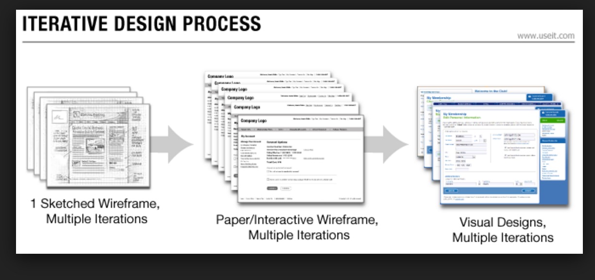
Iterative design is the best way to increase the quality of user experience.”
With iterative design—which is when redesigns happen more frequently, across much shorter time frames, and in sprints or iterations—you also get to shorten the time of launching your new website.
The key here is an adaptive approach to site redesign: Instead of designing a site with content that gets stale and old, Growth Driven Design empowers you to change your site marketing plans in the moment, based on issues and problems captured from real buyers’ feedback. These are discovered through the constant monitoring and testing of your site after it goes live.
See this helpful, visual illustration of the advantage that growth driven offers you compared to traditional site redesign, courtesy of Hubspot.
Instead of designing a site with content that gets stale and old, Growth Driven Design empowers you to change your site marketing plans in the moment, based on issues and problems captured from real users’ feedback.”
Growth Driven Design consists of three phases:

Part 1. Customer-Centric Research and Plan of Action - The first month or two of setting down a decisive data-driven strategy
Part 2. Minimum Viable Website Redesign (or no redesign at all!) - If your particular situation allows it, launch a website quickly and fix the most glaring errors only.
Part 3. Kaizen Sprints: Continuous Improvements - Spend months after the launch monitoring, testing and tweaking to maximize conversions, ensure the site content isn’t stale, and ensure that the UX aligns with what your buyers want and expect.
Part 1. Customer-Centric Research and Plan of Action
The goal of Part 1 is to make a thorough assessment of your site, your buyers, and your business to create an actionable plan with a specific list of things that need to be done to your site, so it converts better and becomes an asset for your organization.
Part 1 starts with asking lots of questions, and it ends with having specific recommendations for new, key page wireframes, including persuasive copy and, if needed, new site architecture.”
During this planning process, which takes a month or two depending on your site’s traffic and complexity, you have to first come up with a strategy to figure out what your goals are, who your buyers or target audience is (coming up with buyer personas), and how you can move them down your conversion funnel.
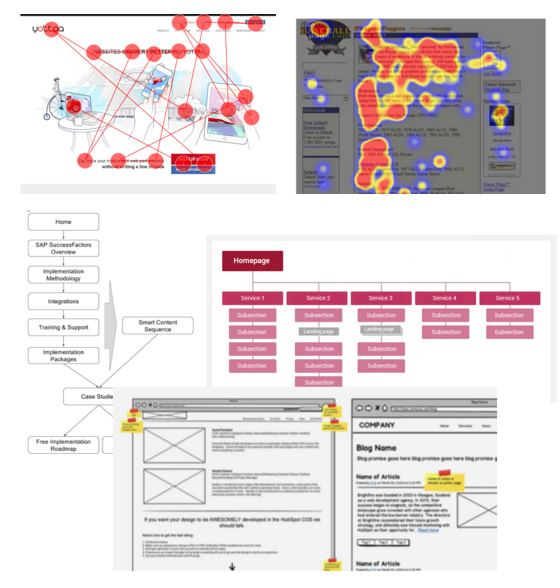
The analysis that goes into this is quite thorough, but here are some highlights:
Buyers’ Analysis
Before proposing anything, you need to do a deep dive into your buyers. Why they are, what they want, and how they speak. Here’s a full article on creating useful buyer personas. It’s important to get this part right. Otherwise, simply put, your buyer personas will be useless, as a recent study by UCSC shows.
Website Analytics & Page Analytics Review
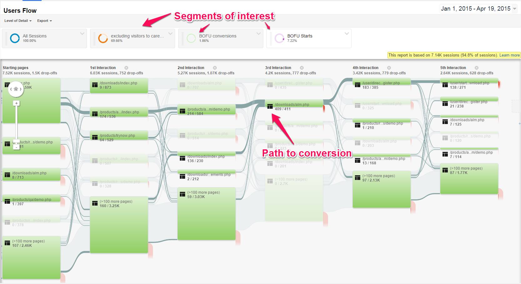
A site and analytics review is meant to determine how buyers come to your site, how they use it, and where they’re bouncing. This review doesn’t just tell you about what your buyers are doing on your site--it also gives you info about what their experience is like and what you can do to improve it.
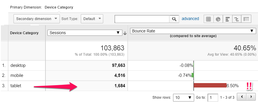
Most important of all, your analysis will let you determine where (pages, devices, screen sizes, traffic sources) your buyers are taking action--and where they’re not. This knowledge is instrumental in the iterative design process for high-converting pages over the longer term.
Analytics
First, you have to make sure that your Google Analytics is set up to measure things that count:
- Measure the goals that matter: Define your funnel and which calls to action likely belong to a particular stage in the buying funnel. For instance, identify goals that track subscribers, downloads and webinars, demos, trials, quote requests and contacts. Here’s a tutorial on how to set up 4 different types of goals. I can tell you right now: For most lead-gen sites, the goals that matter are destination and event goals. Duration goals and screen-per-session goals are misleading and mostly useless for lead-gen sites. Perhaps they are useful if you’re a publisher.
- Segment your audience by behavior: See how users who convert behave vs. those who don’t, or how behavior changes by demographic. Here’s a full article about setting up goals & segments reporting.

- Measure bounces and conversion variances: Which devices, sources, screen sizes, etc., convert better than others? Here are some of the favorite Google Analytics custom reports of top 10 conversion experts.

- Using tools like HubSpot you can also identify top website content, funnel analytics and other closed-loop analytics.
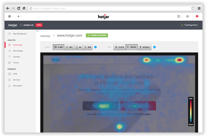
In-Page Analytics
During the analytics review, you also need to see behavior on specific pages that are getting lots of traffic or are key in the conversion funnel. For this, you can use a tool like Hotjar.
In Growth Driven Design methodologies, the users will tell you what to do, as opposed to a group of designers in isolation. Use the numbers to tell the story and figure out exactly what needs fixing.”
From here, we move on to the…
Website Strategy
The next step is to define a written website strategy document, which will serve as your North Star during the whole process. Your website strategy document should include at least the following elements:
-
Key findings from the research: Enlist, top things that were learned from your buyers, your business and your website.
-
Ultimate site objective: What is the ONE most important thing the site needs to do? This needs to be a measurable objective. For instance: “Get the buyer to sign up for a trial.” You can even define a higher level objective: “Get the buyer to download XYZ eBook and subscribe to our email list.” These are the one or two objectives that your entire inbound marketing campaigns and website user flows will ultimately point towards.
-
User Flows: What do we want the buyer to do on the site? How do we get them to the goal.
-
Architecture recommendations: Determine how your website information should be organized and what should be the navigation like.
-
Website guidelines (stuff the new site should have): Structure, voice, long vs. short copy, design guidelines, etc.
-
Current site audit - Figure out how your website measures up against known heuristics: We use our own FOCUSED evaluation checklist.
Wireframes With Messaging and Copy
For each one of the key pages identified in the user flows, you will need a carefully designed wireframe. The wireframes should include a well-defined message and at least the first shot at the copy. You can’t design effective wireframes without having a very clear idea of what the page objectives are. Here’s a tutorial on how to create effective wireframes.
Conversion Optimization Plan of Action
Through the research process, we’re putting together a long list of improvements, which will drive the redesign process in Part 2, as well as the iterative improvement process that follows in Part 3.
In addition to the list of improvements that were already identified during the research process, you can conduct a brainstorming process to come up with everything you can think of that’ll increase the site’s conversions. Some examples might be:
- A better navigation menu
- Improved usability
- More pages
- Better integrations
- Develop a particular asset
See an example of a section of what your conversion optimization action plan could look like:
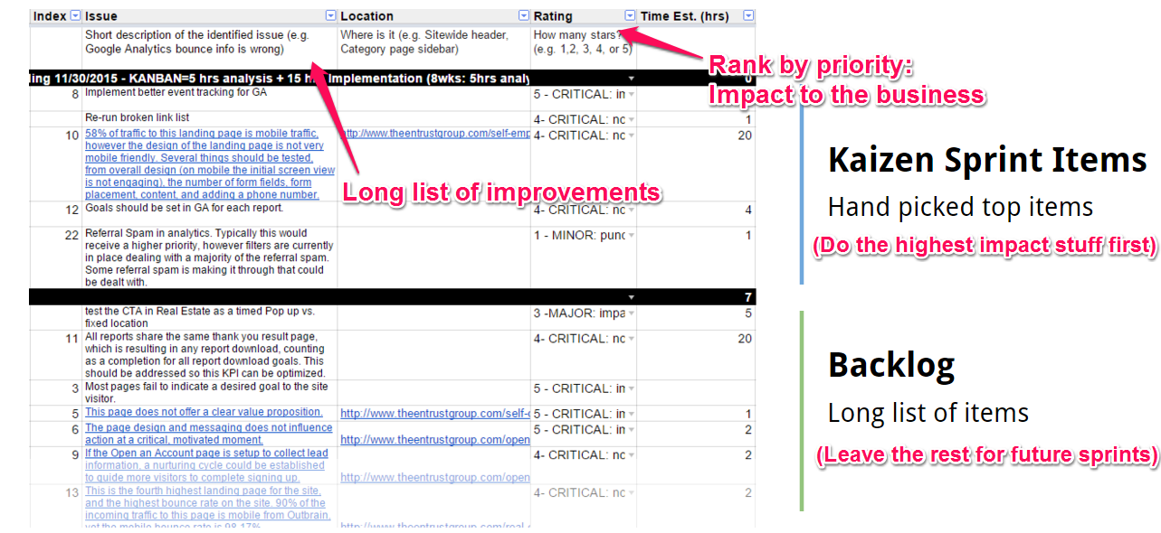
Ultra-important at this stage is to prioritize your desires. You can’t have it all, so make categories to prioritize based on the following criteria:
Impact to the business - Impact to revenue, lead generation, quality and number of users impacted. Here, you simply assign five stars to the highest-impact items that affect every user and affect the main goal of the website, all the way to one star for the lowest-impact items that are still worth fixing.
Focus of the activity - This defines the focus and the kind of expertise needed to complete the tasks. The focus of any one particular improvement can be:
-
BOOST CONVERSIONS: Here’s where you place all improvements related to conversion increases on your site, things like user flows, calls to action, conversion points, A/B or split testing and value propositions.
-
IMPROVE USER EXPERIENCE: Improvements to the website that give the user a better experience and make it easier for him to navigate, find what he’s looking for and solve his problem(s). This includes ideas related to building a superior navigation menu, creating a more intuitive search feature, and updating your tagging system.
-
PERSONALIZE: Adapting the site, calls to action, content offers, etc., to the specific visitor based on the data we know about him: Tailoring based on interests, persona, device, geolocation, referral source or previous actions on your site. Marketers now understand that personalizing sites to be relevant to your buyers is another key to lifting conversion rates. Any ideas about making the UX more personalized go here. Hubspot’s Smart Content exemplifies personalization on a site; thanks to Growth Driven Design, you now have a way of making use of this tool more than ever, as you’ll now have the user data from months of continuous monitoring and testing to adapt personalization elements on your site (like unique browsing histories, past purchases, relevant messages, etc.).
-
MARKETING ASSETS: Build marketing assets for your buyers. These run the gamut from blogs and social-media curation to specific tools like Moz’s tracking of Google’s algorithm changes, Hubspot’s Marketing Grader, Website Grader and Neil Patel’s QuickSprout Site Analyzer. These create real value for buyers.
-
SEO: Modifications to website to improve Search Engine Results Positions or increase authority. This can be either fixing on-page SEO or run campaigns to get legit authoritative backlinks.
Ease of implementation - Figure out what’s the required effort in implementing the change in terms of technical difficulty and labor needs on a scale of one thru five; one being the easiest, and five the hardest.
Type of activity - this defines the type of work needed to complete the activity. This can be:
-
TEST - A clear opportunity to shift behavior; a test, either A/B or live testing, needs to be performed.
-
INSTRUMENT - Fixing, adding or improving tag or event handling on the analytics configuration. We instrument both structurally and for insight in the pain points we’ve found.
-
HYPOTHESIZE - We’ve found a page, widget or process that’s just not working well, but we don’t see a clear, single solution. Since we need to really shift the behavior at this crux point, we’ll brainstorm hypotheses.
-
JUST DO IT - A fix is easy to identify, or the change is a no-brainer. Stuff in here requires low effort or is a micro opportunity to increase conversion and should be fixed.
-
INVESTIGATE - We need to do some testing with particular devices or need more information to triangulate a problem you spotted. We need to ask questions or do further digging.
Build your very own conversion optimization plan, based on data, and work out all improvements in order of priority so you can maximize impact to the business.”
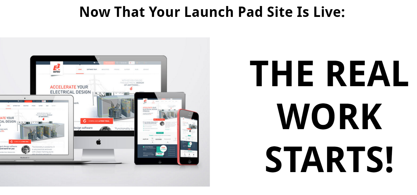
Part 2. Minimum Viable Website Redesign: Launchpad, Refresh or Skip
While the research and action plan in Part 1 are being crafted, a separate team can be focused on creating a minimum viable website.
You actually don’t always need a redesign. Here’s where the conflict with the traditional way of thinking is:
You don’t always need a redesign--in fact, in some cases a redesign of any kind might be counterproductive and lead to business loss.”
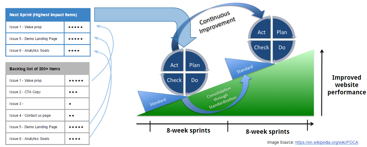
The key here is to launch quickly and move into testing and experimentation as soon as possible. You have a website out there today; unless you have a compelling business reason, don’t try to change and make perfect every part of it. Instead, focus your efforts on the top priority items (outlined at the end of Part 1 in the Conversion Optimization Action Plan), and send the rest of the items to the backlog.
How to determine if you need / don’t need a redesign:
A lot goes into determining if you need a redesign or not and the level of redesign needed. However, the most important factor is the level of success you’re having with your current website. This is a heuristic that’s worked well for us:
|
|
|
|
|
|
|
|
|
|
|
Launch Pad: Fully reengineer the most critical pages and user flow, basic upgrade on all of the rest, launch quickly, and refocus your energy on getting traffic. |
Think about it: If your site is already producing leads and contributing to revenue, then doing a complete redesign can be very, very risky.
What kind of redesign do I need?
It depends. The research in Part 1 will help you point out what exactly needs change. However, here are some questions you need to ask yourself to determine what needs to be done in the minimum, viable website stage:
-
Solve technical difficulties of your current site: if your current website is difficult to edit, unstable, or simply a roadblock to do anything in it because you need a team of programmers to make a change, you probably need to at least think of a platform change into a CMS.
-
Fix usability issues: Sometimes, the information on the site is actually not bad, and your buyers are finding the information useful... when they can find it...If this is the case, you may need a usability-oriented refresh, focused on implementing better navigation, improve readability, and fixing basic usability/mobile-rendering issues on the website. Here are 10 heuristics you can start with to improve a website’s usability.
-
Rework critical user flows: Not all pages are the same. When evaluating a website need for a redesign, there are pages that are critical to the goal; these are either pages that explain your value proposition, pages that contain information that your buyers seek very often, or pages that are receiving loads of paid traffic. In essence, these high value pages need to be at the top of the list.
Do not try to solve world hunger
Launching your website quickly and solving only the most glaring issues is just the beginning of the journey, and it’s just when things start getting really interesting. As soon as the new site’s design is live, you begin collecting all of the data that forms the basis for the iterations of your living design.
The research, action plan and minimum viable website should only take one month or two to complete—the upcoming continuous-improvement sprint cycles will consume the next ten to eleven months of your calendar.
This is where your team constantly monitors the performance of the new site design, tests when necessary to see what’s working and what’s not, and continually improves the UX for your buyers. This is all in the service of maintaining greater conversions. As you can see, this is the part of Growth Driven Design that’s markedly different, and a big improvement, over a traditional site redesign.
Crucial to this part is your focus on your buyers.
PROTIP
 You’ll have to collect as much data from your buyers as possible... you must learn about their behavior on your site, getting real feedback from them if necessary, to determine how your regular site updates impact them.
Here’s how to implement the monthly sprint cycles:
Part 3. Kaizen Sprints - Continuous Improvement
Once the action plan is laid out and your minimum viable website is launched, a massive amount of testing and improvements to your site take place following an agile methodology.
PDCA Cycle for Continuous Improvement
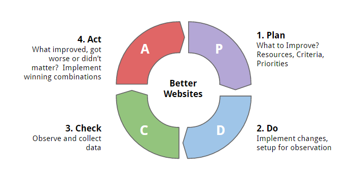
We utilize the PDCA cycle: Plan - Do - Check - Act. A continuous quality improvement model consisting of a logical sequence of four, repetitive steps for continuous improvement and learning: Plan, Do, Study (Check) and Act, which was coined by Deming and originally meant for manufacturing.
Whatever continuous-improvement framework you choose, it’s fine, but you do need to have a structured process that works iteratively.
Agile Approach - 8 week sprints
Each PDCA cycle needs to run for a specific period of time. There are advocates to have sprints run every four weeks. What has worked well for us is to have longer sprints of eight weeks to allow a bit more time for testing results and batching together larger packs of activity.
Defining the Kanban size - How much should you invest?
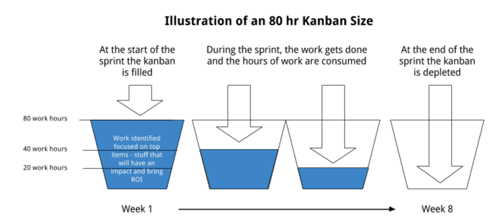
You’ll need also to define a kanban size, or bucket of activity, that you can afford to invest in during each sprint. For instance, you can define a kanban size of 40, 80 or 160 hours of work to be done during the sprint.
How much to invest depends on a few factors:
- The amount of work identified in the Conversion Action Plan: At the end of Part 1, you’ll have a long list of items. From that list you can roughly estimate the time to complete each improvement. You can use this as a stick to measure what kanban size (monthly hours) you should invest.
For example: If your Conversion Action Plan has work identified for 1000 hours of work, you can quickly make a decision about how fast you want to tackle them:
a. 50 months (@ 20 hrs per month)
b. 25 months (@ 40 hrs per month)
c. 12 months (@ 80 hrs per month)
-
Your website traffic: If your site gets 25k visits (sessions) or more per month, you have a great opportunity to do a lot of things and see the results quickly. Therefore, the higher the traffic, the more you’ll get from investing more on the sprints.
- The complexity and value of your offer: If your company offers complex/high value solutions, it might be worth investing in more intensity. Why? Because the upside is very large for you. If your solution is 50 to 100k, just getting a couple of extra clients can pay for the whole project. Even if your site isn’t getting a lot of traffic (under 5,000 visits/mo), there are a lot of things that can be done to optimize your site.
Ok, so here’s what happens during the 8 weeks:
And repeating this on a continuous basis is what lifts the overall website performance over the long term.
Week 1 - Plan
During the first week of the sprint, all elements in the list of improvements in the Conversion Optimization Plan of Action get reviewed. The point is to select the items that will be worked on during the sprint. You need to work 80/20 and keep the focus on results because it’s tempting to want to do visible, cosmetic improvements and fill the team’s agenda with them, but, if the items to work on aren’t prioritized in terms of cost/benefit or risk/reward, then you’re potentially wasting money.
Action items are actions you take to change specific elements on a page on your site—like a call to action button—to get a specific and desired result. These are based on your buyer personas and have to be informed by real data, such as experiments on the site you’ve already completed, UX behavior or feedback from your team. These action items will help provide the crucial, additional metrics you need to make the iterative design a success.
During this first week, you and your team should select action items specifically based on how critical the item is (expected impact) and ease of implementation.
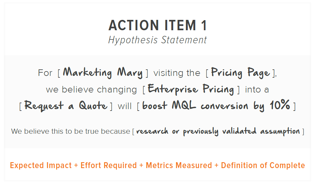
Build hypothesis statements - For instance, if you think that a purchasing manager doing research on your site will be more likely to ask for a quote if you change the call to action copy to something more direct, then you should come up with a hypothesis statement to actually test the action item.
Here’s an example of such an action item hypothesis statement:
Define metrics measured - For each item, you need to define what success means and how the results of that action item will be measured? The more specific the metrics around each change, the better.
Definition of complete - How do you determine when an action item is complete? This is important to eliminate any gray areas in the future.
Once the action items for the sprint are selected and the hypothesis statements are completed, there’s a clear expectation of what needs to be accomplished for the sprint, you are ready to start the implementation process.
Weeks 2-3 - Do
During the next two weeks you need to engineer all of the changes that will happen in the sprint. This includes:
-
Deploy each action item and come up with proposed changes, whether they involve creating wireframes, copy, design or architecture changes.
-
Set up additional data gathering for action items that require additional investigation, including setting up Google Analytics event-tracking codes, setting up polls on the site, and setting up tracking codes to generate heatmaps, scrollmaps or recorded sessions.
-
Set up A/B tests or live usability tests for those items that need to be tested.
-
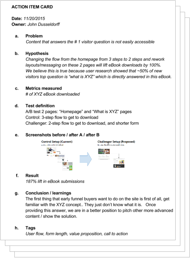
Set up the Action Item Card - Every action item identified as Critical or Important (which will require hypothesis testing) will require an action item card. You’ll set up this card now and complete it after the tests have been run, in week 8 of the sprint. This action item card needs to define the following:
a. Problem
b. Hypothesis
c. Metrics measured
d. Test definition
e. Screenshots before / after A / after B
f. Result
g. Conclusion / learnings
h. Tags
Weeks 4-7 - Check
During the following four weeks, all of the action items that were engineered and implemented get to be measured and tested.
Not EVERY action item needs to be tested. There’s a whole category of action items labeled as “Just Do It.” These are done during this stage of the sprint as well.
Hence, the activities during this phase of the sprint include:
- Run A/B tests or live usability tests.
- Collect data
- Implement items that don’t require testing: bug fixes, things that are based on heuristics analysis, usability improvements, etc.
- You can also gather the data that informs your plan on what to focus on for following sprints. Be thorough about where you can find this information.
Beyond this, you also have to deal with driving traffic to the updated pages and elements your sprint redesigns have created. Targeted marketing campaigns, according to Pardot’s Matthew Sweezey, are some of the best and most untapped marketing opportunities in this digital age.
Week 8 - Act
The last week of the sprint is dedicated to implement winning combinations from the tests and to do a retrospective, which, in agile terms, means reflecting on what happened in the sprint. This should cover the following two angles:
1. Learning From the Results - Based on the information you collected during the Check phase of the sprint, you can either validate or disprove your hypothesis:
- Did the change have the impact you expected? Why or why not?
- Based on the results, what did this teach you about your visitor? What did you learn about them that you didn’t know before?
Conducting tests and measuring results from them will result in one of three outcomes: The change will either have a positive impact, a negative impact or zero impact. Regardless of the outcome you learn from it...
Every test, regardless of the outcome, will teach you something about your buyers. Don’t disregard losing tests.”
Once you determine whether your hypothesis was correct and laid out what you’ve learned about your users, then you’ll want to publish this information in a central location for everyone within the organization to take advantage of. Having a structured system for publishing your findings is also a great reference for the future if you ever need to look for trends or look up previous experiments.
A way to do this is to complete the Action Item Card that you set up during the first week (Plan) phase of the sprint. Here’s a mockup of what the action item card could look like:
Once this is documented, you can share what you learned from the iterative design with your marketing team. After all, your marketing team, because of the data it shares with you, is part of your sprint cycle redesigns, too. The end of this process should result in improvement recommendations.
For example, let’s say that your experiments in one of your sprint cycles produced data that showed that a certain call to action button and copy combo worked better than the previous iteration, under certain conditions. Your marketing team can take critical data like this and, for instance, use the superior call to action combo in marketing materials like emails, provided that the conditions of application are similar. At least this gives you a starting point to consider.
Use the Growth Driven Design sprints as a way for the organization to learn about the customers.”
2. Learning from executing the sprint - Having a retrospective to reflect on your work is one of the most important parts of the process. The Ninth Agile principle outlined in the Agile manifesto states, "At regular intervals, the team reflects on how to become more effective, then tunes and adjusts its behavior accordingly."
In essence, you and your team need to get together to discuss 3 points:
- What worked well during the sprint?
- What did not work well during the sprint?
- What actions can we take to improve our process going forward?
It’s important that you maintain an atmosphere of honesty and trust so that every member feels comfortable sharing their thoughts.
One of Norman Kerth’s (a recognized software consultant and author) prime directive states:
Regardless of what we discover, we understand and truly believe that everyone did the best job they could, given what they knew at the time, their skills and abilities, the resources available, and the situation at hand.”
Conclusion
Growth Driven Design beats out a traditional site redesign all the time, simply because it is less risky, and more focused on results. It’s just much more thorough and meticulous than a one-off site design that doesn’t get updated for a few years will ever be. That’s precisely what makes Growth Driven Design a major marketing component for companies that wish to utilize their website as their best salesperson.
By going with Growth Driven Design, you ensure that your site content never gets stale and that your buyers’ UX is always great. You do this by always testing, monitoring and updating your site design in the monthly sprint cycles that follow the initial redesign in the first month of a typical year.
When you go with this retainer-based model for your next site redesign, you’ll ultimately get what every business owner wants: higher conversions. That’s the only thing that counts at the end of the day.
For more in-depth info on how good design maximizes your marketing power, download our “Website Re-Design for Maximum Marketing Performance” ebook.


