By now —after hopefully enjoying and learning a lot from our gestalt B2B web design principles part 1, part 2, and part 3— you should be quite familiar with this concept. We’ve got one for you this week, with our look at the gestalt B2B web design principle of common fate.
As we’ve been emphasizing throughout our gestalt series, gestalt is a theory of the mind. Even though that makes it seem like it’s heavy on psychology, it really bleeds through to the B2B design world since all aspects of design are governed by the laws and principles behind gestalt. With the gestalt principle of common fate, you’ll again see how neatly a psychological principle can impact B2B web design very significantly.
That’s why we’ve also always made it a point to stress that it’s in your best interest to find a well-rounded designer, who knows gestalt well, for your B2B site. That can make a world of difference in everything from the aesthetic appeal of your site to its functional prowess in terms of navigation, how easily your buyers can find what they want, and buyers knowing what to do and how to do it on any given page (read: calls to action, for instance).
Without further ado, here’s what you need to know about common fate.
How Do You Define Common Fate?
Common fate can be defined in the following way:
Human beings tend to perceive elements that move together as being more similar to each other than elements that are either still or moving in a different direction.
In other words, if you have a group of objects, and those objects are all moving in the same direction, then you’re going to automatically look at them as being far more similar and related to each other than objects that aren’t moving or those that are moving in the opposite way.
Check out this principle in action:

Ask anyone, and they’ll naturally say that the blue dots that move together within each line are more related to each other than they are to the other line of blue dots that’s moving in a dissimilar way. That’s because human beings are simply just programmed by nature to perceive that those things that move together share more in common than either stationary objects or things moving in a different direction.
A Practical Example of Common Fate
Let’s say that you’re driving your car down a busy highway, something with which you’re totally familiar. As you are driving, you are obviously surrounded by other motorists who are doing the exact, same thing. The motorists who are in the same lane as you, and therefore going in the same direction as you, are related to you, according to the gestalt principle of common fate. They literally share a “common fate” with you because they are going in the same direction.

Of course, you pay very little attention to this phenomenon because you likely see it every day as you commute. However, in sheer contrast to this, when the opposite of this same-direction phenomenon happens, then we are programmed to instantly pay attention to it. Guess what B2B web design principle this everyday occurrence just hit on? If you said contrast, then you would have been right.
Common Fate Works in Both Directions
The gestalt principle of common fate works by both illustrating how your world moves in harmony with it, as well as how your world moves in contrast with it. The traffic example above is a primary case in point.
The almost hypnotic and clear-cut pattern of moving cars on a highway tells us a lot about how to seamlessly blend in with them on roadways all over the country. The contrast to this—cars going in the opposite direction in oncoming lanes—empowers you to notice changes at the drop of a hat.
Still sticking with the above example, let’s say that a car on the road violates the principle of all cars moving together in one direction in the same lane. Let’s say that this car changes lanes or merges into the lane from a side street. In such a case, your attention will automatically be stimulated and allow you to react accordingly.

It’s a fact of nature that we human beings are just innately programmed to spot conflicting movement a lot more quickly than any other visual cues, such as color, size or even tone contrast.
Now how does all of this tie into B2B site design, you ask? As you’ll see, it turns out that your B2B web designer can exploit our innate tendency to quickly see both synchronized and conflicting movement to create a site that’s responsive, easy to navigate and satisfies the user experience.
Common Fate Makes Appearances in Web Design
Since the gestalt principle of common fate is usually demonstrated in a very literal fashion, you would be forgiven for thinking that it’s hard to come up with relevant examples in web design. On the contrary, though, there are quite a few and unique ways to incorporate common fate in web design. It’s really only a matter of knowing how to look at things on a page.
Think About the Good, Old Slide-out Menu
One of the best ways to show how this gestalt principle has been applied to web design—and also how you can adopt it for your own B2B site—is by looking at the slide-out menu. A slide-out menu is a navigation menu that has additional layers of navigation. It slides out, hence the name, in an unobtrusive way that also helps you to fit more navigation options onto the screen.
Look at the example below.

Note how the second and third layers of navigation move into being visible, but do so distinctly as separate groups of elements. However, each group of elements in the additional layers of navigation moves in concert, thus showing us very clearly that these links in every group are related to each other.
Let’s look at another example of the common fate principle in action, but this time, with a live site.
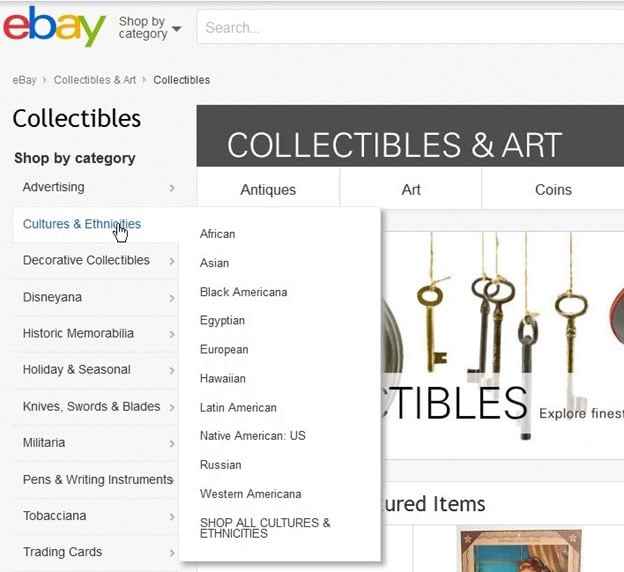
Probably the best example of a slide-out menu in action today is the one you can find on the eBay site. Some pages on eBay—for example, the eBay Collectibles page—show a slide-out menu functioning in a very responsive manner that makes for a super-enjoyable user experience.
Again, note the principle of common fate working in the screenshot below.

As you can see, the second layer of navigation immediately pops out when you simply hover your cursor over each category on the page’s left-hand side. Again here, we see that all the elements in each group of elements in every sub-menu are clearly related to each other, more so than they are to other elements in other groups.
Look to Tooltips for Another Web Design Example
A tooltip is a short message that shows up if you hover your cursor over an image, icon, hyperlink or other element inside of a graphical user interface. It turns out that this feature can be a very practical and helpful component of the user interface.
The absolute beauty and handiness of this type of design is that you can hide specific information until the moment when context calls for it to appear. Check out the below screenshot that visually illustrates this gestalt principle.

As movement is associated between the movement of the cursor and the movement of the tooltip (which reveals previously hidden information when the cursor hovers over it), a strong connection between the two concepts will form in the mind of the user. Therefore, the user is going to make the connection that the revealed information is highly significant to the element that he’s hovering on with his cursor.
Sure, the appearance of the tooltip itself impresses a strong sense of significance and association in the mind of the user, but, make no mistake about it, it’s the revealed information that comes as a result of the motion of the cursor over the element that is crucial.
The thing is that it’s the whole package that comes together to make the tooltip such a powerful and practical visual element. It’s the movement of the cursor and the revelation of information that makes the association powerful. Just revealing information without movement undermines the principle of common fate and so would be inadequate to encouraging the user to form a connection in his mind.
To see this principle in action, just click on this link.
Let’s quickly look at how a tooltip can communicate the principle of common fate on a live website.
There’s no better example of this than the tooltip that appears on Wikipedia, when you’re on a page other than its homepage.
Look at the screenshot below.

No matter what page you’re on when visiting Wikipedia, you can take your cursor and hover it over the big Wikipedia globe that appears on the top, left corner of the screen. After less than a second of hovering, the tooltip will appear, which reveals that you can “visit the main page” by clicking on the big Wikipedia globe.
Voila—and there you have it. The association between movement of the cursor and movement in the revelation of that tooltip is now firmly in the user’s mind, which tells the user that movement can lead to the appearance (read: more movement and therefore similar direction, in an abstract way) of information on the Wikipedia site. In other words…common fate in action.
Conclusion
Common fate is now the fourth gestalt principle that we’ve covered in our exclusive series, in which we’ve been building on every prior concept for added complexity. You’ve made it this far, so give yourself a hand.
As you saw, common fate can be both literal and abstract, which is what makes it such a wildly effective law and principle in design in general. Common fate is all around you in your everyday life, not just with the very obvious example of cars driving down a highway during the morning and afternoon commutes.
As you also saw, you likely had been witnessing and interacting with various examples of common fate in your site browsing, but you likely never knew it. Now you know, though, that a B2B site designer who understands common fate can build a far more effective site for your company.
Next time around, we’ll wrap up our exclusive series on gestalt design by covering, very appropriately enough, closure. You can take everything you learned from the first four entries to get a very deep and satisfying read on closure.
Until then, we have some questions for you:
Do you see how common fate can integrate with B2B web design?
Have you spotted any other examples of common fate in your daily life?
Has knowing about common fate made your site browsing more meaningful?
Previous: Part 3 - Proximity, Uniform Connectedness, and Good Continuation
Next: Part 5 - Closure


