We hope you are enjoying our limited series on gestalt b2b web design principles. A couple of weeks ago, we looked at the all-important figure-ground relationship that is at the center of gestalt design. This week, though, we move deeper into gestalt design principles by introducing the concept of similarity.
This concept is something of an oxymoron, though, and you’ll soon see why. It seems straightforward on the surface, but it can actually get quite a bit more complicated when your web designer has to apply this principle to your B2B site in a way that makes it functional and attractive.
In gestalt design, similarity is defined as follows:
“Things that are similar are perceived to be more related than things that are dissimilar.”
Here is where this seemingly straightforward concept can really throw you a curveball or two. A web designer laying out your site for B2B lead generation has to be intimately familiar with the various ways in which design elements can be similar, so that he is able to pick the correct element and use it to maximum effectiveness. This is what we’re going to explore.
The Basics of Similarity
In design, you can encounter similarity in any number of different ways. Similarity is also what makes elements seem related. Some examples include size, color, texture, shape, orientation and dimension. This is not a complete list, but includes the important ones. The best way to demonstrate how similarity really works is just by moving straight into an example.
Below, we have a bunch of objects, symbols and shapes.

Since these various elements don’t immediately display any noticeable similarities, it’s doubtful that a viewer would perceive them to be related in any way, shape or form. Okay, that was so easy that it was a no-brainer, right? Alright, let’s move on to an example where you literally can’t miss the similarities between elements.

There are actually both differences and similarities in this image, but they are likely not readily apparent. The average viewer would look at the above elements and categorize them based on their shape. Naturally, you’d have to say that the squares and the circles were, respectively, related to each other.
You may have also noticed by now that, in the above example, both size and proximity take a backseat to shape as the defining element of similarity. However, if we switch things up somewhat, then your perception will be changed further.

At this point, you’re thinking to yourself that the bigger squares are related to each other while the smaller squares are naturally related to one another. Because size is a reliable means by which to offer contrast, the consistency of the size of figures can be used to imply relationships. Let’s look at a fourth image to illustrate this point further still.

In the image above, you’re now noticing how color as opposed to shape is the greatest indicator of a relationship between the figures. The similarity of the colors between the balloons in this case hits on the fact that color similarities are the most powerful ways of implying relationships. Additionally, color’s also the first element that registers in the human brain when we’re using perception to make sense of our environment.
While both patterns and irregularities can well conceal shapes and sizes, color still shines through these obstacles very handily. That’s why, thanks to evolution, color has been used in nature as a most potent tool to warn of danger.
Now that you understand the whole relationship model based on similarity, we can apply this concept in design to the more interesting and relevant world of web design.
How Similarity Is Used in B2B Web Design
Your B2B site designer’s job will be to present site visitors with the necessary visual clues to inform them about which interface elements relate to one another. This is done for a purpose, not just to render a page that will look pretty.
The whole point of this is that the site visitor (read: your buyer) can efficiently perceive the organization on the pages of your site. When the site visitor does this, he is better able to use and interact with your B2B site, which only helps you get more conversions.
Similarity and Links in B2B Web Design
One of the most prevalent elements on a website and, in fact, on the entire world wide web is the links you encounter when browsing and surfing. Links are there to permit some of the most basic and integral interactions in both web pages and applications.
Because of this, it is necessary that they have to be distinguished from other elements all around them on any given webpage. Of course, they have to be noticeable, whether that’s just moderately or very noticeable, for them to be effective.
It all comes down to context, though. Links must be similar to each other because they have a common function (to open a new page). Let’s look at the first example of this version of similarity.
Different Colors but Common Purpose
Much of the time, a site will have text link that’s a different color than the body copy. You’d think that this illustrates a difference, but it actually demonstrates a similarity in the text link in question. In the example below, you can clearly see how the text link on The Hickensian is styled to be a completely different color than the body copy of the webpage. The text link is purple, yet the body copy is standard black.
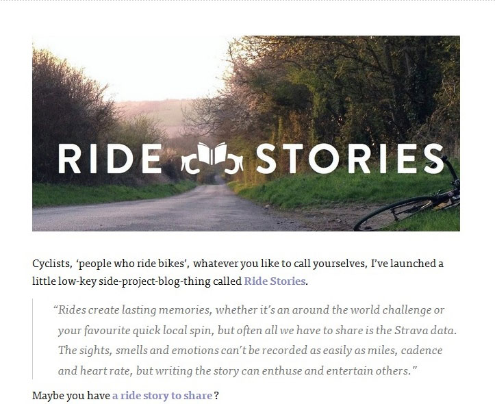
Following this principle of gestalt similarity, we can see that the relationship between the purple text is that it is all link text. Right away, based on the similarity of color, we can see determine the distinct relationship of the function of this text.
Various Link Styles for a Common Purpose
Of course, many websites utilize different link colors and different link styles, but they all work toward one, specific and common purpose. So instead of there being disunity and chaos or confusion in the links, there’s actually great similarity of purpose and therefore function. Let’s look at the homepage of Fox News to illustrate this.
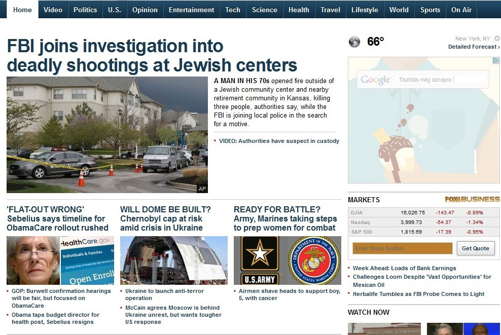
As you can see above, there’s a lot happening on that busy news site homepage, link-wise. The link color changes, and the link styles are all just over the place, but they do have a single and common purpose.
Let’s start from the top. The big headline at the top and center of the homepage is dark blue, bold and in large font. This is naturally meant to be the eye-catcher element on the page, which makes a world of sense.
Then, when your eyes move down the homepage, you will notice a whole slew of smaller links. There are the links to the smaller headlines in the middle of the homepage, as well as the variety of even smaller-size links to videos and other news stories on different pages on the site.
These smaller links are also lighter blue as opposed to the dark blue utilized for the headline font. Clearly, dark blue stands out more, which makes it ideal to catch the eye for headline reading.
This all ties together in that the differences in link color and link size come down to one thing: They are all in the service of telling the readers about the site’s categorical indications. To wit:
- Bigger font is reserved for the most important headlines
- Smaller font is meant for body copy, videos and less important headlines
- Dark blue indicates headlines
- Lighter blue indicates links to stories
Similar Relationships in Content
Showing content relationships—specifically showing these relationships so that they’re obvious for buyers and site visitors—is one of the most vital duties of your B2B site designer. This is a reference to showing how particular content is both more and less related to other elements of content. The purpose of this is to highlight content hierarchies, substitute an implied structure for a visual structure, and effectively communicate content.
In the example of the homepage of Intercom below, the various departments of a company are represented by a consistent visual motif (pictures of employees in different departments, inside of a circle). Since what’s most obvious is the size and the shape of the geometric figure containing the pictures, we naturally see that these pictures are somehow related.
Of course they are because these pictures stand for the different company departments for which Intercom’s platform makes communication easy.
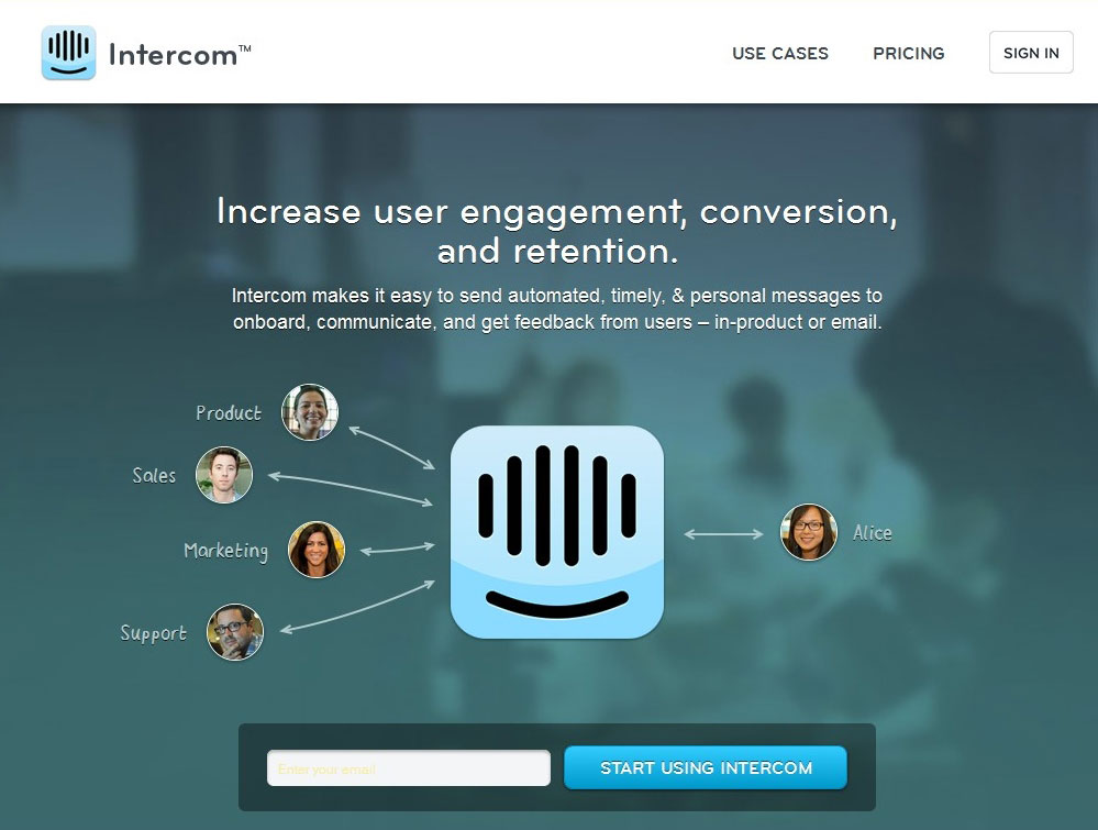
If we look at one picture of an employee in one department, then we can safely and accurately guess that the other pictures will stand for employees in the same company, but in other departments. In this way, this presentation’s consistency really indicates consistency of context (how all departments in the same company can enjoy effortless communication through Intercom’s platform).
In another example of similarity applied to content, we have the homepage for UX Magazine.
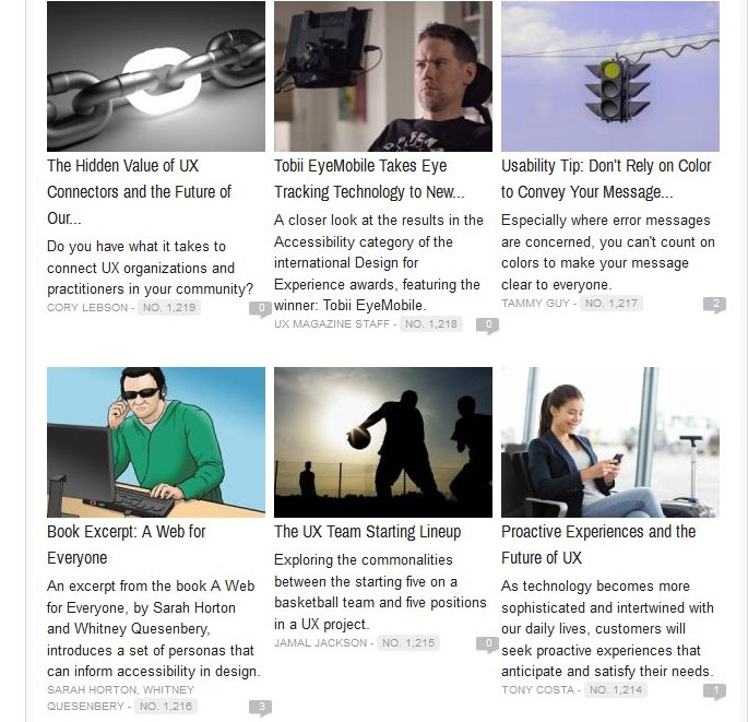
Immediately, the user will notice that all of the headlines that appear right below every picture are also reference links to articles on the site.
Finishing Off With Organization
By being able to observe similarities, buyers and site visitors won’t only be able to understand which elements are related to one another, but also understand the implications of structure that naturally emerge from patterns. Look at the example below.

Here’s a grid of elements defined by no apparent divisional structure. As a result, all of these elements appear to be equally related. Let’s examine another example below.

These elements in the grid are now obviously arranged in a column-based layout. Now, because the squares are similar due to their shape, color is the communicative factor in this layout. Take a peek at the next example below to get a still different view of organization.

Here, it’s obvious that the similarity is based on the elements being laid out into horizontal rows. Finally, look at the last image below.

Here the elements are divided into just two categories: the gray squares are related while the brown ones are related. It follows that these two parts are utterly distinct in spite of having the same, physical structure. Color is what makes them distinct while the shapes still suggest similarity.
In these examples involving organization, it’s clear that color—and, fundamentally beyond that, contrast—was utilized to suggest relationships and therefore structure. As such, these examples are clear lessons for any designer who wants to create a sound B2B site: Physical structure isn’t necessarily required to describe either page structure or the relationship between various elements of content.
Structure can be effectively implied based on either the contrast or the consistency of the dimension and styling of your page content.
Conclusion
In part two of our series on gestalt design, we showed you that something as basic and straightforward as similarity can be extended into all sorts of relationships, some obvious and some not so obvious.
Similarity can be played on via shapes, sizes, colors and contextual or categorical relationships. As such, once you understand the utter fundamentals of similarity in design, you can extend that concept into increasingly sophisticated web-design applications.
To end up with a B2B site that pleases the user from a navigation and user experience standpoint, it’s recommended that you choose a designer who understands this fundamental concept of similarity. Similarity is invaluable when you’re laying out your B2B site since the buyer has to understand what elements are related to move down the sales funnel with greater efficiency and less friction.
Do you now see how similarity helps a B2B site?
What kind of similarity (shape, size, category, etc.) is the most captivating to you?
Have you used similarity on your site already?


