There’s a chance that your website could be contributing to the big, fat B2B website discontent out there. Don’t fret, there’s lots you can do to improve this. Some B2B companies don’t even know that their websites are not living up to maximum efficiency at snagging buyers. To have a truly well-performing website, you have to give your buyers exactly what they want. It’s that simple.
The big, fat B2B website discontent can be attributed to B2B companies not knowing precisely what their customers really want. This sets up an obvious conflict that reduces the user experience for customers.
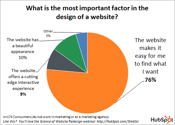
According to a HubSpot study, 76% of customers simply want a website that makes it easy for them to find exactly what they want. Sounds simple enough, right? When it comes to execution though, this is extremely hard to pull off, which explains why so many websites out there are bad.
So if more than three-quarters of all customers just want a smooth and pain-free user experience, then why do so many websites utterly fail to provide this? It’s simply because so many B2B companies fall short of getting inside the head of a B2B buyer and understanding his user experience.
Getting Inside the Head of Your B2B Buyer
The old saying goes something like this: To understand a man, you have to walk a mile in his shoes. The same principle applies to your B2B buyer. If you want to understand what he wants from your B2B website, then you have to understand his B2B buyer experience. An absolutely insightful and sharp analysis of this comes from Kristin Zhivago’s article on the great B2B website disconnect.
In a nutshell, a B2B buyer has a problem for which he’s searching for a solution. He starts out by doing a Google search for either his problem or what he imagines his possible solution could be. He gets the first search page result in Google, and scans the first few results to see if any match his idea of a solution. His first search will probably be too broad, which explains the lack of relevant search results.

So your B2B buyer then refines his search by adding another word or two to his search phrase. This time, he’s happier with the results on the first Google search page. Consequently, he begins to click through to some of the first few results.
Unfortunately for him, the first site has wretched navigation and is entirely confusing, meaning he’d have to spend a lot of time digging through the site to potentially find his solution. Disgusted and frustrated, your B2B buyer just clicks the back button. Naturally, this is a lost sale.
More discouraged but not yet ready to give up, your B2B buyer then chooses another option on the first search results page. Luckily for him, the site he clicked on seems to be more promising than the last. For example, there’s a navigation bar that features a drop-down menu, and one of these categories may actually have his solution.
However, as soon as he clicks the category where he thinks his solution may be, he disappointingly discovers that the ensuing page is anything but helpful. As a matter of fact, all he sees are more categories that don’t clarify anything for him and make the process more chaotic. Therefore, he starts to doubt that his solution is even on the website in the first place.
In a last-ditch effort of pure desperation, he notices a search box on the site, enters his solution phrase and hits “go.” Annoyingly, no search results are returned whatsoever. Feeling defeated, he does the only thing he can think of: Click the back button to the Google search page results. Again, your B2B company has lost another sale.
The B2B buyer was obviously not served well because those websites failed to make it easy for him to find exactly what he was looking for on their websites when he was searching for a solution to his problem. The dilemma here is the conflict between what your customer wants and what your B2B website presents him with.
To solve this dire problem that’ll drain your potential revenue faster than anything else, you have to design a website that doesn’t suck. First, though, you have to identify what makes your B2B website suck.
Identifying Factors That Make Your Website Lousy
Before you can fix all the problems with your website and make your customers happy, you have to be able to identify the various factors that can contribute to a sub-par B2B website. You might be stunned to learn that you have some of these elements on your own B2B website.
Atrocious Copywriting: A smart individual once opined that web design is 95% typography. This makes all the sense in the world when you consider that the majority of stuff on any webpage is text. The copy on your landing page has to be excellent for you to generate leads and move them down through your sales funnel.

Unfortunately, many B2B websites suffer from horribly awful copy. Bad copy is characterized by a lack of clarity and specifics, the failure to connect with its target audience and not being able to make a persuasive case for the value that site visitors are about to get.
Design Problems: When it comes right down to it, bad site design can sabotage your entire landing page no matter how effective your copy really is. Bad site design can encompass a number of things.
Choosing, for instance, a template that thousands of other B2B companies are using on their own landing pages can help to drive leads away. Using templates communicates that your brand is not exclusive or important enough to stand on its own.

Another design mistake relates to excessive copy, particularly if that is too much technical jargon on your landing page. This simply makes it hard to understand for site visitors. At the same time, the opposite extreme of too little copy is adverse as well. Sure, minimalism in landing pages is highly effective, but that doesn’t mean too little copy.
Successful design for a B2B website demands attractive site design that is visually pleasing. Sites that just look unappealing drive away leads. Here are some design errors to avoid, so that your B2B website won’t look awful.
Ineffective Messaging: Messaging problems will sabotage your website because your leads will get confused or distracted by inessential elements. For instance, your messaging will get lost if your landing page has a bunch of irrelevant elements on it. If this is how you execute your messaging, then you may as well save some money and skip messaging altogether.

Issues with your call to action can also contribute to a sub-par website that won’t help bring in more buyers. Your call to action is the star of your landing page, and the better you plan and execute it, the more leads your page will generate. To spare yourself the aggravation of creating abysmal calls to action, see the following resources:
- Determining the Correct Calls to Action for Your B2B Site
- 5 Ingredients to Creating Conversion-boosting Calls to Action
Usability Nightmares: The user experience is all-important to B2B buyers . If you create a poor user experience for site visitors, they will experience friction that will reduce your B2B site’s rate of conversions. One of the most notorious usability problems is a slow-loading site. You can improve your site if you can increase the speed of your page load times.

A lack of customer focus on your site can easily fall under this category, too. B2B sites that don’t understand their customers’ B2B buying process (as in the Kristin Zhivago example above) are usually the offenders that create sites with a poor customer focus. In other words, such sites fail to offer their buyers exactly what they need in a super-easy fashion.
How to Know When Your Website Needs a Makeover
There comes a time when you just have to know when your B2B website is not up to par and therefore needs a makeover—fast. You can make the argument that your website needs a makeover badly when it fails to do any of the following for you:
- Present a proper image of your company
- Explain your overall value proposition
- Understand your product or service offering at an expert level
- Adjust the message based on your audience
- Show empathy by sincerely demonstrating an interest in helping the buyer, emphasizing value first and foremost
- Be well-prepared to answer questions of any types about the buyer’s needs, as well as your products and services
- Find leads or have leads find it
- Follow up with leads and complete a process of qualification
- Keep your buyers updated on new developments
- Close the deal at the proper moment without the “hard sell” approach
- Upsell on each deal based on value
- Keep track of its own performance
Basically, you need a website makeover if it fails to operate like your best salesperson.
How to Get a Website That Works Well for You
To get a website that works well for you, you have to resist the temptation to wing it by simply telling your web designer what you think will make a good B2B website. Designing a site like that—completely obviously to what your buyers want—is a recipe for disaster.
Instead, you have to actually interview your customers by asking them what they want and how they make their buying decisions. This is the best way to get the most reliable and accurate information to design a website that gives your customers exactly what they want, super-easily.
You can’t just ask your customers any questions; they have to be highly relevant and appropriate.

Here are some great resources to help give you some ideas about what kinds of questions you can ask your B2B customers:
- 20 Questions to Ask Your B2B Leads, Prospects and Customers
- 12 Most Potent Questions for B2B Companies to Ask Their Customers
- 5 Vital Questions for B2B Companies to Ask Their Customers
- How to Interview Your B2B Customers
- Tips on Getting the Most From Your B2B Customer Interviews
By asking these types of questions when you next get in touch with your customers, you have the right information you need to build a super-successful B2B website that gives customers what they want and are looking for.
Conclusion
It’s a sad fact of life that so many websites on the Internet do suck, but that’s only half the story. This means that you can greatly improve your image, credibility and reputation as a B2B company by standing out from the pack by designing a website that works wonderfully well .
The truth of the matter is that it’s relatively easy to do this: All you have to do is give your buyers exactly what they want in a very easy way when they’re looking for solutions to their problems.
It doesn’t take superhuman effort or secret and special knowledge to design a website like this.

All it takes is actually taking the trouble to ask your buyers both what they want and how they makes their buying decisions. That’s all. B2B buyers are only more than happy to share this information with you because they want a better experience, too. So why not make it a win-win situation by understanding what your buyers want…and then giving it to them?
Do this, and you will be the proud owner of a B2B website that pleases your customers. In turn, you will be the owner of a B2B company that sees increased profits due to having more buyers.


