
“Thank you for doing a great job in designing our website,” a customer says. “Overall, I’m satisfied with it. Thank you. However, I have one last request.”
“Absolutely. What is it?”
“We’d like a rotating slider on the homepage, showcasing our latest product addition, our value proposition and some key stats that will be interesting for our buyer personas.”
I have had this conversation a few dozen times; automatic carousels are attractive, and the concept of it sounds nice. However, if you either have one of those or would like to have one on your homepage, you should know some highly important facts.
To begin, I have an exercise for you. Spend some time looking at the following sliding banner and ask yourself what this company does:
.
.
.

.
.
.
You got the idea of what they do?
No? Kind of?
Thought so...
Automatic carousels are typically made to help transmit important messages to the buyers. The common thought is that if they are carefully crafted, well-designed and feature some kind of fancy motion, they will be able to help you pack a lot of important information in your homepage.
So long as they’re above the fold, your buyers will be able to get what you do, understand your key products and know why you are different just by looking at this slideshow, right?
Wrong...
The idea of an automatic carrousel is fundamentally flawed for the following reasons:
Sliding Banners & Carousels Are Distracting
The human eye reacts to movement, even involuntarily. Just the fact that the slide moves will distract the buyer from getting the intended message.
The human eye reacts to movement, even involuntarily.
The U.S. Army funded research to find out the level at which motion distracts subjects from a task. It centered around a critical piece of information while designing control tower dashboards with multiple moving indicators, on which the lives of passengers depended.
Subjects were tasked to focus on a specific object on which a letter would appear momentarily. The task was to identify which letter and the direction in which it appeared. At the same time, a peripheral object moved.
In most cases, participants were distracted by the peripheral-moving object and failed the task. However, the surprising fact is that the participants who failed the task didn’t consciously look at the peripheral object; their eyes just moved without them acknowledging it.
PROTIPSome will be tempted to argue that you’re not designing B2B sites for air traffic controllers, but that misses the whole point. The whole point is that anyone will get distracted by motion, whether that’s an air traffic controller or your buyer on your site.
It all comes down to the human brain, mainly the fact that it has three layers, the oldest of which humans share with reptiles.
This part of the brain is preoccupied with survival, and any abrupt change in the field of vision can be interpreted as a matter of life and death. As such, the human brain, too, is wired to react to movement, and when it does, it can miss important information.
Automatic Carousel Problems Can Be Explained by Inattentional Blindness
Even the field of psychology explains the problems human beings have when it comes to seeing things that they should when motion is involved.
It’s called inattentional blindness, and it has been documented by solid research for many decades.
Basically, inattentional blindness is when a person experiences a psychological lack of attention as opposed to a real defect in his vision.
Basically, inattentional blindness is when a person experiences a psychological lack of attention as opposed to a real defect in his vision.
It’s essentially the failure of a person to notice unexpected stimulus that is still in his field of vision when additional, attention-demanding tasks need to be done.
This is labeled an attentional error and can be attributed to the fact that people are simply overloaded with stimuli.
As a result, it is just impossible to pay the necessary attention to all of the stimuli in the environment. Another explanation is that people can even be totally unaware of the stimuli.
It’s easy to see how this psychological phenomenon, then, can translate to the user not being able to understand the intended message of any given automatic carousel.
As soon as the user looks at the carousel, he sees a deal or a promotion, but his attention is interrupted by motion as the carousel reveals a new item.
As soon as this occurs, his next task is to figure out why this motion happened and what changed, thereby taking away attention from understanding the original message in the carousel.
Yes, the user is then simply overloaded with too much stimuli—all the different deals, offers and promotions in the carousel on top of the motion effect.
Yes, the user is then simply overloaded with too much stimuli—all the different deals, offers and promotions in the carousel on top of the motion effect.
Look at this video of a famous inattentional blindness experiment to understand further.
Probability-wise, It Just Doesn’t Work
Say you have 5 key messages in 5 sliders each one of them coupled with a call to action.
You will put the key message and CTA in front of the user for 5 seconds, and then rotate the slider.
Another key message and CTA is there now, but it will be gone in yet another, mere 5 seconds.
In other words, you’re really only allowing 5 measly seconds for your site visitor to see the slider, read the message, understand the message and then act on the CTA. That’s nowhere near enough time to give your site visitor a chance to act.
PROTIPFor perspective’s sake, just think of this: It took about 5 seconds to read the last couple of sentences. Not a very long time, is it? With the short attention span of internet users, what do you think is the probability that they will even see those key messages you have in the sliders?
Automatic Motion Is Just Plain Annoying
Imagine the scenario where you have a qualified buyer ready to buy your solution, and he just wants to get the hang of it by looking at your homepage.
Here is Slider 1: “Improve your lead generation with tools...” oops, it just went away…
Here is Slider 2: “Access B2B marketing Thought Leadership...” oops, gone again...
Granted, most “well-done” sliding banners have navigation controls. However, these are typically insufficient and are unnoticeable and unfamiliar to the average user, hence completely useless.
Research Shows That Automatic Sliding Banners Should Be Avoided
Jakob Nielsen, the usability guru, put it to the test and found out that auto-forwarding carousels and accordions annoy users and reduce visibility.
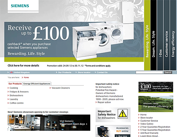
In a UK usability test of Siemens’ website, the user failed to answer this test question in a major way: “Does Siemens have any special deals on washing machines?” In fact, the user failed catastrophically.
This copy was displayed in big font on the automatic carousel on Siemens’ homepage:
“Receive up to £100 cashback when you purchase selected Siemens appliances…Rewarding. Life. Style.”
Not only did the user utterly fail to identify Siemens’ special deal, but he also concluded that he wouldn’t be choosing a Siemens product unless he was very wealthy. How could the user fail at this seemingly simple task so disastrously?
Because the task was anything but simple. The Siemens screenshot above is anything but static; it’s actually an automatic carousel that would only display the special deal every five seconds.
Clearly, the user couldn’t focus on and understand this information because it was only in front of his face for five seconds.
Referring to the homepage for Siemens Appliances in the U.K., Nielsen wrote:
“This example design is flawed in so many ways, but the worst offense is probably in making something move that should be static. It's sad to think that extra money was wasted on jazzing up this design with harmful moving features, rather than just creating simple content that clearly communicates the company's value proposition.”
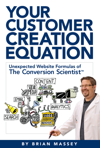
In his book, “the Customer Creation Equation,” Brian Massey, the conversion scientist, offers his take on sliding banners:
“Imagine trying to read a book, and someone is waving something in front of you every few seconds. Both your reading speed and comprehension would drop. It turns out that the same is true for home pages.
The motion of a rotating BAH [Big Ass Hero image] - also called a slider - causes the reader to stop scanning the page and look back up. Almost every test I’ve seen on this is clear: rotating banners reduce conversion rates.”
When to Use a Carousel or Sliding Banner
There are some instances where sliders are appropriate. However, you should ask yourself, “Can I present the same content using a different layout on the page?” If the answer is yes, then you should. I’d venture to say that, in most cases, you can avoid a carousel.
However, if you determine you need one, keep these best practices in mind:
a. Keep good usability. There are common usability mistakes made on carousel design, and they can be fixed, but above all, make sure the user is in control. Don’t auto rotate the slides. Instead, make navigation controls obvious and huge so they can be noticed, and the user can intuitively know that there is more to see. In general, avoid these mistakes at all costs:
- Auto-sliding after the user is already in control – This is a huge no-no. When the user has taken control of the carousel and is browsing through its items, manual sliding should take center stage. The user should be able to browse at his own speed without worrying about auto-sliding taking over and disrupting him.
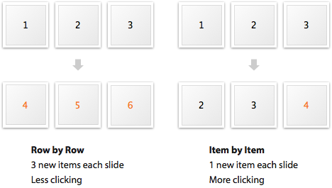
- Showing new items one at a time in a row – If your carousel shows different items in a row, the user can typically browse them in batches. Never permit the user to frustratingly have to look at the items in a new batch one by one. Instead, display the items row by row, so the user can see more items with less clicking.
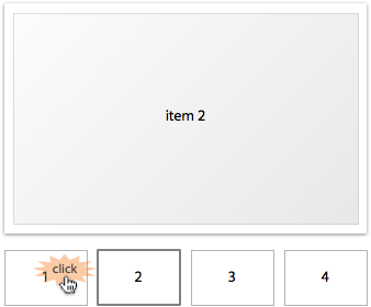
- Displaying item progress confusingly – Never display the item progress in your carousel in a non-intuitive way. Avoid showing the number of items displayed out of the overall number of items. Instead, simply show the carousel’s number of rows and the row that the user’s on.
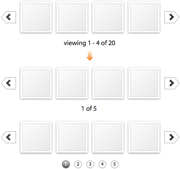
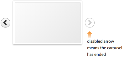
- Infinite sliding – Infinite sliding can be confusing since it fails to inform the user when the carousel’s ended. If your carousel loops back to the first item without making clear that it’s started at the beginning again, your user will accidentally keep looking at the same items.
- Small click targets – Don’t make things hard for your users by giving them small targets to click. Never make your carousel arrows tinier than the size of the mouse cursor. It’s a best practice to make targets easy to click by placing them on a button’s surface.

b. Keep messages short and simple - A sliding banner is not the place for long copy; in fact, consider only showcasing a single message. Only make the visuals rotate, or better yet, keep a single message and offer images that complement the message. This could be useful when presenting different product capabilities that would be difficult to describe with copy only.

Superior Door & Gate Systems utilized some fading slides on their homepage to showcase different types of doors they could make. Notice that there is no messaging in the banner slider area, which would actually help a bit.
The bad thing is that the images rotate automatically, and the key space in their homepage is invested in this image as opposed to showcasing their unique value proposition: “the Total Systems Approach from fencing to monitoring.” I bet most users will miss out on this key value proposition, and some qualified buyers are bouncing off their site.
Here is another similar company with the top value proposition: Remax Products, a maker of traffic doors and screens. Note how much easier Remax Products’ homepage is to understand.
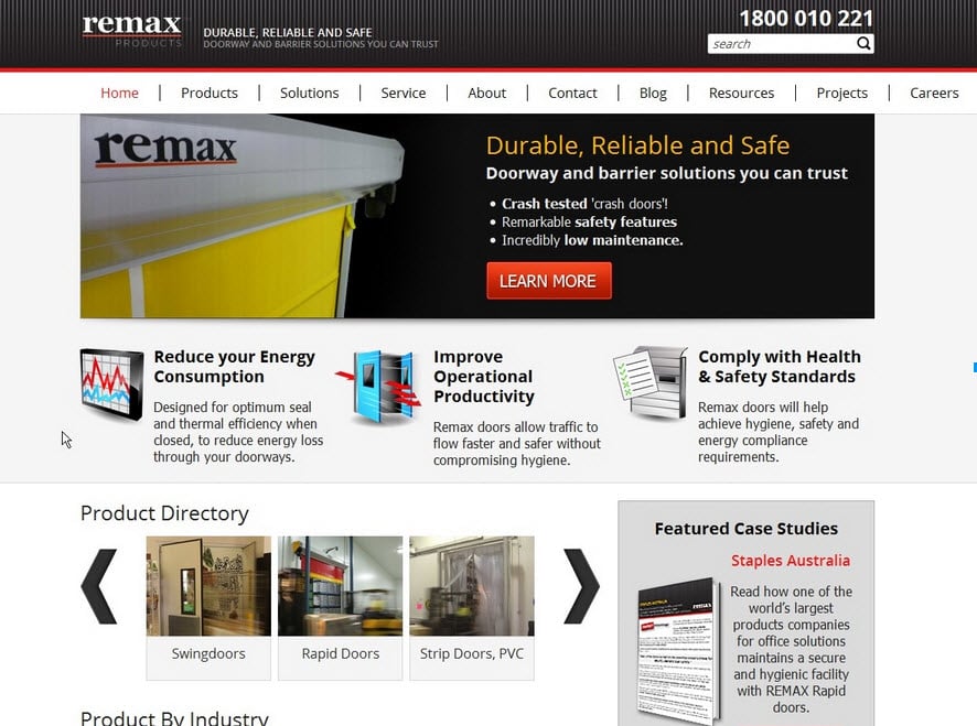
Right off the bat, the buyer is automatically gripped by the clear and easy-to-understand value proposition.
At the top of the page and right in the center, Remax Products excellently communicates that its doors and screens are durable, reliable, safe and need little maintenance.
There’s even a call to action thrown in there, so that customers can “learn more” and aren’t left wondering as to what the next step will be.
Under the call to action, even more value propositions are spelled out, again, making them super-easy to be noticed by buyers.
In addition, the homepage also shows site visitors a slideshow of all the products the company sells, and testimonials are right below that to build credibility with buyers.
Beside that, the company offers a bunch of downloadable case studies to build even more value and make buyers feel like they should reciprocate with a purchase.
Overall, Remax Products’ homepage is far better because it is well-organized, very easy to understand and has their buyers’ user experience in mind.
c. Test it - Make absolutely sure that you have a click thru tracking code, so you can check your conversion. Your case is unique. You want to be able to determine how effective your rotating slider was. You’d be surprised at how many B2B sites actually fail to track this, even though it’s an essential part of B2B.
A click thru tracking code can be set up, but it can take several steps. A popular choice is Google’s Event Tracking, which measures site visitors’ various interactions with the elements of your B2B site. This can be anything from how many people click on your rotating sliders to how many people use your menu system.
An even better approach is to A/B test the page, so that you have one version with the slider and one version with a clear value proposition and call to action instead. You can see for yourself the dramatic difference there is.
Conclusion
Rotating sliders occupy probably the most important area of your website: your homepage, above the fold. This area has a huge role on your website:
- Cause a good first impression
- Tell your buyers what the site is about
- Tell your buyers what’s in it for them and why they should stay on your site
A rotating slider can cause more harm than good.
These banners are being placed on the homepages of B2B lead gen sites that have very complex products or services. To add to the problem in a homepage, there are other elements competing for attention: Main navigation, other calls to action and copy.
Since senior executives evaluate the homepage the most of any other pages, there is likely a plethora of other irrelevant stuff in there: latest tweets, latest blog posts, big Facebook-like buttons, etc.
The result? Most homepages say nothing useful to anyone, even qualified buyers of that product or service. So don’t add to your problems by including automatic carousels, sliding banners or rotating sliders on your homepage. You have enough on the homepage that could potentially go wrong.
What’s your experience with sliding banners? Have you found any applications in which they actually make good sense?


 Image Credit
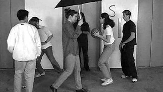 Image Credit