
Web forms are the unsung heroes of your inbound marketing efforts, whether you know it or not. They are a mighty tool in your online-marketing campaign that should be used in your lead-generation efforts to maximize conversions to the hilt. Of course, as with everything in business, knowing precisely how to use them to your advantage is the key.
Forms can impact your conversions in one of two ways: They can either increase or decrease them. There are many factors to take into consideration that can impact your conversions. Anything from the length of the form (which ties into complexity and readability) to its format and the type of copy you use are important factors that influence the success of your forms.
The next time you’re worrying about deciding how to handle your forms on your landing pages, don’t. Just read our handy tutorial to maximize your web-form conversions.
How Long Should Forms Be?
The most basic question you have to ask yourself is, how long should your web forms be? In general, it is in your best interest to make your web forms as short as possible. There are exceptions, but studies have shown that shorter web forms actually increase your conversions. This relates to friction in the user experience: The more fields you have on your forms, the more you create resistance to successful conversions.
A 2007 study from Imaginary Landscape about contact forms on its website yielded some highly interesting and eye-opening results. In the study, an 11-field contact form was compared to a contact form that had only four fields. Guess which one was more popular with site visitors?
Short forms resulted in 160% higher conversion than more complicated forms.
This is hardly a lone study on the issue. Another study compared web forms that had five, seven and nine fields. Again, guess which did the best, conversion-wise? The five-field form had the best conversion rate at 13.4% while the seven- and nine-field forms had conversion rates of, respectively, 12% and 10%.
Clearly, by making your landing page’s forms longer and more complicated, you are depriving yourself of more business.
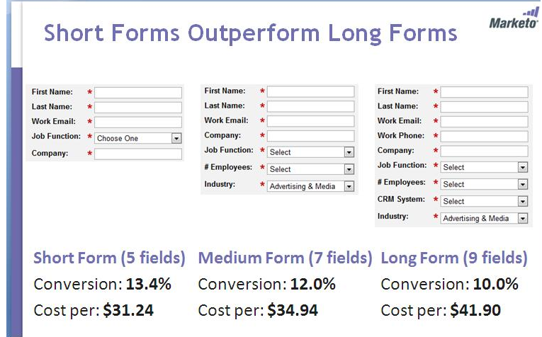
When people see longer web forms compared to shorter web forms, they simply get turned off because the friction increases so much.
Are There Exceptions to the Length of Web Forms?
You’ve heard the old saying: There’s an exception to every rule. In the case of web forms for your landing page, this holds true as well. It all comes down to the types of leads you are hoping to get with your forms.
It’s essentially an all-important tradeoff between the quantity and the quality of the leads that you will generate.
See, when you make your forms shorter rather than longer, more people will naturally be willing to fill them out. Therefore, you end up receiving more leads. On the flipside, the quality of your leads will be better when your site visitors are willing to complete a greater number of form fields and also offer more detailed information about themselves and their needs.
The most vital factor to help you decide how long to make your forms is determining how to reach that legendary sweet spot of the ideal form length. You can do this with some good, old-fashioned A/B testing.
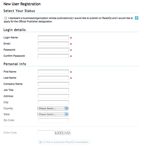
If you want more leads, test a landing page with a short form, then the same landing page with a longer form. When looking at the results, check if the shorter form got more conversions. If it didn’t, then it’s time to look at other factors or elements of the landing page. These might be having an even bigger impact on your conversions than the form length.
If, on the other hand, you’re looking for higher-quality leads, then just run an A/B test on a landing page featuring longer forms, having different kinds of fields for different information you want to collect. During your evaluation of the results, be on the lookout for lead-quality indicators.
You should be noting that the number of overall leads drops while the quality of leads and the ease with which you can qualify them increases.
Sometimes, Long Forms Are Okay…IF You Offer Killer Content in Return
Continuing the there-are-exceptions-to-every-rule theme from above, there is a situation where you can get away with having longer web forms on your landing page. That’s when you give your leads killer content in exchange for filling out more fields.
It just stands to reason anyway: If you offer your leads more specialized content, then they are willing to spend just a little bit more time in filling out a longer form that has a greater number of fields. Of course, the key is to know exactly what passes for killer content.
Put another way, you can’t put a pitiful ebook that’s less than 10 pages long and offers no practical advice and expect your leads to fill a long form to get it.
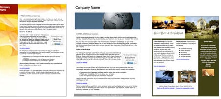
Here are some examples of truly awesome killer content that justify longer web forms on your landing page:
1.Killer Newsletters:
If you can create kick-butt newsletters that provide nothing but value for your leads, then they’ll gladly spend a little extra time in filling out a longer web form. Killer newsletters share the following characteristics:
- They’re interesting and provide actionable advice for your readers
- They contain additional value elements like stats or Q&As
- They have relevant subject lines that tell your readers immediately what they’re getting
2.Killer Case Studies:
Providing stellar case studies that are chock full of highly detailed information about how your product or service solved customers’ problems can persuade leads to fill out longer forms. There are also similar elements of killer case studies. These include:
- Aligning the case study to your buying process
- Using bullet points and subheadings to highlight the most vital parts
- Offering data and evidence to make the case that your products and services improved customers’ businesses.
3.Killer Ebooks:
Another way that you can convince leads to fill out a longer web form is by providing a killer ebook. It’s important that you include these important elements of killer ebooks in your ebook. These are:
- A catchy title to grab the attention of your leads
- Information that your leads can use in a practical way
- Graphics and charts to complement that useful information.
Tips for Writing Stellar Copy for Web Forms
The type of copy you include on your web forms has a massive impact on your conversions. When you fail to write this copy effectively, you’re hurting the number of leads and, ultimately, profits you can make. So how do you write successful copy for your web forms?
You need to give your leads an extremely persuasive reason to sign up and fill out your forms in the first place. Without a convincing hook, you won’t get as many leads as you could.
For example, you have to be very clear in what you write, so that your leads understand exactly what they’re getting when they sign up. Instead of just writing that leads will receive updates, write copy that makes clear that your leads will get case studies, podcasts and how-to guides.
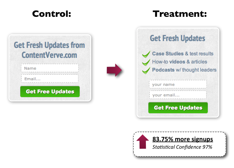
In addition, you have to direct the attention of your site visitors to the benefits they’ll get by providing you with their contact information. Do as much as you can to get their attention away from the actual process of filling out your web forms. As opposed to simply prodding leads to join your subscriber list, for instance, write copy that explains that they’ll be getting free tips in return for providing their contact information.
You also have to think about about what elements to actually include in your web forms. For instance, it’s beneficial to include the headline, button copy, a bulleted list/sub-header and a privacy policy at the end.
- The headline should express a clear-cut benefit or value
- The button copy should clarify what leads will get in return for their clicks
- The bulleted list/sub-header should help to clarify both relevance and value
- The privacy policy should make clear to leads that their information will be 100% safe from security breaches.
Format: Should Web Forms Be Single- or Multi-Column?
This is actually one of the easiest questions to answer in setting up web forms so that they maximize your website’s conversions. Web forms should mostly be single-column, and the research into how people use websites supports this. If the site’s responsive, then single-column forms will work better on mobile devices. Of course, there are exceptions to this rule, too, based on the content of your form.
However, in most situations, you definitely want to rely on a single-column web form. Single columns allow lots of space for any changes to any text inside of form labels, should that be necessary. Readers will also enjoy the uncluttered presentation that a single-column form offers because that makes it easier for them to read.
A common usability problem can appear when you’re deciding on how to configure the fields in your forms. Whatever you do, don’t configure your fields so that their field names show up inside of the fields themselves.
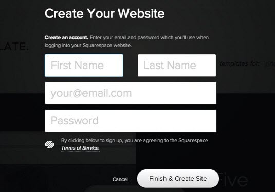
The problem with placing field names inside the fields is that the help text disappears as soon as your buyer clicks inside the field. Once it disappears, your buyer has to force himself to remember what he was supposed to put in there, which can be difficult. As a result, he’s got to click elsewhere to be reminded. This is pure friction and it is unnecessary.
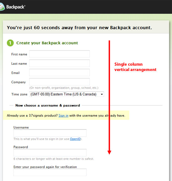
Research also shows that site visitors just don’t do very well when it comes to dealing with the increased complexity of multi-column forms. Usability drops from their perspective, as they either got confused and thought the second column was an alternative to the first column or simply thought that it was okay to just ignore the second column altogether.
The bottom line from studies like these is that it is best to avoid the ensuing problems that come from having multi-column web forms on your site.
Can You Honestly Get Away Without a Landing Page?
This may be a less popular decision when it comes to a landing page, but you can also consider designing a landing page without the presence of any web forms at all. You don’t always have to include one if you prefer a really slimmed-down landing page instead or if you can somehow still market your brand and contact information to your leads without capturing their information.
You could always, for instance, give away free white papers or ebooks that both further your brand expertise and exposure, so long as each and every page has your company’s brand identity and contact information. If you create exceptionally high value inside of the pages of free white papers and ebooks, you will still get more site visitors and leads as a result.
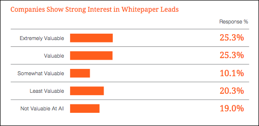
Another example could be for product brochures and other items where you don’t provide leads with advice. With product brochures, you’re already advertising your company’s products, and if they satisfy your buyers’ pain points, they’ll come back to you even if you didn’t ask for their personal information on a web form. So done well, this could be a win-win for your company.
Another Alternative to Think About: HubSpot’s Smart Forms and Progressive Profiling
Wouldn’t it be amazing if forms can be responsive to the buyer personas and needs of your leads. Enter HubSpot’s Smart Forms and their progressive profiling feature. What do leads hate the most? They hate it when questions on web forms are not tailored to them or when said forms ask repetitive and therefore pointless questions. That’s a sure way to drive away leads instead of qualifying them down your sales funnel.
HubSpot’s Smart Forms are the answer to this dilemma. Appropriately named Smart Forms, they permit you to change the specific information that your web forms collect from site visitors as they experience your site over a period of time.
Here are the benefits of Smart Forms’ progressive profiling:
- Improve Initial Conversions:You simplify the process of starting a relationship with your prospects since your forms ask just a few important questions when they convert. This increases the number of leads you’ll get.
- Ask Different Questions Every Time They Visit:You can identify fields on your forms that’ll be replaced with new questions every time your lead visits your site. This works to personalize your marketing efforts and collects higher-quality lead information.
- Ask Correct Questions at the Appropriate Time:After your leads have been site visitors a few times, you get to tailor questions to them that are more relevant to their position in the sales process.
To help you get a better idea of the process, here’s how it breaks down:
- The Visitor Becomes a Lead:The first time your lead visits, you show them a brief form that only asks for basic contact details.The lead then goes straight into your contact database, as does the record of the time they spent browsing your site up to that moment.
- The Lead Becomes a Marketing Qualified Lead or MQL:You should show your leads more targeted questions when they visit your site the second time around. They’ll only have to enter their information one time because HubSpot forms retain this information. Through this consistent targeting of your forms, you’ll progressively obtain greater lead intelligence.
- The MQL Turns Into a Sales Qualified Lead or SQL:The more your lead interacts with your marketing content, you should keep tailoring your forms to get more targeted intelligence. If the lead responds to a question in a way that’s vital to your business, you can tell anyone on your team as it occurs. For instance, as soon as somebody turns into an SQL, you can email your sales guy.
Conclusion
At the end of the day, you need to ask yourself if your landing page’s web forms are helping, not helping as much as they can or actually hurting your company’s business. Web forms are crucially important to lead generation and moving leads down through your sales funnel. With good forms, you stand to capture and qualify great leads that can turn into actual customers; with bad forms, you will lose money, business and opportunities.
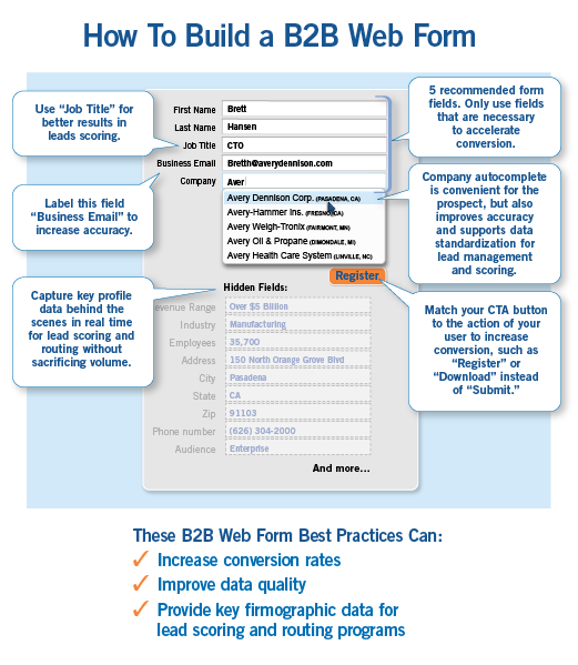
Web forms should be shorter rather than longer, but just remember a critical detail. Shorter forms will indeed get you a greater quantity of leads, but the quality will be poorer than leads you get with longer, more complicated forms. If you do decide to go with longer forms, just keep in mind to offer your leads killer content they can’t get anywhere else in return. Good examples are always killer newsletters, case studies and ebooks.
When writing copy for your forms, make sure to keep things clear and as persuasive as possible while steering clear of multi-column forms. You don’t want to confuse your leads when they’re already willing to provide you with personal information. When you’re offering non-advice stuff such as a product brochure, not having a web form that leads have to fill out may be more appropriate.
Taking all this into account when you create your next web form will give you killer results.


