So…what makes a website really beautiful? We mean the kind of website where your buyers are just instantly impressed by its aesthetic qualities. You know…the kind of website where it’s love at first sight, and your buyers form a highly positive first impression that ends up being long-lasting. Any guesses?
We know what establishes beauty in the eyes of your buyers, and we have science to back us up. According to the research, two, separate scientific principles play a huge role in the perception of website beauty on your buyers:
- Thin-slicing
- Prototypicality
On the concept of thin-slicing, we can reference none other than the esteemed psychologists, the late Dr. Nalini Ambady and Dr. Robert Rosenthal, both of whom coined the phrase, “thin-slicing,” as early as 1992.
Thin-slicing is basically when you’re able to find patterns in events even when your experience with the event lasts for only a very short time (read: a thin slice of time). So you’re able to correctly guess the outcome of the event with more accuracy than can be explained by mere chance.
On the issue of prototypicality, we refer to this seminal study by Javier Bargas-Avila, Alexandre N. Tuch, Eva Presslaber, Markus Stoecklin and Klaus Opwis, found inside the pages of the International Journal of Human-Computer Studies.
In a nutshell, users (read: your buyers) form their first impressions of your B2B website by how simple and prototypical it appears to them.
So what’s the big takeaway from all of this? Human beings including your buyers form impressions of events and things, including your B2B website, instantly when being exposed to an experience. This first impression is long-lasting and continues to influence their opinions long thereafter.
In this eye-opening and stimulating blog post, we show you how you can beautify your B2B website so that your buyers are left breathless by its beauty from the first moment they visit it and gaze upon it. This naturally increases the chances of conversions, too.
A Primer on Thin-slicing
Thin-slicing is a psychological as well as philosophical phenomenon that helps to explain how and why your buyers can form an impression of your B2B website in a really short period of time. This impression then has a long-term influence on their perception of your website.
If they like what they see in the first split-seconds…from the get go…they will have a more favorable opinion of your website than if they didn’t like what they saw from the beginning.
Of course, the more favorable their opinion of your website…the greater the chances of conversion.
Thin-slicing is a relatively new concept that was coined by the aforementioned Drs. Ambady and Rosenthal. In 1992, the term appeared for the first time in Psychological Bulletin, which is a peer-reviewed academic journal.
The phenomenon is centered around people only using short moments of observation to correctly predict outcomes later on. Call it intuition, call it a gut feeling—call it whatever you want, but it’s repeatedly been shown to have a very solid foundation.
Take this example from the Journal of Experimental Social Psychology. Two different experiments showed that thin-slicing is superior to cognitive deliberation when it came to detecting deception. Clearly, thin-slicing is a powerful and useful phenomenon that everyone is capable of.
Famous people like photographers Henri Cartier-Bresson and Alfred Eisenstaedt have alluded that thin-slicing, or, in their terms, making fast decisions with only little information, was essential to their craft.

Then, we have author Malcom Gladwell, who wrote the seminal book on thin-slicing called Blink: The Power of Thinking Without Thinking. The book details a plethora of cases where people from various walks of life could very successfully make judgments about people and situations by observing them for only a short period of time.

So How Does Thin-slicing Relate to Making Your B2B Website More Beautiful?
Alright, so now you’re more than familiar with what thin-slicing is all about. But how does it relate to B2B site design?
In a study within the pages of the Journal of Consumer Psychology, researchers Laura Peracchio and David Luna say that science suggests that:
“80% of web surfers spend only a few seconds looking at a website before moving on to the next site, and that the average web surfer is unlikely to look past the first two pages of a site.”
When buyers visit your website, they, too, can tell within a very short and quick span of time whether or not they feel that your website is attractive.
Studies show that there is a definite link between websites that are deemed beautiful the first time buyers see them and a greater conversion rate.
Knowing this important piece of info, it’s your job to design your B2B website in such a way that the likelihood of buyers who find it beautiful increases. Maybe it’s arranging elements around your homepage or landing page differently; maybe it’s changing around the colors on your entire site; or maybe it’s just choosing a different font for your headlines.
Whatever the choice will be, it certainly pays off to invest some time to think about how to arrange the layout of your site, so that your buyers will instantly find it more beautiful.
Let’s look at some tried, tested and true ways that you can beautify your B2B website quickly and effectively:
1. For starters, you should get rid of bad stock photos and use custom imagery, illustrations and iconography. By taking more time with your images, you’re able to convey a high degree of authenticity and uniqueness to your buyers right off the bat.
2. You could also use more white or negative space as a visual aid to direct the line of sight of your buyers. White or negative space is ideal for framing or highlighting the really important elements on a page, such as your copy, headlines or call to action buttons.
3. Minimalism is also a surefire way to make your website more instantly attractive to buyers. After all, research again confirms that simple websites are the most effective ones. So whether you choose to represent this minimalism in design by way of the latest in flat design, parallax scrolling or just bold and simple colors, make sure you keep the look of your site uncomplicated.
4. Since 95% of all web design is typography, it obviously pays to also be thoughtful when it comes to choosing the font on your B2B website. Much of the content on your site is text, so you should choose fonts that are conducive to both readability and legibility, not fonts that you believe look “cool” because they’re fancy.
5. Many studies have been done that show the correlation between choosing the right colors and getting your buyers to behave in a certain way and convert. When beautifying your B2B website, you should also pay close attention to the colors that you choose because they can mean different things to different people. Here’s a great resource about color theory for web designers that you can sink your teeth into.
6. Mega images (assuming high quality photography is uses) almost always cause a good first impression.
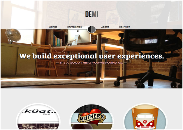
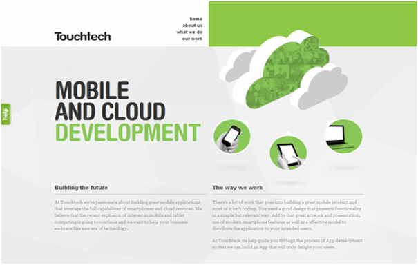
For inspiration, here are some examples of beautiful website design:
Now that you know that thin-slicing involves your buyers looking at your B2B website briefly, forming a first impression, and then deciding whether or not to buy from you, we can move on to another highly vital aspect of making your website beautiful: prototypicality.
A Primer on Prototypicality
Prototypicality refers to what your buyers are generally expecting when they visit your B2B website.
You see, the thing is that many buyers—after a couple of decades of the Internet being widely available—are now used to seeing websites in a certain way. This is based on their own experiences of websites they’ve visited throughout their lives.
If your B2B website design is so appalling that, for instance, your navigation menu is on the footer of the homepage, then you’ve violated prototypicality with your site design. Another example could be if your B2B website is riddled with a bunch of flashing animations.
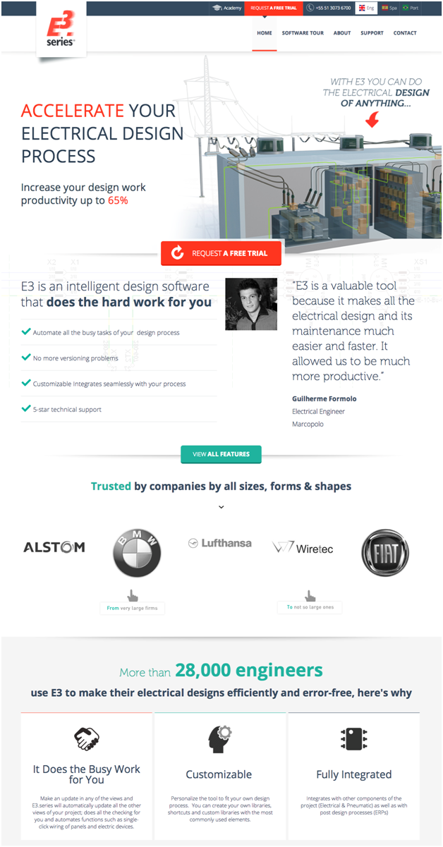
Cim-Team Latin America does it right because it sticks to the conventions their buyers are already used to. Their buyers can quickly and easily access the information they're looking for in the places they're used to finding it.
This means the following:
-
Your navigation menu at the top of the page
-
A blog that’s constantly updated
-
Clear goals on each page
-
Site copy that’s crystal clear
-
Call to action buttons that are persuasive and easy to spot
-
Valuable, downloadable content to help bring buyers closer to solving their problem
-
Trust-building elements
So How Does Prototypicality Relate to Making Your B2B Website More Beautiful?
There’s one, prominent study that established that prototypicality is a major factor in how your buyers form their first impression of your B2B website. This impression is long-lasting, as they continue to carry it around with them to determine if your site is trustworthy or likeable. In other words…if they will do business with you or not.
According to this 2012 study entitled -The role of visual complexity and prototypicality regarding first impressions of websites: Working towards understanding aesthetic judgments-
“your buyers will form their first impression of your B2B website within 17 miliseconds”
Imagine how long you spent on designing your site…only to realize that your buyers actually use a more intuitive way—rather than a cognitive one— deciding if they like your site or not (which will influence whether or not they will do business with you).
The users in the study relied on two, distinct factors when deciding whether they found a website beautiful or not: prototypicality and visual complexity.
Visual complexity was defined as how complex the site was based on the subjective perception of the users in the study.
The study determined that websites that were low in visual complexity, yet high in prototypicality, were deemed the most attractive by the users in the study. In other words, minimalist websites with fewer page elements that resembled websites the users were already used to seeing were the most visually attractive.
Another study, this one by Harvard University, determined something similar. It found that websites with greater visual complexity were less liked by the users in the study.
Again, simplicity wins out when it comes to what site users find beautiful in web design.
Here’s how to use the extremely valuable and insightful results from these two studies to make your B2B website as beautiful as possible, which will be more likely to create instant, positive responses from your buyers and greater conversions, too.
Understand that your B2B website should be prototypical—that is, in keeping with the best practices of web design. This will ensure that your site looks like the majority of other sites that your buyers have navigated their whole lives.
Second, understand that you should make your site as minimal and clean as possible by removing clutter and visual complexity as much as possible.
Your B2B website should then, ideally, feature the following to be prototypical:
- User-friendly hyperlinked text
- Headlines to break up long content
- Skimmable and easy-to-read content
- Placement of visuals to complement text
- Text blocks that are appropriately spaced
- Text and typography that are readable and legible
Your B2B website should also feature a minimalist approach like flat design to reduce the number of elements on pages and appear less visually complex.
Conclusion
As you can see, creating a beautiful B2B website needs to be high up on your priority list. Thanks to a phenomenon like thin-slicing, your buyers can make a split-second judgment and decide if your site is attractive or not.
Talk about making lighting-quick decisions in only a small window of time. While this process of thin-slicing is intuitive, to be sure, that doesn’t mean that the first impression of your buyers should be discounted. Only someone who doesn’t care about getting more conversions and revenue would do that.
As the above studies from experts and luminaries in the field have illustrated, thin-slicing is very real. Your buyers will make quick judgments about your B2B website—that they will carry with them consistently—so you have to consider factors like the prototypicality, visual complexity and overall simplicity of your site while it’s still in the design stage.
Only then will you be able to build a B2B website that many of your leads and buyers think is attractive.
Instead of losing potential conversions and leads with a very mediocre B2B website, we strongly recommend doing it right the first time around. Get a designer who has an eye for beauty, but who also understands the science behind what your buyers find beautiful.
Design your B2B site like this, and expect to enjoy greater conversions and revenue. And there’s nothing more beautiful than that.
This means putting site elements where your buyers expect them to be and also reducing the number of overall site elements to create a simple and minimalist layout.
