Anyone who's ever visited any website will tell you this: navigation is important. While this statement seems obvious enough, it is shocking how many websites are still being created with no real thought given to how navigation would work. Viewers are faced with questions like: where am I? What am I looking for? How did I get here? Questions which could easily be avoided by using a proper website navigation system.
Taking your time in organizing your website's navigation will ensure that your viewers can easily reach the information they want. This makes them more likely to enjoy their time on your website and refer to it in the future. If you're thinking of designing or re-designing your website, stop and consider the elements of good website navigation.
1. Logical
Navigation should be easy. This means that under no circumstance should you make your viewers stop and think while they are navigating around your site. If your site architecture is not laid out properly, your viewers will be confused about how to reach the information they are looking for. They will be too busy questioning how things work, which page to visit first, what path would be better to take. To avoid that happening, you should be sure that your main navigation is obvious and self-explanatory.
Similarly, don't include many different paths leading to the same page. This will confuse your viewers and frustrate them. Test your website's navigation out on a friend. If at any point you need to explain to him where to click or what to do next, or he has trouble finding information on his own, then you need to rework.
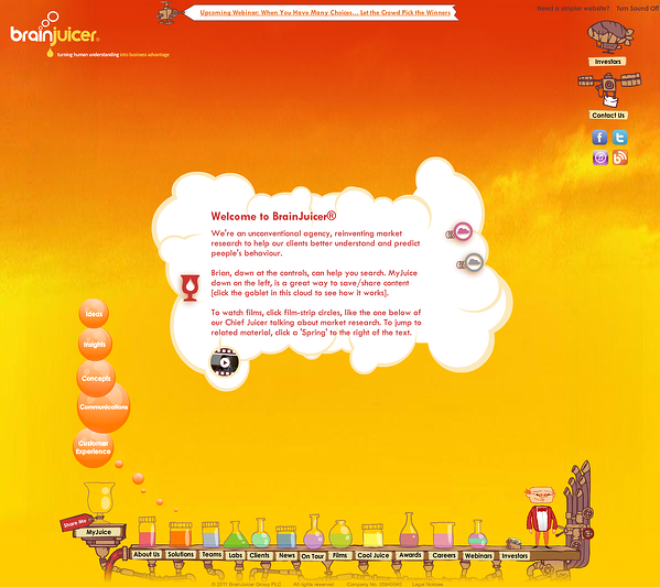
BrainJuicer missed the mark on this one. Let’s start off with the obvious: my lord their website looks cute! It’s adorable, with the little scientist man on the lower right corner, how the bottles fill up with liquid when you hover, that nice plane advertising their upcoming webinars, and I don’t know if you caught this, but you can actually move the cloud around by dragging it! Eye-candy indeed. Now let’s see beyond that. I counted 32 clickable buttons on their homepage (see if you can find more). One of the buttons is called “BrainJuicer Bytes: The (Honest) Byte About Dishonesty”. As a first time user, I don’t know what that means and I certainly wouldn’t click on it. They have 2 different buttons leading to the Awards section, 2 different buttons leading to the Investors page, and a whole lot of buttons that just don’t make sense.

2. Intuitive
The best way to make a product people will love is to consider how they think. The same principle can apply to navigation. Your website's navigation has to be intuitive and based on how viewers interact with websites. While everyone is going on about thinking outside the box and innovating, I want to say this: convention is key.
Conventional does not mean boring, you can still create beautiful and highly functional websites with conventional navigation. Conventional just means that it is something people are used to seeing and using. It means that your viewers will have absolutely no trouble finding what they are looking for.
As such, there are things you should keep in mind. The main links should be easily identifiable. They should be located either on top of the page, or on top of the side column. The currently selected link should be clearly distinguished from others so that viewers can tell what page they are on at all times.
One highly practiced convention is to create a Services button in your main navigation menu. This is a good practice as a viewer can directly understand where to go if s/he is interested in seeing what you have to offer. But, why don’t you make it even easier for them? If (and only if) your company’s services allow for something like this, why don’t you pick the 2 or 3 main services that your company provides and put those (in VERY clear terms) on your main navigation. For example, if you’re a design agency that specializes in animation and digital branding, on your main navigation bar you can add in a link Animation and another to Digital Branding. Now you’ve made the road for your customer one step shorter.
This wouldn’t work for, let’s say, a design company that offers animation, digital branding, print branding, publication design, photography, video editing, and silk-screen printing. Now you’ve got too many buttons and you need to group them under Services. If you’re not sure which way to go with, ask yourself “Will this make it easier for my customer to reach what they are looking for?”
If convention is not your thing and you insist on creating something completely new, remember to always be helpful, not just cool. Just because something looks great doesn't mean it has a place on your website. Whenever you want to play around with your website's navigation, ask yourself 'will this add value to the navigation?'. If the answer is yes, then use it. If not, discard and move along.
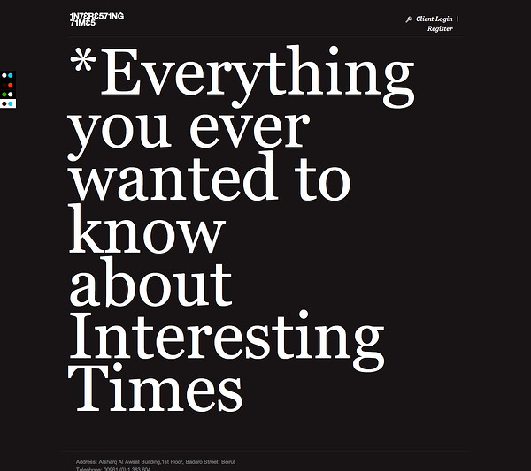
Interesting Times chose to go for something cool. Their homepage looks very classy with their big white typography and black background. You could even change the colors if you want to! But... where is the navigation? If I wanted to see their services, what do I press? How can I reach their About Us page. More on that, what do they even do?

3. Organized into Main and Sub Navigation
It won't do to have links to all the pages on your website on the main navigation menu. It would result in a catastrophe, both visually and functionally. Your user would be overwhelmed by the amount of links to choose from and would not understand the overall organization of your site. It would be better to dissect all the pages in your website and logically organize them into main and secondary pages that go into main and sub navigation menus.
Let's consider a grocery store. All the items are divided into isles. One isle contains meats, another produce, another dairy products, etc. Within the dairy products, you'd find cheese, milk, yogurt, etc. Within the cheese, you'd find cheddar, brie, swiss, etc. Your website is the store. The main pages are the isles. The secondary pages are divisions within the isles. The tertiary pages (if they NEED to exist) are the divisions within the divisions.
Organizing your site's architecture in this way will ensure you have a logical and intuitive navigation. The main pages would be in the main navigation menu, while the secondary pages would be in a sub-menu that would either drop down from the main menu, or is located in the side column of the relevant page.
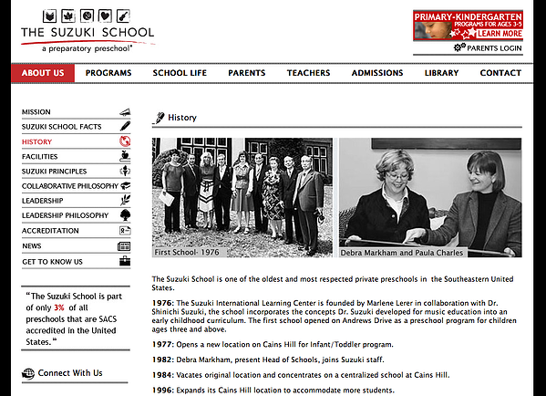
The Suzuki School can teach us a thing or two about organization. This is the About Us page. There is a sub-menu in the left column with the different topics within the About Us umbrella. You can very clearly tell which page and sub-page we are on because they are highlighted in red. All in all, I could easily find my way around their website and find the information I’m looking for.

4. Don't Open Internal Links in New Tabs or Windows
Main and sub navigation links should always open in the same tab in your browser. Users like to be able to go back by pressing the back button, and move through your website smoothly by pressing the other links. Having a new tab/window open every time the viewer clicks on a link will create a clutter of tabs/windows, leaving your viewer both confused and frustrated.
That being said, this is only limited to links in the main and sub navigation menus and should not be applied to external links present within your content. External links should open in a new tab so that the viewer can check it without losing your website.
5. Advice: Create a Website Blueprint
In order to have a clear, organized site architecture, you have to structure it in advance. Create a website blueprint of how the different pages are laid out and how they follow and link to each other. This would create a map of the entire user journey. You'll be able to spot any navigation problems or page confusions easily and it would save you a ton of work for when you move to implement.


