Abstract artists cheat. They create aesthetically beautiful art and ask you to interpret it for yourself. They can pool all their efforts into making their art beautiful because they don’t need to worry so much about communicating a message (since the message is almost always subjective).
Unfortunately, when it comes to web design, this does not pass. Your website needs to be as clear as it is beautiful otherwise your viewers will not respond to it. Having breathtaking designs with illegible typography will confuse your viewers and turn them off.
Using web fonts cleverly will help you avoid all of that. Here are four reasons why:
1. The Font Hierarchy Helps Establish a Message Hierarchy
Web fonts can help you define the hierarchy of your content in two ways: size and color. The bigger the font is, the most attractive it will be; second biggest, second most attractive, and so on. This means that you have your viewers read your information from most important to least important just by using font sizes.
Let’s talk about color now. Imagine a parking lot that contains one hundred cars. 99 of those are big black SUVs and the last car is a bright pink Mini. Which will stand out the most? Using a contrasting color can help you highlight important information to direct your viewer’s attention to it. You can do this simply by changing the color of a headline.
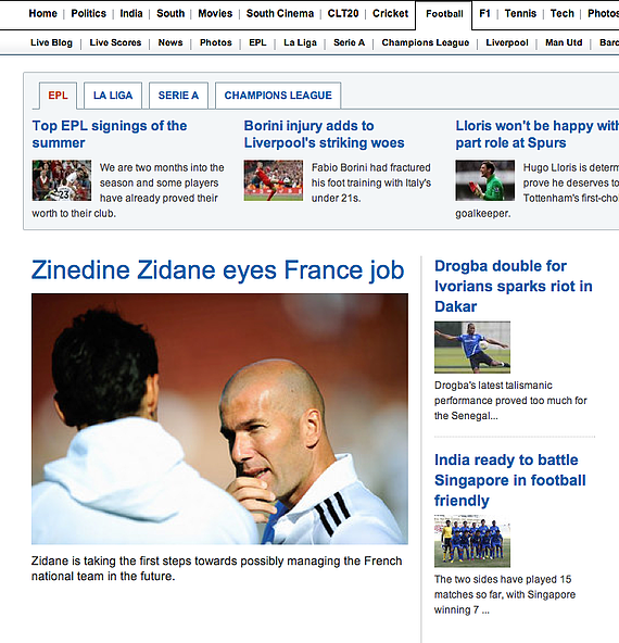
A good example for this is IBN Live. Even though it is not at the top of the page, the first thing we read is “Zinedine Zidane eyes France job”. Next come the titles on the right of the image, then the titles above. They’ve managed this hierarchy just by changing the font size. This simple variation made it possible for them to bring us the most important information first.

2. Different Font Types Help Differentiate Between Types of Messages
In any website, there are several types of content: main, secondary, and navigation. To quickly define them, main content is the one that directly relates to the page it is on. This is where you present the information you want your viewers to see when they are on that page. Secondary content is the kind of content you find in the side columns. It is usually comprised of links to related stories, CTAs, tags, etc. Navigation is self-explanatory; it is the content viewers navigate with. It is very important that from the first second, viewers are able to distinguish between different types of content.
Using typographic styles to differentiate between the type of content makes your website more clear and easier to understand.
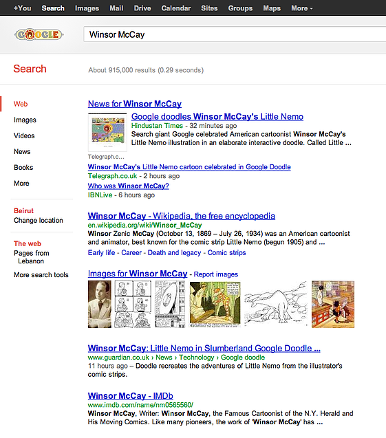
Here’s an example of a website you’re all familiar with: Google. Notice how their headers are an in underlined blue font, bigger than any other font on the page. They have 3 elements in the main content that are of the same size: the website names, the copy, and the time that the page was created. They differentiated them by using color: green for website names, black for copy, and gray for time. I’ll leave it up to you to pick out the other differentiations. Perhaps you can share them in the comments?

3. A Good Typography System Will Drive Consistency Between Pages
You’ve already differentiated your types of content so that your viewers understand the different aspects of your website. Now let’s apply the same differentiation across all the pages of the website. Let’s say you’re using a bold red typeface at 20 px for your navigation, a regular black typeface at 16 px for your main content, and a regular black typeface at 12 px for your secondary content. If you maintain these elements across all the pages of your website, it would be very easy for your viewers to tell where your navigation is, what your main content is, and what the secondary content is, no matter which page they are. Your viewers will be able to easily understand your content, how it is structured, and how they can navigate through it.
4. Combining Stylized Fonts with Standard Fonts Can Create a Nice Designed Effect
There’s nothing more attractive that a good balance. Sweet and sour, dark and light, a nice cold icicle on a blazing hot summer’s day. The contrast of the elements makes them sophisticated and charming. How can we apply this to web design?
By using a clean, easy to read font for copy with stylized headers, you can achieve that charming balance and give your website a sophisticated and well designed feel. Typical content management systems can allow up to 6 different types of headers, from H1 (most important) to H6 (least important). The less important they get, the less luxurious your type choice should be.
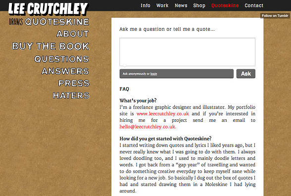
The example I want to use here is from Quoteskine. I want to note the use of a very clean serif font for most of the elements and the use of a sketch-y font for the navigation on the left. The mixture gives the website a lot of personality and –if I may use the word- pizzazz.

My Advice
Ask your designer to use a worksheet to define font styles for all the elements of your website. The elements include but are not limited to headers (H1 to H6), main content paragraph text, links, navigation, paragraph text in side column, and buttons. For each of these elements define the typeface, style, weight, size, and color of the font. Then setup sample content pages that instruct how to use the hierarchy. This will come in handy specially if there are many contributors touching your site. The last thing you want is to have different pages looking entirely different because headers or some areas of content were manually modified. By having a good font hierarchy and sample content with instructions, you will better be able to keep consistency.
A well-defined font hierarchy is instrumental to communicate your message to your viewers. To communicate, most times a good font hierarchy is much more effective than a complex and sophisticated graphic design.


