
From reading our first post on gestalt b2b web design principles, you know that gestalt forms the basis for the various principles and laws that designers—web or otherwise—follow in their work. In this third installment in our exclusive gestalt series, we want to tell you all about three concepts that are interrelated and equally important. They are proximity, uniform connectedness and good continuation.
So far, we’ve gone over the figure-ground relationship and simplicity or minimalism in design and how these apply to designing a B2B site. Now, we’re taking what we’ve learnt from earlier entries in the series and building on them.

Proximity, uniform connectedness and good continuation are deceptively simple. After you understand what they’re all about, you’ll say to yourself, “Ahhh, that does make sense!” Nonetheless, you’ll be quite shocked at how hard it is to spot these design principles in any given layout or structure.
It takes a truly skilled web designer to understand these concepts, but that’s exactly whom you want designing your B2B site.
Without further ado, here’s what you need to know about proximity, uniform connectedness and good continuation.
The 411 on Proximity, Uniform Connectedness & Good Continuation
The best way to immediately get what we mean when we talk about proximity, uniform connectedness and good continuation in design is to compare that concept to a paragraph. That’s right: Your basic paragraph that you’ve encountered in any piece of writing that you’ve ever read in your life. A paragraph…just like this one, in fact.
Know that the only reason why you can easily absorb and understand what you’re reading in each and every paragraph in this blog post is because of the use of three very vital gestalt-design principles.
The layout of the paragraphs in this blog post relies on it respecting the laws of proximity, uniform connectedness and good continuation.
Consider, for a moment, what any given paragraph would look like without the laws of these three gestalt principles in full effect.
It would naturally be a disgusting mess that wouldn’t lend itself to easy reading or comprehension by any means. Take a look at this disgraceful example to see what we mean:

Obviously, it goes without saying that the above paragraph is completely unintelligible. What makes it so is the fact that its words are jumbled, the spacing or formatting is not uniform, and there’s clearly no sense of practical continuation of any kind. In other words…it’s an utter mess.
If you think about it, you depend on these three laws of gestalt in all aspects of your everyday existence, whether in a tangible or conceptual way. Your B2B site designer should have a fundamental understanding of every one of these principles. Let’s take a much closer look at each one of them.
Proximity Matters
Proximity’s definition can’t get any easier than this:
Objects that are near to each other are seen as being more related than objects that are spaced farther apart.
This principle is the easiest since it doesn’t have to depend on any external structure or arrangement. In fact, each and every one of us automatically gets that the most efficient way to show relations is by manipulating proximity.
In the example below, you can see that, the closer that objects are, the more it’s perceived that they’re related in some way.
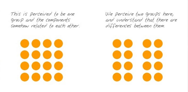
Okay, that was straightforward, but let’s go to the next example that introduces another gestalt principle into the mix (which is not part of the three we’ve been discussing, though). Note how similarity is introduced, yet it is overshadowed by the perception of proximity.
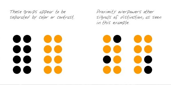
Here, you can see that you would naturally relate the elements in each group based on their proximity to each other, not on their color. The ways we perceive objects are constantly competing with one another to come out on top. The person who designs your B2B site must know the relative advantages of each way in order to be able to choose the best approach for a specific circumstance. The next gestalt principle in this lesson is even more significant than proximity.
Uniform Connectedness Can’t Be Ignored
Uniform connectedness is extremely noticeable when you’re talking about relations. It can be defined as:
The reality that objects that are associated by uniform visual qualities are seen as being more related than objects that aren’t connected.
Like the aforementioned law of proximity, uniform connectedness allows us to see groupings instead of just singular and individual elements that aren’t related.
To help you understand uniform connectedness very easily, just think of drawing a box around a collection of objects to signify that they’re related. That’s it. That’s the concept in a nutshell (or in a box, if you will).
You have another option here, though. You can instead choose to draw some connecting lines or any type of connecting shape from one object to another in order to illustrate uniform connectedness. Take a peek at the example below to see this played out in all its visual glory:
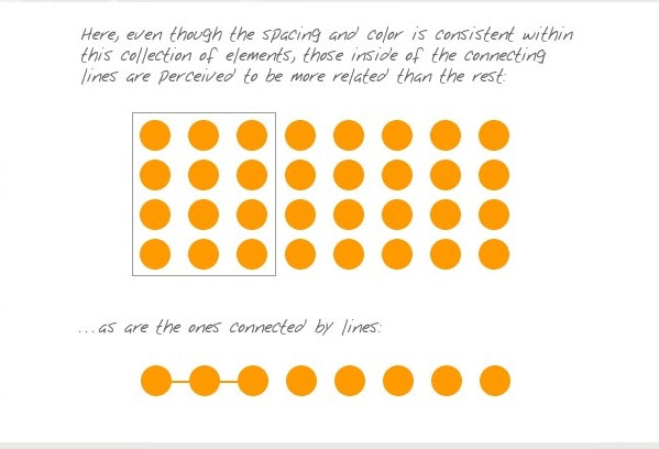
Note how all of the circles are equally spaced and obviously the same color. Yet, by drawing a box around the nine on the left, you’ve effectively indicated that they’re more closely related than the rest of the circles in the entire group. The same can be said of the connecting lines between the circles.
How This Specifically Applies to B2B Web Design
Uniform connectedness is typically used in B2B web design to indicate context. One of the easiest ways to see this is by simply taking a look at the menu bar of any B2B site to observe the tabbed navigation.
When you’re faced with elements that are separated both visually and by proximity, such as the navigation links and the copy on the page, the most efficient way to convey relation is by enclosing the different elements. Take a look at this gorgeous example of tabbed navigation:
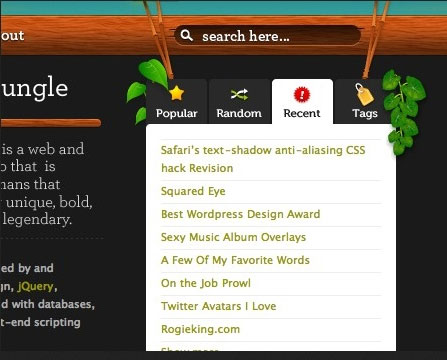
As you can see, because of tabbed navigation’s enclosing effect, it’s impossible to miss the significance, which is that the navigation link and page copy are closely related to each other.
An Example on Connecting Lines
We can show the connecting lines principle very handily by an example that involves both speech and thought bubbles. Just look at the image below…you can easily tell that it makes no sense because there’s no attribution provided to give context to the text.

Let’s correct the picture according to the rules of gestalt design and admire what we get:

Now, the image makes a lot more sense since it just got a uniform-connectedness boost by way of the connecting lines that are apparent. Now, the reader can understand that text belongs to the man and the woman.
Since the line goes from the speech bubble to the woman, we know that these words are being spoken by the woman. Same goes for the man: Because of the bubbles going from his text to him, we know that’s what he’s thinking.
However, you’ll really be pleasantly surprised at what’s coming up next. Sure, even though the thought bubbles from the text going to the man demonstrate uniform connectedness, they also demonstrate something else.
That would be the third and final component of gestalt in this week’s series. And what a perfect segue that is to…
Good Continuation
Let’s dive right into the definition of good continuation:
Elements that are arranged either on a line or a curve are seen as being more related than elements that are not on either the line or the curve.
Let’s connect this to the example of the man and his thought bubble. If you carefully look at the bubbles, they’re actually set on a gentle curve as opposed to a straight line. Thus, thanks to the principle of good continuation, we see that both connections involving lines and curves promote the appearance of greater relation.
Moving further along in this principle, we can see that, going back to the paragraph comparison, the placement of the words in this paragraph illustrate good continuation.
After all, all the words in this paragraph are in a straight line, which means they are related to each other. In fact, the linear layout of words is a highly significant device because this is commonplace across all languages and cultures.
The law of good continuation is our guide when it comes to displaying clear relationships. That much should be clear by now.
Examples of Good Continuation in Design
Good continuation is essential to order and enhancing the user experience. Look at the below example of the screen of an Android device.

Thanks to the law of good continuation, we can immediately see how the various apps are related because the user will instantly get that he has a bunch of apps that he can sort through.
This linear arrangement of the rows and columns of these various apps makes the app icons seem more related than other elements on the screen, such as the time display, the battery indicator and the icons along the very bottom of the screen.
Of course, other gestalt principles are also at play here, which make the app icons seem more related. Can you guess which ones?
The Use of the Grid in B2B Web Design
Any good B2B web designer should already be familiar with the use of the grid, which is a design device that promotes good continuation in an ideal way.
Not only does such a device provide order to an arrangement, but it also, and perhaps even more importantly, offers much-needed context. Check out the example below to see how this grid promotes context in a horizontal-linear arrangement:
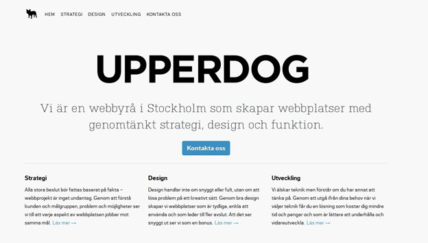
This is the homepage for UPPERDOG, a Swedish web agency. You’ll no doubt remark that the company’s explanation of its workflow (strategy, design and development) showcases the horizontal part of the grid while its reasons for why it’s better than its competitors form the vertical part of the grid. Because of the good continuation both horizontally and vertically, a site visitor is easily able to follow along and identify which elements belong to which category.
So as you can see, it’s possible to use a gestalt principle and have it deliver powerful visuals and practical benefits on a B2B site. That’s why your site designer ought to have at the very least a fundamental understanding of laws like good continuation.
Conclusion
Every installment of our exclusive gestalt-design series, we bring you another principle or law, so that you can cumulatively build your knowledge base of gestalt design. The three that we covered this week—proximity, uniform connectedness and good continuation—are essential to your understanding of design in general. You’ll find it much easier to understand concepts we’ll tackle in the coming weeks if you can wrap your head around these three.
One amazing thing about these three principles is that they merely reinforce what you intuitively know already.
As you were reading about each one, you no doubt had one of many “Aha!” moments when you realized that you see relatedness in the same way. It’s just that you probably didn’t know exactly what to call it—but the concepts are naturally familiar.
Another takeaway is that all three principles typically move toward the same end result. Of course, each is unique, so each one progresses in a different way, shape or form.
A B2B site designer who truly knows his stuff won’t go overboard when employing these principles on your site. He’ll intuitively know how to be efficient in the use of each and know not to use more when one will do fine.
So what are your thoughts on proximity, uniform connectedness and good continuation?
Do you now see ways of how you can apply them to B2B site design?
How do you think that these principles can help you increase your conversion rate?


